Taylor Clough’s Is, And of The at Occam Projects features an assortment of paintings on canvas and paper, absorbingly and tauntingly saturated. Clough painted people as an undergrad, but her current sceneries are unpopulated. Though lacking in figuration, she paints these apartment views, subway seats, windows and waterless pools as she would people. Interiors build upon the canvas like mounds of flesh, smeared on in pileups of texture.
“I don’t like to be dainty with it,” Clough says. She ditches the preliminary sketches, the hesitant, initial graphite that begins a canvas. “I try to draw with paint.”
Force inaugurates these paintings. Clough’s canvases are constantly subject to revision, and “the way it looks, in the beginning, is nothing like at the end.” These are Clough’s remembered places, but they reach into the archetypal habitats of the twentysomething. In the same way that memories rewrite themselves, drifting further into fiction’s caress, so too do Clough’s spaces extend beyond specific locales. “I’m definitely not celebrating architecture,” she laughs. Rather, she’s advancing an ontology of painting that is more than pigment-on-ground: “A painting to me is color and space articulating an experience with emotion.”
Clough’s second solo show arrives courtesy of Occam Projects, a pop-up gallery and studio space in Providence. Located in the Olneyville neighborhood, directly adjacent to Yellow Peril and GRIN, Occam Projects focuses on showing emerging, local artists like the Boston-based Clough. Since graduating from Montserrat College of Art in 2014, Clough has developed a visual vocabulary that will be especially familiar to Bostonians (the MBTA appears in four of the show’s fifteen paintings) and anyone who’s ever lived in an apartment. Her subject matter is quotidian. Aside from interiors, she’s fond of window sills, beer bottles, pool noodles, those ubiquitous “THANK YOU” bags and cigarettes both nicotinic and confectionary.
These banalities register human presence without showing it and Is, And Of The makes absence a conceptual concern. As sociologist Morgan Meyer notes, absence is “textured and materialized through relations and processes, and via objects.” One must “trace” absence, sussing out its proximity to presence, and Clough does this with her brush.
Artist John Walker describes paint as “colored mud,” offering a reminder that the medium can be almost vulgar in its materiality. The robust physicality of paint makes possible the impact of otherwise pedestrian imagery. Rendered with a commanding and corporeal use of color, might we refresh our attention to our usual surroundings? After all, space incorporates not only objects and people but the interactions thereof. Or, expressed another way by sociologist Martina Löw: “Space is a relational arrangement of social goods and living beings in places.” Clough paints the emotive load of these “arrangements.” The blue doors in Take Care seem to have absorbed the uncertainties of the people who pass through them. The seats in 11pm on the Red Line, meanwhile, look both noble and exhausted, movingly illuminated by a pyramid of light.
Haunted by the human, these paintings are bilingual in abstraction and representation. Clough’s thick, sloshy brushwork nods toward abstract expressionism, and she admits a fondness for artists like Robert Motherwell and “how far they were able to simplify a gesture or line.” Stylistically, however, Clough is closest not to AbEx but one of its parallels, the Bay Area Figurative Movement—artists like Richard Diebenkorn, Elmer Bischoff, and David Park, who took up figuration just as East Coast painters were plunging deeper into the chasm of abstraction. With this lineage, Clough shares a desire to “say something” with the paint itself. The application might provide not only substance but widen the picture plane so that viewers “discover things more meaningful than just color.”
Critic John Yau characterizes “what we might call the dark side of domesticity and community” as “recurring themes” in Bischoff’s work, and one sees a similarly nocturnal (and perhaps anxious) quality in Clough’s empty subways. Likewise, author Nancy Boas describes Park’s paintings as “a balance between the definition of the image and the presence of the paint itself,” a visual ethos also deployed by Clough, as seen in a swift and kinetic piece like MBTA, Unfortunately.
Her oeuvre still in its nascence, Clough expects that she’ll eventually return to figuration. For now, she wants to push these spaces as far as they might go. Open the windows, or, better yet, smash them. Crack the door, and then pull it off its hinges. Saturation is Clough’s best friend in inciting this mayhem.
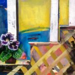
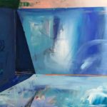
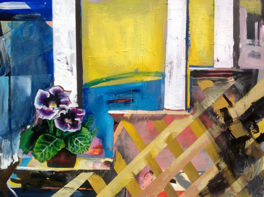 “Once I had someone tell me I knew nothing about color,” she remembers. Clough’s desire to be both “jarring” and “reassuring” might have inspired this barb. Her coloration can be challenging, but the stimulating ways in which she constellates hues are easily appreciated. Notice the gleaming columns of white in Porch Flowers, how they intersect with a buttery yellow sky. With a more unified palette, Clough achieves potent feeling. In Pool and Deep End, it’s as if Clough has painted sequels to David Hockney’s A Bigger Splash (1967)—long after all the glittering, chlorinated water has been drained.
Clough is painting the left-behind, the no-longer, the space-around, the in-between. The transient, impermanent feel of her work implies space as inherently liminal, always changing and always contaminated with humanness. In a 2013 interview, the late geographer Doreen Massey described her scholarly efforts to “bring space alive, to dynamize it and to make it relevant, to emphasize how important space is in the lives in which we live.”
The same can be said for Clough’s labored yet sincere compositions, which ask us to linger in unease and comfort. Take Really In It, which leads the viewer down a corridor going nowhere. White light pours in, maybe from an open window, its illumination stopping somewhat neatly along a crooked swatch of navy blue. Compositionally, this could be pure abstraction. And yet there’s enough of something palpable for the viewer to enter this space, and tread the abandoned floors.
One might even wander into one of the “traces” described by Meyers: “A trace is something that points to, something that is incomplete, something that once was. These traces always lead us into other places, other directions, other times; they are always incomplete, elusive, slippery and awkward.”
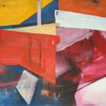
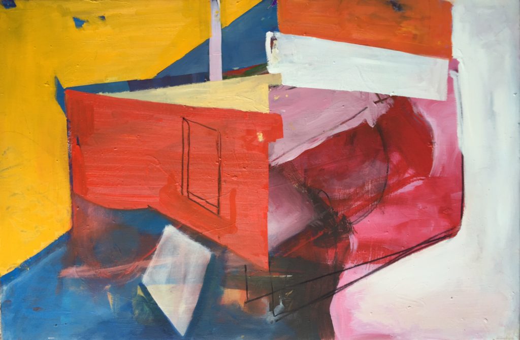
These traces run through True Love Never Dies, animating an interior that can barely hold its form. Opaque color besieges the suggestion of a room, while a scant line defines a door, or perhaps a window, inviting us in. The title implies optimism, but the colors voice something more ambiguous. Are these bursting reds and pinks signs of adoration, or lost affection? This room could be disintegrating, but something compels us to stay, basking in the heat of leftover feelings, of the squishy memories packed within the walls.