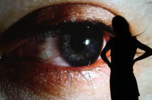
In his quintessential text on vision, Techniques of the Observer, author and art historian Jonathan Crary notes: “The mind does not reflect truth but rather extracts it from an ongoing process involving the collision and merging of ideas.”(1) The nineteenth-century theorists he cites understood perception as being in a state of flux, informed by past sensations and transcending the present moment.
The photographs of Liz Deschenes, whose first mid-career survey is currently on view at the Institute of Contemporary Art, Boston, seem to echo this sentiment. Dating from the late 1990s to the present, the roughly twenty works on view clearly express a fascination with human perception—both the physical, biological act of seeing and the conceptual processes that follow the intake of visual information. Calm and cerebral, Deschenes’ photographs explore themes that range from process and material to vision and perception and are lodged in the history of the medium itself.
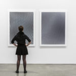
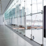
Eschewing representational imagery, the New York-based artist works with abstract patterns, monochrome prints, and glossy panels that more closely resemble sheets of metal than traditional photographs. The latter are in fact photograms—a process that bypasses the camera and requires only light-sensitive paper, photographic chemicals, and a light source to create an image. Photograms are most commonly exposed under an enlarger or by sunlight, but Deschenes often makes her images by the light of the moon. Indeed, there is something of the celestial, the organic, the elemental in her images that resemble materials like mercury or obsidian. The photograms in Timelines (2016), a new piece created as a response to the architecture of the John Hancock Founders Gallery which overlooks Boston Harbor, mimic the reflective, blue-black color of the water below.
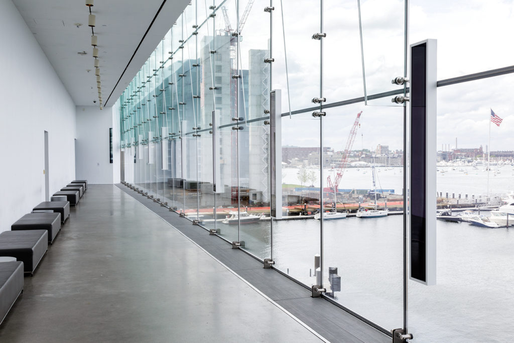
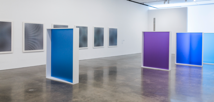
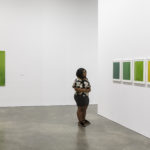
Installation view, Liz Deschenes, Institute of Contemporary Art, Boston, 2016. Photo by John Kennard. © Liz Deschenes
The subtle beauty of her metallic photograms in stark contrast to the bright, rainbow hues of pieces like Gallery 4.1.1 (2015) and Elevation #1–#7 (1997), yet somehow the juxtaposition is not unsettling. As Deschenes remarks, “I like taking seemingly opposing things and positioning them together.”(2) A sense of cohesion is maintained throughout the exhibition by the work’s consistently clean, Minimalist forms and its material presence.
Deschenes’ photograms are reminiscent of Minimalist works like Carl Andre’s 144 Aluminum Square (1967) and Richard Serra’s Prop pieces, while the more colorful prints share similarities with certain Donald Judd sculptures. Perhaps the most significant comparison can be found in Robert Morris’ Untitled (1965), in which the mirrored surfaces of four wooden cubes reflect and multiply the gallery around them. Morris’ intent was to make the viewer hyper-aware of his or her physical presence in relation to the sculptures.(3) Deschenes describes how her photographic work aims to achieve a similar awareness in her audience:
[M]any of my photograms take on the rooms they’re exhibited in as a viewing device, where the viewers can actually see themselves seeing and can have a clearer understanding of the object’s construction—as well as of their own perception. I’d like people to have agency with the work and their experiences, to develop a deeper sense of their relationships to space, light, color, and, of course, photography.(4)
Like the Minimalists, materiality and the physical object are central to Deschenes’ work, yet her images and geometric sculpture-photograph hybrids do not erase the evidence of the artist’s hand. Deschenes remarks, “The hand versus the machine is something that I’ve investigated in a way that wasn’t of interest to [Donald Judd] at all. The photograms are so handmade that the hand, as you can see, is still in them.”(5) Of note, too, is the fact that although her work gives the appearance of metal, sleek enamel, or a mirror, the effect is an illusion. They are prints on photographic paper, an organic material that the artist has carefully manipulated and experimented with to achieve the final product. This is quite different from the Minimalist approach of outsourcing the fabrication of industrial materials in order to eliminate the presence of the artist.
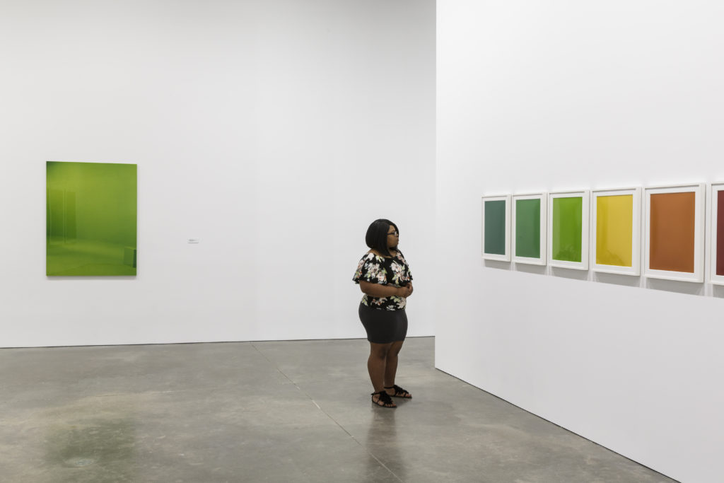
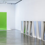
Installation view, Liz Deschenes, Institute of Contemporary Art, Boston, 2016. Photo by John Kennard. © Liz Deschenes
Deschenes’ work engages both with the theory and physical processes of making an image. Titles like Rise / Fall, Tilt / Swing, and Shift / Rise refer to ways of positioning a camera in order to control focus and perspective, while her Stereograph series alludes to the stereoscope: a viewing device that simulates depth by focusing on two nearly identical images. Her work in the darkroom seems to challenge the precise set of steps every student is taught to adhere to in an introductory photography course; her images are not always permanently fixed to the paper. As a result, the surfaces will “oxidize” over the course of the exhibition according to the conditions of the gallery’s atmosphere. Unfixed and mutable, they take on a life of their own. They become, in effect, a kind of historical record, an abstract documentation of not only the gallery space but our presence in it as well.
As concerned as she is with the material processes of photography, it would be difficult to classify Deschenes strictly as a photographer. Some of the works in the exhibition occupy space in the center of the gallery, while others are curved into concave shapes to relieve them of their planar forms. In his 1965 essay “Specific Objects,” Judd outlines the tenets of a “new work” (later referred to as Minimalism): “[T]his work which is neither painting nor sculpture challenges both. It will have to be taken into account by new artists. It will probably change painting and sculpture.”(6) Deschenes seems to take inspiration from Judd’s words, turning her attention to photography rather than painting. Her work pushes at the boundary between photography and sculpture in an effort to liberate photography from its status as “a secondary medium beholden to framing single moments in time and space” that are ultimately mounted flat against the wall.(7)
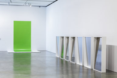
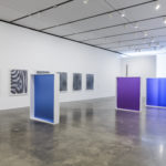
Installation view, Liz Deschenes, Institute of Contemporary Art, Boston, 2016. Photo by John Kennard. © Liz Deschenes
The artist also experiments with unconventional modes of display, providing a further reference to Minimalist strategies. These works tend to inhabit space on the floor, ceiling, and at the very edges of gallery walls. Shift / Rise #42 (2016), for example, is tucked unassumingly in a corner at the beginning of the exhibition. With a finish like black lacquer and a slender rectangular form, it could easily be mistaken for an architectural element of the gallery space, much like the thin, bent photograms in her Stereograph series. Green Screen #4 (2001/2016), a long inkjet print in a vivid green hue, hangs unframed from the wall and extends onto the gallery floor like a backdrop. These shifts in placement are subtle, but they immediately activate the images into objects that confuse the line between photography and sculpture.
Works like Gallery 7 (2014) and Gallery 4.1.1 (2015) expand on this concept. In Gallery 7, silver gelatin photograms mounted to sheets of aluminum stand upright on the gallery floor, stabilized by rectangular white frames. The frames, lined along one wall of the gallery, are positioned to show either the matte surface of the aluminum or the highly reflective silver-and-copper-toned photograms. Rather than positioned against the wall, Gallery 4.1.1 occupies the main floor and presents the most interactive work in the exhibition; there is enough space between the five free-standing frames for the viewer to navigate in and out of the monolithic works. The work feels serene, comprised of five pigment prints on acrylic that range from pale blue to violet. While one side is reflective, the other side gives the effect of a fogged window through which one can make out only vague areas of light and dark.
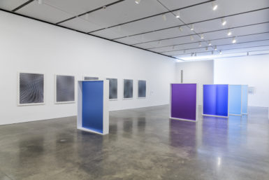
Installation view, Liz Deschenes, Institute of Contemporary Art, Boston, 2016. Photo by John Kennard. © Liz Deschenes
Here Deschenes plays with photographer and curator John Szarkowski’s 1978 definition of contemporary photography, in which "the photograph is seen either as a mirror—a romantic expression of the photographer's sensibility as it projects itself on the things and sights of this world; or as window—through which the exterior world is explored in all its presence and reality."(8) Deschenes cleverly translates Szarkowski’s metaphor of mirrors and windows into a literal manifestation. The duplicity of surfaces in both Gallery series is intended, in Deschenes’ words, to create “a new set of portals, reflective viewing experiences, transparent viewing experiences, opaque viewing experiences.”(9)
Perhaps the most notable example of Deschenes’ experimental installation technique is found in Tilt / Swing (360° field of vision, version 1) (2009). Comprised of six rectangular photograms mounted on sheets of metal, Tilt / Swing greets the viewer upon entering the gallery. Only one of the six images is positioned on the gallery wall. The others are hung from the ceiling, propped against the wall or laid flat on the gallery floor. Installed in a ring, the work suggests suspended orbital movement, encouraging the eye to move from plate to plate. The silvery sheen of their surfaces is blemished by stains from photographic chemicals and its gradual oxidation process, giving them the appearance of tarnished antique mirrors which both reflect and distort the viewer’s image.
Tilt / Swing is modeled after a 1935 illustration by Bauhaus artist Herbert Bayer, Diagram of 360 Degrees Field of Vision, a replica of which accompanies the installation’s wall label. At turns a graphic designer, architect, and photographer, Bayer took a particular interest in exhibition design, declaring it in 1961 “an intensified and new language” which should be, among other things, concerned with “movement (of the display as well as the visitor).”(10) When mounting a show Bayer would often install works on the floor or lean them against the wall rather than resorting to the traditional formula for hanging two-dimensional work, in which the center of the piece is positioned sixty inches from the ground (a standardized, “ideal” height).
The innovative designer conceived a way to take advantage of the full range of human vision, creating an unusual and dynamic viewing experience that activated the eye. In the diagram, the viewer (depicted as a human body with a single, hieroglyphic eye for a head) is positioned on a small elevated platform in the center of a ring of rectangular panels, much like Deschenes’ Tilt / Swing. Unlike the figure in the reproduced drawing, however, the viewer is barred from entering Deschenes’ circle of photograms—a shame, as this would have been a compelling vantage point and seems fundamental to completing Bayer’s theory.
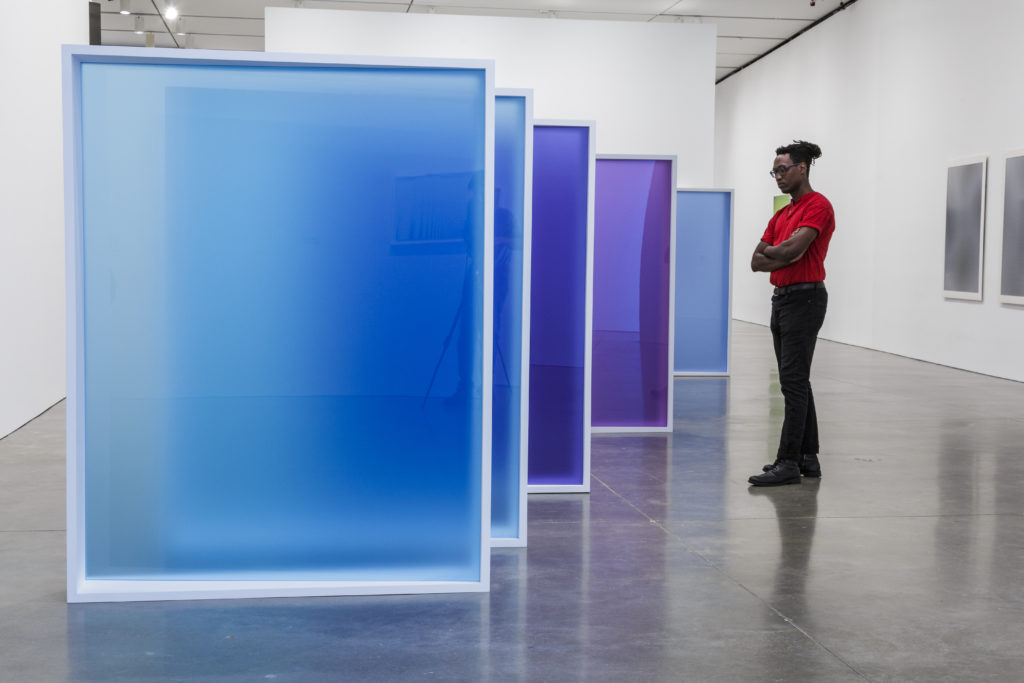
Installation view, Liz Deschenes, Institute of Contemporary Art, Boston, 2016. Photo by John Kennard. © Liz Deschenes
The Bauhaus member was equally concerned with the viewer’s physical movement within the gallery, going so far as to direct visitors by adhering cutouts of footprints to the floor.(11) Deschenes, however, is not as interested in such a rigid experience of her work. The space being fairly open, there is not a clear path that directs us through the exhibition. There are no benches—ubiquitous of museums and galleries—strategically placed in front of individual works to indicate an ideal vantage point. These conditions encourage the viewer to move around the works more fluidly, navigating the entire exhibition autonomously. Like Bayer, Deschenes’ innovative installation design is an “acknowledgment of the relationship between the viewer and that which is viewed.”(12)
This relationship is clearly significant to Deschenes, and feeds back into her notion of human perception as a complex, shifting and historical process. It extends in both directions from the present moment, informed by past experiences and continuing to develop long after the initial viewing of the image. Deschenes explains that within the model of past, present, and future, the latter is determined by “how the work changes, and how people interact with the work,” placing an emphasis on the viewer and her role in completing—or at least extending—the work.(13) How liberating, then, for a medium whose identity has been defined by capturing a single moment, to instead be viewed as a “continuum”—for an image’s meaning to unfold over time.(14)
- Jonathan Crary, Techniques of the Observer: On Vision and Modernity in the Nineteenth Century, (Cambridge: MIT Press, 1990), 101.
- Liz Deschenes, interview by Jonathan Bruce Williams, The Third Rail, no. 5 (2015), 37, accessed July 28, 2016. http://thirdrailquarterly.org/wp-content/uploads/10_Deschenes_TTR5.pdf.
- “‘Untitled’, Robert Morris.” Tate, August 2004, accessed July 31, 2016. http://www.tate.org.uk/art/artworks/morris-untitled-t01532.
- Liz Deschenes, as told to Gabriel H. Sanchez, “Liz Deschenes talks about her retrospective in Boston,” Artforum, July 25, 2016, accessed July 31, 2016. http://artforum.com/words/id=62368.
- Deschenes, interview by Jonathan Bruce Williams, 37.
- Donald Judd, “Specific Objects,” Originally published in Arts Yearbook 8 (1965), accessed on the Judd Foundation website July 30, 2016. http://www.juddfoundation.org/generalinformation
- Thea Ballard, “How to Light a Show: Liz Deschenes Turns the Gallery Into a Camera,” Blouin ArtInfo, November 29, 2014, accessed July 28, 2016. http://www.blouinartinfo.com/news/story/1064289/how-to-light-a-show-liz-deschenes-turns-the-gallery-into-a.
- Museum of Modern Art, New York, “Mirrors and Windows: American Photography since 1960,” June 1978, accessed July 30, 2016. https://www.moma.org/momaorg/shared/pdfs/docs/press_archives/5624/releases/MOMA_1978_0060_56.pdf?2010
- Ballard, “How to Light a Show.”
- Mary Anne Staniszewski, The Power of Display: A History of Exhibition Installations at the Museum of Modern Art, (Cambridge, MA: MIT Press, 1998), accessed July 29, 2016. http://www.worldcat.org/wcpa/servlet/DCARead?standardNo=0262692724&standardNoType=1&excerpt=true.
- Ibid.
- Ibid.
- Ballard, “How to Light a Show.”
- Deschenes, interview by Jonathan Bruce Williams, 37.
- Installation view, Liz Deschenes, Institute of Contemporary Art, Boston, 2016. Photo by John Kennard. © Liz Deschenes
- Installation view, Liz Deschenes, Institute of Contemporary Art, Boston, 2016. Photo by John Kennard. © Liz Deschenes
- Installation view, Liz Deschenes, Institute of Contemporary Art, Boston, 2016. Photo by John Kennard. © Liz Deschenes
- Installation view, Liz Deschenes, Institute of Contemporary Art, Boston, 2016. Photo by John Kennard. © Liz Deschenes
- Installation view, Liz Deschenes, Institute of Contemporary Art, Boston, 2016. Photo by John Kennard. © Liz Deschenes

