By RITA LOMBARDI
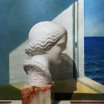
A fly on the wall of the Bernard Toale Gallery will hear all kinds of speculation about Abelardo Morell's new work. The image visitors see when they enter the gallery (or walk past it) is a color digital print of a Nadelman marble sculpture in front of a Hopper painting. Conspiratorial whispers of "it's Photoshop" or "that's superimposed on that" abound about the work, Nadelman/Hopper - Yale Art Gallery. In truth, the image is as straightforward as they come: Morell had the statue placed in front of the painting. Both pieces are in Yale's collection. The Nadelman sculpture is a head in profile looking out the window of one of Hopper's seaside interiors making the final image look oddly like a de Chirico. The clue to the process lies at the bottom of the image, where Morell has left the gilt frame of the painting and the base of the sculpture to let us in on the joke.
The show, “Pictures in Pictures” (incidentally, the Bernard Toale Gallery's last show), is comprised of three bodies of work - or at least three distinct subjects. It would be accurate to tell you that the subjects are cliché verre, camera obscura, and photographs of other art, but not true.
In every image, Morell explores some other use of photography. There are several artists today who push the limits of contemporary photography by reviving old methods and reaching into its history. Tintypes, glass negatives, wet plate collodion, and cyanotypes all abound. Morell has reached back even further, to use cliché verre - a process almost more related to painting than photography - and to camera obscura - a process used as long ago as the Renaissance. Not to mention his plain old fascination with the way our eyes work. Instead of indulging in a sort of nostalgia for things past and obsolete, Morell uses these methods of picture making in the most contemporary and forward thinking way and without sentimentality. He seems more interested in the beauty they provide, and the opportunity for the fresh seeing that they give, than for using an older process for the sake of the process.
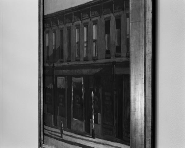
Nadelman/Hopper is not only put together to create a de Chirico and a stunning image, but as Morell will tell you, because Nadelman and Hopper were born in the same year, making them inextricably linked to each other in the history of art. The other two color images from Yale use elements from the works photographed to create a commentary on them. White marble contrasts with lushly colored landscape, harsh shadows in a Van Gogh are mimicked by harsh shadows under the frame of the Van Gogh painting. The black and white images are of Hopper paintings and play with our assumptions more subtly, changing the way we see the painting and the angle from which we would normally see it. In one photograph, the sun shines on the frame of the painting at what we imagine to be the same color temperature as the sun in the painting itself: a color saturated Early Sunday Morning by Hopper.
Aside from the pictures from Yale, there are the images in the show that Morell is most famous for: camera obscura. These are not the camera obscura we have grown accustomed to however. In these works, Morell uses color and a prism to flip the projected image of the outside world from its usual upside-down to upright. What better place to do this than Italy? The images that were complex and beautiful in black and white are no less so in color, and after seeing these, you may never want another black and white camera obscura.
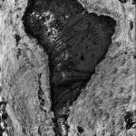
The cliché verre images are perhaps the most surprising of the show. Using candle smoke and glass, Morell made odd organic patterns. He then scratched the patterns and made a negative from the remaining shapes left on the glass. Corot and Millet both used the process but they were painters.
The interesting thing here is that a cliché verre is probably closer to a drawing or an etching than a photograph. Why is a photographer making drawings? Because he can, I suppose. The thing that makes the works successful is that they transcend media. They are images of the continents. That fact doesn't define them, however, and they are dark, imperfect and mesmerizing. They work especially well the way they are hung: in a group against a neutral gray. The camera obscura are dazzling in both their size (30x40") and their subject matter but the cliché verre, even at 20x24", hold their ground.
I think my favorite thing about this exhibit is that the pictures are large enough to have serious presence in the gallery, but they aren't as large as they possibly could be. Photography today so often tries to compete with painting by making itself larger than life. Because photographers start with a negative, they have the ability to make a print any size. As a result, "bigger is better" has been the rule in the last few years and often to the detriment of the image.
"Pictures in Pictures" bucks the trend by considering the pictures themselves. What size were they meant to be viewed at? Is bigger really better? The largest image, at 59" x 74.5", seems almost out of place in the company of 30 x 40's and 20 x 24's. It's yelling "look at me! I'm the showpiece!" while the others quietly steal the show.
- Abelardo Morell, Early Sunday Morning by Hopper, Gelatin silver print, 2007.
- Abelardo Morell, Nadelman/Hopper – Yale Art Gallery, Digital print, 2008.
- Abelardo Morell, South America: Cliche Verre with Ink Transferred to 8″ x 10″ Film, Gelatin silver print, 2007.
"Abelardo Morrel: Pictures in Pictures" is on view through 28 June 2008 at the Bernard Toale Gallery.
All images are courtesy of the artist and the Bernard Toale Gallery.
- See more at: http://www.bigredandshiny.com/cgi-bin/BRS.cgi?section=review&issue=84&article=ABELARDO_MORELL_292741#sthash.AwGTC2NM.dpuf

