“Cut” works gently. None of the works are quite human-scaled. The effect is that of an alien and enchanting terrain, parts Lilliputian and parts Brobdingnagian.*
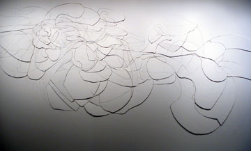
For Inhabitat XI, Chris Nau drew on and cut into one of the gallery’s walls. He then removed choice internal shapes, refined their edges, and returned them to position. This mode of draftsmanship, in charcoal, tool, and sandpaper, reminded me of Richard Diebenkorn. The focus is on line and virtuoso corrections. Inhabitat XI looked a bit like lace, or a pressed bloom—actually a counterintuitive quality in an intervention-by-jigsaw. The expanse of unadulterated wall on all sides made an elegant presentation of his looping cuts.
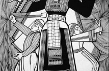
In Randal Thurston’s Ouroboros, the stunted shapes of bonsai repeat and combine to suggest neurons side-by-side with ova and flowering plants. This network of black paper shapes skims the wall on pins, effecting nimble shape shifting. I noticed that Thurston listed “graphite” as a component of the piece. His decision to cite the penciled directions for the piece’s assembly as the second element in Ouroborus is interesting, although I did not see it commented upon by artist or curator. At close inspection, the smattering of pencil lines complicated what at first seemed like easy black/white graphic signification. Depth got screwy. Black motif and white ground flattened into a unified surface support for more improvisatory marks.
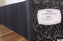
In a reverse trajectory, Debra Weisberg’s painstakingly three-dimensional sculptures--each had a grottoed surface area that was exponentially greater than its mass--were such a dense, matte black that they made uncrackable hieroglyphics across the floor. I never found a point of entry that allowed me to fully engage these “constructed drawings.” Nonetheless, Weisberg’s forms had a Beuysian presence, all petrified wood and fossilized pyrotechnics. Theirs was a rich, mystical aura.
As I left “Cut,” I daydreamed of a more precarious gallery installation. I rotated the three works 90° counterclockwise, to the next surface in the gallery box. Chris Nau’s arabesque lines would be incised in the gallery’s floor rather than into drywall; Debra Weisberg’s dark, craggy forms would jut from the walls rather than litter the floor; and Randal Thurston’s cut paper shapes would be highly-wrought, low flying storm clouds and eddies pinned up to the ceiling. Once loosed from their current surfaces, the pieces might come fully into view.
Indeed, despite the show’s brief gallery blurb, none of the pieces struck me as even remotely site specific. I would instead argue that the works are without context. In a somewhat perverse way, I wanted one of each for my apartment. The complicated relationship between artwork and location is “Cut’s” greatest hook. For example, what is meant by “site specificity?” Is it simply the absence of a frame and support and any characteristics that distinguish the piece as a recognizably purchasable art object? When a work is made of pure substance--drywall, paper, a shape of inky black-- rather than of a material layered on top of a support, are its immediate surroundings, its site, automatically essential to our phenomenological experience? Even if the site is not considered in or by the art object?
As an exhibition, “Cut” makes a great case for a continuing consideration of autonomy v. site specificity in non-representational art objects. Despite the show’s loose thematic grouping by technique, that of cuts, I found that the key unity in the show was simply its formal tightness. I never felt bothered to ponder over what the pieces were or what they represented (all works in “Cut” were far removed from conceptual art practices). I was just happily distracted by my looking.
__
*Meanwhile, the brutality that “cut” can connote remains to be explored in another show. If a companion exhibit of more merciless cutting is ever planned, I suggest including of Yoko Ono’s “Cut Piece,” a scary, heedless march toward total vulnerability, snip by snip by snip.
Links:
Boston Center for the Arts
"Cut" is on view until January 9, 2005 in the Mills Gallery at Boston Center for the Arts - 539 Tremont Street, Boston
All images are courtesy of the Laura Donaldson, the Mills Gallery and the artists.
Anneka Lenssen is a regular contributor to Big, Red & Shiny.


