By ARTHUR WHITMAN
To those well-versed in contemporary art, the selection of work in "Recent Acquisitions" is likely to have a wearisome familiarity. Many or perhaps most of the artists will be familiar. Most of the art seems to fall into into well-worn modes. And (not unusually for such work) much of the art here walks the line between the endearingly offbeat and the gratuitously twee. (The best example of work falling into the latter category is an untitled figure sculpture by Lucky de Bellevue made out of variously hued pipe cleaners and partially supported by a cane.) But of course, the Johnson is not a big city museum. Located in Ithaca, in upstate New York, the local viewer is five, six, or seven hours away from Boston, New York City and nearly every other regional contemporary art enclave. So, the show serves an obvious pedagogical function--an art of today sampler for the "centrally isolated". And there are some modest pleasures for us jaded sophisticates too.
Counting for a lot, the most unabashedly gorgeous work in the show is Beatriz Milhazes' As irmã ("the sisters" in her native Portuguese). Measuring a good 52” x 60”, the screenprint is one of the larger pieces in the show. Its left hand side is dominated by loose vertical stripes--black, white, cyan, various yellowish greens, orange-tan--with a black sillhouette overlay of rose blossoms and baroque curls. Moving to the right, the stripes gradually give way to a dense arrangement of layered motifs: rectangles, target or mandala-like circles, abstracted flowers, more curls. The overall balance of colors is warmer: pink, gold and lavender, for example. Overall, the print skillfully splits the difference between lush decoration and the high art seriousness of abstraction.
Several artists are working with cut paper. Most interesting are three cut paper bags by Yuken Teruya, collectively entitled Notice-Forest (Breakfast Street). The bags are from different fast-food donut outlets: Mister Donut (with mostly Japanese lettering), Krispy Kreme, and Dunkin Donuts. They are open towards the viewer, revealing delicate cut trees inside. There is obvious irony in the juxtaposition of a carefull--and characteristically Japanese--aesthetics and vulgar American culture. Given the importance of their shadows, they would have likely benefited from elaborate, staged lighting. Diana Cooper's Trip is a large sheet of paper mounted on a board (behind plexiglas), and elaborated with a messy, awkward combination of line drawing, cutouts and collage elements (transparent plastic sheets, felt, snapshot photos, map pins). It resembles, in abstracted form, a map or a technological diagram. Although I'm a big fan of similar work by other artists, and although I like other work by Cooper, this one feels too ungainly for its own good. Mark Fox's Untitled (Stingray) is a hanging paper cutout screen, colored on one side with various painting and drawing media and featuring an scrap heap iconography.
Like the Fox, most of the sculpture in the show is hung rather than freestanding. Russell Crotty's Spanish Trails is a panoramic landscape drawn on paper, mounted on a fiberglass sphere (two feet in diameter) and suspended from above. A horizon line divides the globe into two roughly equal halves. The line traces out the tops of small houses and trees. Above is a nighttime sky with stars; below is a landscape made of circular bands of letters, the words spelling out banal messages related to real estate and consumerism. The lettering gets larger and larger as it approaches the bottom. Trails is rendered with ballpoint pen and thin watercolor washes (warm and cool). The combination of wonderment and ironic social critique is rich.
Also hanging out at the Johnson is Ernesto Neto's Colors, Cultures, Knots, and Time and an untitled piece by Tony Feher. Colorshas a whole wall to itself. White plastic rings are pinned to the wall; these are connected by variously (and vividly) colored cotton threads. The overall design resembles five large, irregular wheels, bunched together with a smaller wheel in the lower left corner. Feher's work hangs from the ceiling. The piece is strangely elegant, considering that it is mainly just a cluster of plastic water bottles, each filled with water (mixed with a small amount of rubbing alcohol, according to the wall label). The bottles are smaller above and become gradually larger moving down.
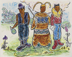
A number of the artists here are known for exploring ideas of racial identity in their work. Among these are the African American artists Ellen Gallagher, Kerry James Marshall and Kehinde Wiley. Their inclusion feels perfunctory and the pieces themselves--while not terrible--are slight. The Gallagher, Bouffant Pride, has more or less what you would expect: rows of black female heads (done in photogravure) with cut-out hairdos and a larger head with plasticine hair studded with toy eyes. Work so dependent on repetition and clustering probably needs more space to be effective. The Marshall is a sketch for a painting, as is (or so I'm assuming) the Wiley.
Several similarly "minor" works" fare better (although they're inadequate as samples of a style ). An untitled ink and watercolor drawing by Julie Mehretu lacks the intricate geometric structures of her large architectural paintings. But the markmaking is lively and expressive, suggesting storms, explosions, fires. While Cecily Brown's canvases can feel too thick and clogged up, her small monoprint here (also untitled) is airy. Standing in front of a red brick wall is a struggling mass of vaguely organic forms, pointing what looks like an umbrella towards the upper left. The composition is strangely reminiscent of Gericault's Raft of the Medusa, which feels appropriate. Chloe Piene's charcoal on vellum Sleeper 6 is a delicate, messy tangle of lines, only loosely suggesting a figure.
"Acquisitions" is a casual kind of show, which seems appropriate, given summer vacation time at a university art museum. There is no real overarching concept and little in the way of apparent scholarship. The quality of the artwork is quite uneven, as you might expect. Its relevance is a matter of perspective. Thankfully (and not altogether unlike the Chelsea gallery trawling that is being simulated), there are moments that provide pleasure as well as edification.
The Herbert F. Johnson Museum Of Art at Cornell University
"Recent Acquisitions: Contemporary Art" is on view July 21 - September 30, 2007 at The Johnson Museum.
All images are courtesy of the artist and The Johnson Museum.


