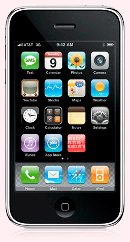
BIG RED GOES MOBILE
The iPhone, Blackberry, and all the other mobile devices that pervade our lives have brought a new mobility to information that never existed before. They are portable, user-friendly and a fun way to communicate via the internet. No doubt some of you are reading this on your mobile device right now!
Of all the great features of new mobile technology, one of the more annoying is that most websites (like Big RED & Shiny) are created for the larger screens of desktop and laptop computers, and often hard to read on the tiny screens of mobile devices.
Introducing mobile.bigredandshiny - a new specially formatted version of Big RED & Shiny that improves your mobile reading experience!
To access the new mobile format, simply log in to http://mobile.bigredandshiny.com or click the "mobile" link at the top of any page.1Bookmark it, or put it on your home screen for easy access.
Version 1.0 of mobile.bigredandshiny features every issue of our journal, plus current event listings. Later versions will include the blog and much more. Send us your thoughts and ideas for what you would like to see included in future versions.
No more squinting or trying to click on tiny links with mobile.bigredandshiny!
1 - Note: the mobile formatting will probably look pretty bad in a standard web browser.
Click here to jump to mobile.bigredandshiny.com
iPhone image from the Apple website.


