By MATTHEW NASH
A few years ago, I gave my father a book of Dilbert cartoons. He gave it back.
To me, Dilbert is an hilarious sendup of corporate culture, showing the ridiculousness of cubicle life and how impersonal it can be. I think that Dilbert is a funny reminder of why I chose to be an artist, and an affirmation that the culture I have rejected is both morally vapid and an environment in which I would not wish to spend my life.
To my father, Dilbert is a slightly exaggerated version of his work week.
At Work, the new exhibition at Judi Rotenberg Gallery, runs the risk of sharing the fate of my Dilbert gift. Is it a critique of the culture of “work” and the spaces occupied during the creation of wealth, or a glorification of the environs and people who drive our economy? Are the artworks included here meant to re-affirm the choice of many artists to avoid the mainstream workforce, or are they expounding the glories of post-industrial employment?
Ultimately, the success of the show is that, collectively, they do neither. At Work is not a critique per se, nor is it a marketing tool. In many ways, the pieces simply declare what is, and invite us to bring our own perceptions of “work” to the conversation.
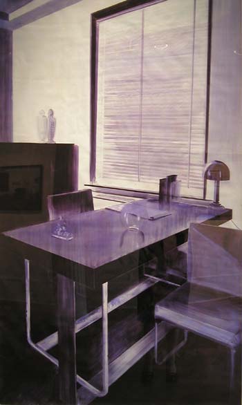
In Rebecca Chamberlain’s drawings, the office space appears as a monochromatic and formalized experience. Made from the ink of ballpoint pens, they evoke both the water-color fluidity of older architectural sketches, along with the rigid composition of formalist photography. The use of the blue ink masks the institutionalism of her locations, but the structure of her compositions is so cold as to neutralize any humanity in the artist’s brush strokes.
The challenge of Chamberlain’s drawings is to consider these banal spaces as worthy of illustration; even the use of the ballpoint ink implies that the entire context must be considered, but that a medium such as oil paint would be too much for these lonely desks and chairs. At the same time, there is also a sense of glory in the use of a medium found on the scene, as if these tableaus were made by a creative soul trying to escape the drudgery of the everyday, using the only media on hand to paint the simple still life in front of them.
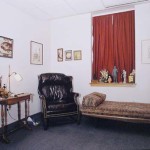
Shelburne Thurber’s images are an appropriate, if unsurprising, inclusion in this show. Thurber’s very formal medium-format images of psychiatrists’ offices evoke many questions about how one creates the space in which they earn a living. As these spaces are designed for the comfortable interaction between a therapist and a patient, the element of “comfort” is foregrounded. Despite the lack of people, the personality of the person who works in the office is thrown into sharp relief, framed by the furniture and decorations used to accent the room.
Thurber uses the titles of these images to ensure that this individuality is not lost. With titles like "Brookline, MA: Office with Native American Wall Hanging," "Buenos Aires: Office with Floor to Ceiling Windows and Sheer Curtains," and "Arlington, MA: Office with Red Window Curtain and Small Statues," it is clear that the decorative choices are the key to understanding the person who works in each office. Using the spaces to create portraits-in-reverse of their occupants, Thurber posits the question of whether one designs a space for themselves, or for the guests they hope to receive.
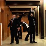
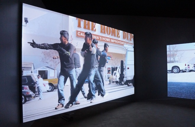
With the drawings of Chamberlain and the photos of Thurber exploring variations of the spaces of “work”, it is left to Ann Carlson and Mary Ellen Strom to consider the people who might occupy those spaces. Their video "Sloss, Kerr, Rosenberg and Moore" presents four lawyers who appear to be waiting for four elevators. In the course of the 3:53 minute video loop, these men move and bend, their actions sometimes seeming choreographed while at other times disjointed. At times they seem to be dancing, or perhaps unleashing some internal spasm or pent-up energy.
The title of the work, with four surnames strung together, clearly implies that these men are lawyers and this space they occupy is a law firm. In spite of Strom’s explaining the repuation and history of the four lawyers to me during the show's opening reception, I still find the most pleasure and significance in this piece when I consider these four men as anonymous representatives of every corporate job. These four men might be lawyers, accountants, advertising executives, stock brokers or catalog marketers… All that is important can be seen in their actions, these uncontrollable and subconscious desires set free as they wait for the elevators to arrive. Each twitch, bend, spasm, or stretch can be interpreted as a form of creativity, a small movement toward individuality. Since they stand back to back and, presumably, cannot see each other, the implication that they are acting out in some hope of privacy is both enhanced as they ignore each other’s actions and shattered by the obvious proximity of the other men.
At Work presents the imagery of three artists who appear to be challenging the nature of “work” and the sites in which it is enacted. That these sites may be glorified by the application of the artist’s hand to create drawings in media associated with the workplace, captured as photographic documents of the individuality of the spaces in which work is performed, or subverted by the personalized actions of those who must inhabit such spaces, this exhibition asks a ton of questions concerning how our days are spent and what we expect of the sites in which we pass that time.
Ultimately, though, I wonder what my father would think. For me, an artist who does not work in a cubicle and seeks mockery of the mainstream every chance I get, I acknowledge that I am willing to find a lot of humor and critique within this work. But I would like to know what someone who spends their days in cubicle culture, and who has felt (or even acted out) the need to express their individuality in the workplace, would say of this work. Is it accurate, or insulting? Is it a naïve view made by outsiders looking in, or an accurate representation of the some aspects of corporate culture?
The success of At Work is that it seems to straddle the line, and could appeal to both sides. It does not pass judgment, at least not explicitly, and offers a view of corporate life that is recognizable to those inside and outside. It is the kind of show that I think both my father and I could enjoy.
- Rebecca Chamberlain, 1933 Office Sketch, Black, bic ballpoint pen ink, acetone on printed vellum, 2007.
- Shelburne Thurber, Arlington, MA: Office with Red Window Curtain and Small Statues, chromogenic print, 2000.
- Ann Carlson and Mary Ellen Strom, Sloss, Kerr, Rosenberg and Moore, video loop, 2007.
"At Work: Ann Carlson and Mary Ellen Strom, Rebecca Chamberlain, Shellburne Thurber" is on view September 6- Cotober 6, 2007 at Judi Rotenberg Gallery.
All images are courtesy of the artist and Judi Rotenberg Gallery.

