I was informed that there are two types of people who go to the annual (this year being the 33rd) SIGGRAPH conference, technology people (the ones who build the hardware and write the software) and industry people (the ones who sell and buy technology) as well as a few who fall somewhere in the middle. Similarly, there are two types of artists (and many more who fall somewhere in between) who are chosen to be shown in the Art Gallery section of the exhibition: artists who find ways to make art with technology (technocentric) and artists who just so happen to use what the SIGGRAPH curators see as technology to make their work. In some cases the technology is the media used to create the work, in others, the work is about technology.
Typically, the former provides more immediate, visceral stimulation and the latter is more insightful and conceptually sophisticated. Both types of art have their basic intrinsic worth, yet some would argue whether the technocentric art belongs in the Art Gallery or would be better suited as a tool for displaying a new invention in the adjacent Emerging Technologies section of the conference’s exhibition hall.
It was this issue that the curators seemed to grapple with the most. Even the Art Gallery’s official title, “Intersections,” seems to call to mind some ambiguity. An accompanying video to “Intersections,” found on the conference website, promised that the show would “send [me]on an intellectual and creative journey through the intersection (italics added) of art and technology” and to its credit, it did. Though the intersection was crowded, confusing, and the traffic lights weren’t working very well.
To be fair, however, curating a show that “feature[s]digital art” would be like telling someone to curate a photography show. Not even taking into account the history behind photography, one would need to place much consideration on what is art in the field of photography as well. “Intersections” includes “Art Animations,” many of which are simply music videos, and some worthy performance based works ranging from dance and music to quintessential—though not disappointingly—performance art. What are disappointing are some of the 2D selections in the show. They are not so bad as an elaborate recreation of Starry Night on a T1-83(Thanks, Dan), but some do unfortunately have conceptual bases of comparable profundity.
Mark Millstein’s Kite Form: Chrome Bowl is layers of warped photographs resembling a polished piece of agate in the form of a boat’s sail. Though some technical virtuosity was employed to create it, its banality as a 2D abstract digital image makes it seem like the art that one would find on the wall of a hotel built in the mid-nineties. TEMPLE: Time Tapestry is basically a fame-by-frame break-down of the abstract video, Temple. The one-inch in diameter circular frames of the work were printed in order over a 44”x26” poster. The wall text refers to it as a “time tapestry” that takes “linear time and dissects it onto a two-dimensional plane” which is just a fancy way to tell you the same thing I just did; this work is somewhat visually interesting but conceptually inane. Benedict Sheehan’s Magic Mirror, comes across like an amusement park attraction that I think I may have enjoyed as a child. If the work had an interactive audio component, a comparison to Snow White’s wicked stepmother’s mirror would be an understatement. Sheehan’s a reputable New Media artist who primarily works with software, so we can only blame the curatorial staff for not choosing a better piece for the show. Is there not enough well founded digital art out there to prevent works whose only merits are the way they were created from being included in this show?
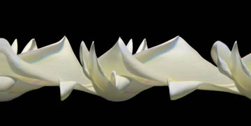
Ansen Seale, created Unfolding no. 14, an image of what appears to be a continually unfolding white rose petal, with a custom-built camera called the digital slit-scan. The camera takes multiple pictures over and over using only a single column of pixels; it is essentially a scanner with a fancy lens attached. The images he achieves are beautiful, and I’m pleased to see the piece included, yet if this work wasn’t made with some technologically intensive digital method, it probably wouldn’t be here. Another work that was included in the show for its technical merits is Sachiko Kodama’s Morpho Tower/Spiral Swirl. This work is the clearest example of a piece which might be better suited as a demonstration piece in the Emerging Technology section and, moreover, what’s most interesting about the work is not its electronics, but its materials. By far the ugliest piece in the exhibit, it is a black, granite, 12” diameter sphere with a pool hollowed out on top, in which a thick black liquid sits. In the middle of the pool, a 6” spiraled iron cone resembling a boring bit one might use to drill for fossil fuels. It looks like something we might find in the villain’s lair of a sci-fi film. The work was by far the most captivating in the show; it was easy to find as there was always a small crowd surrounding it. Captivating because the thick black liquid was magnetic and could be controlled to solidify into a spiral of spines covering the iron cone. The liquid could solidify or liquefy in either direction in split second, responding to ambient noise. It was literally incredible.
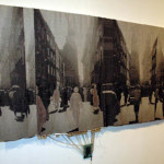
Joanna Berzowska’s Krakow: a woven story of memory and erasure was also a curatorial flop, but not because of the piece itself. About memory, it uses electrically conductive yarns and inks that fade over time to change the landscape and content of the entire image. The work is both contemplative and visually interesting, but unlike the image of the work on the conference’s website, the piece hanging in the show has an awkwardly draped white silk cloth hanging from it. Stitched into the cloth are the wires and silicon panel containing the electronics that manage the conductive yarns in the piece. It is distracting and distasteful and I presume that it was done only to make painfully obvious to the SIGGRAPH audience what warranted the work’s inclusion in the show.
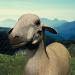
The wall text may shed some light on the heavy-handed presentation of Berzowska’s piece. It is descriptive and educational, like you might find in a museum with an education department, and highlights each work’s technical prowess. However, in an exhibition space where I observed visitors banging on the glass of the monitor of one of boredomresearch’s Biome biological models, I can understand why they might want to ‘simplify’ some of the art’s explanations. Also incriminating is the “Intersections” video, which has the same corporate aesthetic and narrative structure one would experience in an 80’s science museum video about celestial phenomenon, replete with a robotically-emphatic male voiceover and a Techno-cum-New Age soundtrack. In some cases, it is actually difficult tell if the language in the wall text refers to the technical process employed to create the piece or what the piece is about illustrating the trouble a gallerist might have when putting together a show for an audience comprised mostly of software developers. In the text for Sheep Jet Head, by Brit Bunkley, I image that an artist and a technologist would interpret “The same digital entities were output using different modes of representation as a means of questioning identity…” quite differently.
Technologically based artwork will forever be subject to the pitfalls of work created from new types of media, but only because it’s forever changing. Much of the what we know as New Media artwork today will, within our lifetimes, follow the same path as photography, and—more recently—video, into the hallowed walls of respectable institutions. Until then, however, we’ll have to deal with black granite spheres filled thick black liquid and Las Vegas hotels will have lots of cheap digital art to fill their gaudily decorated rooms. I only hope we have curators who are savvy and brave enough to wade through it and come out with something good every once and a while.
Links:
SIGGRAPH2006
SIGGRAPH2006 Art Gallery - Quicktime video
"SIGGRAPH2006: 33rd International Conference and Exhibition" was held at the Boston Convention & Exhibition Center from July 30th to August 3rd, 2006, in Boston, MA.
All images are courtesy of the artist and insert venue name.

