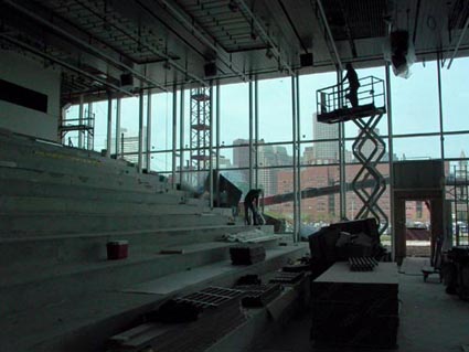
At first after putting on a hard hat, we walked across a drawbridge of perforated metal flooring and into the new Institute of Contemporary Art. I did feel like we entered the building through the left hip pocket instead of the proper front - the water side, but that probably makes more sense than walking halfway around the building to get in every time. The entryway passes under the back edge of the step-like theater floor and then into the more open central reception area which is very interesting visually.
First impression: WOW! The openness of the space and the ability to see across the first floor and out to the water was framed by the central elevator atrium beautifully. After blocking out the echoing classic rock (Allman Brothers, Sweet Melissa...at top volume) the thrill of seeing something this elaborate and specific in its focus on presenting art in Boston was overwhelming. Can this be real? The pull of the water and the light from it energize the entire lobby space. A glass elevator will lift visitors up the center of the whole space - which should keep this floor plan easy to navigate.
But as a curator and veteran museum installer, I was impatient to see the real deal: The two 8,200 square foot galleries on the fourth floor. I hurried past the Store and the two story Learning Lab without using my camera (because I was there to see where I would be helping install - not to take pictures...). I did examine the art loading dock, “prep” area and workroom which were really were nice - no more squeezing stuff past a huge staircase just to get art in the building!
The West side of the first two floors are dominated by the sloping floor and high ceilings and the view down the theater space and out through the glass into the harbor is simply breathtaking. We walked up one level and into the to the open glass stage and seating of the 325 seat theater space. The continuation of the interior space all the way down the exterior steps to the water beyond the stage creates a very open feel unexpected in a backstage area. I imagine much of this view will be closed off for lighting and so that the performances not to be upstaged by the harbor view behind them.
The stairway and railings are sculptural: graphic folded steel plates make up the handrail and the open central shaft creates a vertical space that feels like a James Turrell installation. Up another level is the Cafe and, the theater support area.
This space was luxurious: five green rooms, three bathrooms and an open floor plan that made the administrative floor I visited next seem small by comparison - which is too bad because it was where all the offices and library were located. Handsome outside offices had sliding doors ( doors were in short supply at the old ICA building) and windows with the end wall spanned by the just plain sexy all-glass conference room.
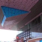
The super cool, media center - the wedge-shaped protrusion below the ICA’s distinctive 80 foot cantilevered top floor really shows what happens when you allow talented architects to do what they want: space is transformed. Water fills the front edge of the room’s view and the sensation of hanging is palpable. The steps and desks are laid out like a medium sized lecture hall (where Boston Harbor is teaching the class). You enter this space from the central elevator lobby which offers a long view of the interior and sits along side the two story theater.
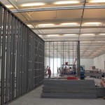
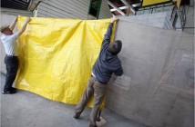
Finally we entered the cavernous West gallery where interior walls for the “Super Vision” exhibit were already being framed out. The space was big and really beautifully proportioned, great usable height of over 14 feet that did not dwarf the occupant (or feel oddly tall like the Rose expansion). The space was a great rectangular layout that just felt good to be in. The amazing saw-tooth roof let in natural Northern light and also had uplights bouncing off of the ribs that ran across the shorter dimension of the space.
The scrim panels were not in place at the time so the structure was revealed more than it will be during exhibitions. The grid on the ceiling will hold large rectangular cloth panels to diffuse the natural light even more. The combination of natural and artificial light reminded me of a high tech version of the DIA Beacon roof, which creates the nicest light I have ever seen in a museum.
Connecting the West and East galleries is the “long gallery” that extends along the picture window across the water side of the third floor ( this is the area that gets the party planner rental income!) While it may not be suited for actually exhibiting art, it reminds you where you are and feels like a combination of a sheltered courtyard and an open roof deck.
In the East gallery a contractor was polishing the handsome light gray concrete floors that the ICA wished it had at the old space ( they painted plywood and cement floor boards gray in the old days). Integrated electrical access and attachment points for walls are built flush into the floors. This space is where the ICA Prize finalist will exhibit and the area that will host the permanent collection.
The outside amphitheater is already the choice lunch spot for the contractors and is warmed up by the inventive wooden surface of the overhang which feels like a continuation of the wide wooden deck and Harbor Walk. This area will truly be the best reason to walk the handsome new Harbor walk from either the North End, South End or Fort Point Channel. I did think that it was funny that if you climb the stairs there was no entrance to the museum anywhere - only the emergency escapes lead there from inside. But that was a small problem easily tempered by the reward the viewpoint offered. The steps create a vital missing attraction in the area; final an area designed for the public to enjoy a wind sheltered view of the water without owning a luxury condominium! This area reminds me of those great steps where everyone hangs out and meets up at PS1 in Queens, New York - but with a much better view.
Congratulations to everyone at the ICA, Macomber, Skanska and Diller Scofidio + Renfro! Take your time finishing this building right, we have waited 100 years for a great new art museum in Boston, we can wait a few weeks longer.
Links:
Institute of Contemporary Art
All images are courtesy of the James Hull and the ICA. See more images from inside the ICA.

