By JASON DEAN
I saw a Christoph Büchel piece in a building in Chinatown once. I have to describe it as a singular piece because the entire building was literally the work, every corridor, every light, every room had his fingerprints all over it. I don't think there was one original left to work from. It was an impossible architecture of holes in the floor to crawl through, leading to giant spaces. Or I'd find myself suddenly standing on the roof of a house inside the top floor of a warehouse, which I then had to crawl down shingles to get to the floor. It was really one of the most amazing things I've ever been in... part funhouse, part Alice In Wonderland nightmare. The best part was that I'm left with the memory of this space that keeps getting better the more time passes. You had to be there. That's why I was looking so forward to his piece at Mass MoCA, and it's too bad something couldn't have been worked out either way.
Mike Nelson and his piece for Creative Time brought some of that back for me, but in a less tactile and more symbolic way, like sepia photographs and movie sets.
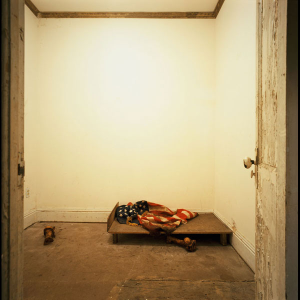
Of course there were releases to sign before you went off into a boarded-up storefront. I immediately ran into a few people backtracking from dead end passageways which led up chained-across stairs and closets. Finally, one door led out of the initial back room of what was probably the kitchen of a chinese food restaurant. Every door opened into hallways or tiny rooms, which opened into more tiny rooms with doors and so on. It quickly turned into a labyrinth of dislocated memories. Every other room had tiny altar's to the past, on the floor or on a shelf... muddy (bloody?) flags with gigantic animal bones in the corner of a tiny room with a fan on way too fast and uncomfortably low to your head. I kept trying to piece together some kind of narrative out of tattoo equipment, Iraqi trading cards and a wind chime made out of wishbones.
There were framed pictures of JFK over a beaten formica counter with a skull in the corner. Some rooms looked exactly like ones you had been in before and I convinced myself the door on the right opened last time I was in there. The couple standing across had to tell me there were identical rooms.
I like these that random collections of old worn objects inherently create a story, but I also know that's easy, and there's really no context here. Maybe these spaces and antique objects are celebrating this building and an idea of NYC, but it's pretty unclear, not that I need a sign on the wall, but random dusty, scary things in creepy corners don't do much more than look cool. Yet, who doesn't love a little voyerism, especially in NY, where everything is hidden away, we're literally feet away from completely different worlds at every turn? Given the opportunity to explore a wierd unknown secret space, we'll jump at the chance.
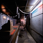
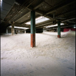
The most interesting part was the interior re-architecture. All of a sudden you open a door and you are in the middle of a long diner-style bar with an old cash register. Was this moved from an existing diner? Was it in one of the other rooms? It definitely didn't make sense with where I knew the boundaries of the building to be, that was great, that feeling of being completely surprised by the next space. How many rooms could there be across? You aren't conscious of these things normally walking around inside a building, but somewhere you inherently know that a sprawling giant bar with mirrors won't be through the next door... but there it is. The final straw was right when I thought the corridor was going to take me out to the street, I turned again and was in the middle of an enormous room filled with light grey sand, all the way to the corners. But unfortunately the last space was off limits to exploration, as it was only two inches thick and covering a lot of the rooms I was just in. A nice spacial trick, but a bit like being denied the best part, as I stood and imagined what it would be like to walk through sand in the middle of NYC.
I think the iconography was too heavy-handed, too obvious, too romanticized, which comes with using existing found objects. It reminded me of the things I've seen put together from a dumpster right before sophomore sculpture class - fascinating as arcane mysteries, but this could be called curating garbage. They didn't really mean anything together, it looked like a great picture at every turn, but I couldn't see the content. It was a semi-haunted house, serial killer museum, not anything like I imagined or knew Essex Street to be.
- Mike Nelson, A Psychic Vacuum, (detail) Mixed media installation, 2007.
- Mike Nelson, A Psychic Vacuum, (detail) Mixed media installation, 2007.
- Mike Nelson, A Psychic Vacuum, (detail) Mixed media installation, 2007.
"Mike Nelson: A Psychic Vacuum" is on view September 8 - October 28, 2007 at Creative Time.
All images are courtesy of the artist and Creative Time. Photos by Charlie Samuels.

