By HANNAH COLE
I am a reasonably good audience for art. I’m an artist, I go to lots of shows, I occasionally buy art, I’m not overly cynical about the art world, and I’m capable of having the occasional profound experience in the midst of madness. But the Miami art fairs made me feel embarrassed about myself as a viewer. Looking at 2000 artworks per hour has a dulling effect on one’s perception. Even taking notes doesn’t stop it. By the end of a long, oversaturated day, hopped upon two-dollar diet cokes, its hard to be a good viewer anymore. In that state, I may walk away from a painting with only the slightest glance that might move me under normal circumstances. Forget giving each individual piece the time it deserves.
When I confessed my bad viewership in a conversation with a dealer (who shall remain nameless), he replied, “You think that’s bad? I did Basel in thirty minutes.” Basel, for the record, had over 200 exhibitors, five exhibition sections, two locations, and over 2,000 artists.
Despite my intention to give each work its due, with 24 art fairs in 5 days, going to Miami to appreciate the art is like doing keg-stands at a frat party to savor the beer. A few individual pieces and galleries stand out, but what develops overall is a sense of the trends.
I went to the fairs with my friend Elizabeth, an artist. When we asked each other what we’d seen, we found ourselves listing themes more than individual works. So Liz, whose day job involves following trends in the fashion industry, suggested writing up a trend report. Over the course of three days, Liz and I took in Art Basel, NADA, SCOPE, Art Miami, Red Dot, Aqua Wynwood, Aqua Miami Beach, Bridge and INK. Here’s what I found:
Skulls: Sculpted, found, photographed, drawn and painted. A universal symbol – vanity, mortality, death, collapse, war, catastrophe, including fuzzy black and white vintage war footage.
Super-Obscured Video: LED lights-as-pixels showing barely discernable black and white video through a thick, translucent barrier – like watching video through gel.
Brazil/Brazilian Artists: Brazilian skulls
China/Chinese Artists: Some good, some bad. My husband’s comment after a series of stultifying works from China: “It may be the next big thing, but it sucks.” (and Chinese skulls)
Ripoffs: Unabashed ripoffs of other artists - Vija Celmins, Carl Fudge, Walton Ford, Gerhard Richter, Ron Mueck.
Agglomeration Absent: In stark contrast to the stream of agglomerative work coming out of New York, there was virtually none of it here.
Cut Paper: Paper sculpture, laser cut paper, hand-cut paper, topographical layers of paper, lacy paper. Most of it delicate. And beautiful.
Plexi-glass Boxes: Dioramas and imaginary worlds inside glass and plexi-glass. Brian Burkhardt at Judi Rotenberg/SCOPE, Matthew Day Jackson at Ballroom Marfa/NADA.
Needlepoint/Stitching: A skull on a quilt.
Pencil Drawings: Intricate, elaborate, and in every size. Large scale intensely rubbed fields of graphite. (And pencil drawings of skulls.)
Tiny Drawings in Series: Tiny books. Drawings on business cards. A fantastic micro-book made on a stack of rolling papers by Ricardo Lanzarini at Josee Bienvenu Gallery/NADA.
Symbols of Global Warming: Polar bears, Trees, (and Skulls)
Further signs of Environmental Interest (though vague):
-Cardboard as a sculpting material: Painted or raw.
-Rough Plywood: Utilitarian a la Arte Povera. Used as a painting surface, or roughly sculpted, routered or cut up.
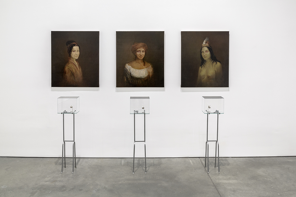
-Counterpoint to Rough Plywood: Alison Elizabeth Taylor’s fine-grained, precise, figurative inlay panels, at James Cohan/Basel.
-Natural Brown: Drawings on unbleached paper, paintings on unprimed canvas. Drawings and paintings on wood or cardboard.
-Counterpoint to Natural Browns: Fluorescent frames on black and white photographs.
Black and White: Small, graphic line drawings – tons and tons and tons of them. Because they reproduce so well? Because they are so transportable and saleable? Or are they just the Little Black Dress of drawing? A mesmerizing pair of black and white inkjet prints, called “Single Line Labyrinths” by Spanish artist Ignacio Uriarte at Nogueras Blanchard/NADA. (And black and white skulls.)
Counterpoint to Black and White: Black on black and white on white: Dark, underexposed photographs. Black paintings. White on white paintings. A resistance to reproduceability? Ad Reinhardt would be proud. A handsome installation by Gallery Joe at Aqua Wynwood – entirely made up of small, light drawings. It was quiet and intimate – exactly the opposite of the fairs. (And white on white skulls, and black on black skulls.)
•
With such a diversity of work, there is no way to find a unifying trend. Clearly artists the world over see a bleak picture of climate change, human cruelty and war. Yet where they do, they are addressing it or presenting alternatives. Even within the rampant commercialism of the art fairs, the art left me feeling optimistic. Broad and energetic, the work may not change the world, but it made me happier to live in it.
For more reportage on Art Basel, read Fair Factor: Prologue by Joanne Mattera in this issue of Big Red & Shiny.
"Art Basel - Miami Beach" occurred in Miami Beach and South Beach from December 6th -9th, in a variety of locations.
Image courtesy of C-Monster at flickr


