By JON PETRO
The Newbury Street art scene is pedestrian by location and concept. By which I mean, it’s neither dead or alive; it simply exists because of what it once was. It rarely shows any type of art that would be relative to the cutting edge. If Newbury Street was all-encompassing, then 450 Harrison Avenue would have never happened. This idea is not exclusive to the Boston art scene; Soho gave way to Chelsea and, to a lesser degree, the latter to Williamsburg and the lower east side. It is a prevalent scenario when a secondary art market is masquerading as a primary market. I only present this opinion because I never hear anyone openly talking about it. We all know it exists; we just don’t want to believe it to be true.
I’ve developed a similar opinion of Sean Micka “After Images” at Judi Rotenberg Gallery on view till February 3rd. His paintings are Minimalism in vernacular and fashionable by decorum. There is an entire new generation of artists who attempt to carry on the ideas put forth by the forefathers of Minimalism. The only issue I take with this wave of current day minimalism is its “Jackson Pollock Syndrome”, as I like to call it. When an artist or a student discovers Pollock paintings for the first time and realizes just how simple a Pollock painting can be to execute, paradoxically you end up with a stylistically accurate painting but one that lacks the historical content or importance of the original. It is the one guaranteed experience from today’s artistic academic institutions, alongside the dreaded student loans.
“Reductive Art is generally characterized by its use of plainspoken materials, monochromatic or limited color, geometry and pattern, repetition and seriality, precise craftsmanship, and intellectual rigor.” The quote comes from the about section of the website www.minusspace.com; it is a manifesto of some sorts that, in my opinion, acutely defines contemporary minimalism.
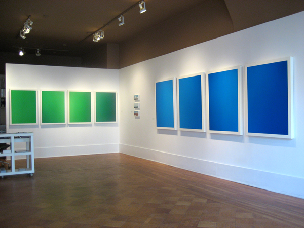
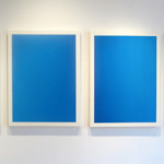
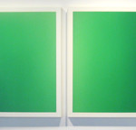
Sean Micka easily fits into the category of Reductive Art. Micka’s narrowly optically green monochromatic painting titled “Greenscreen” is made up of 4 30” X 40” texture-free pure green canvases, with an inch or so of white border. As can be expected, the green paint has a subtle shift in value on the edges making the painting somewhat bow in a kind of vignette effect, the 4 panels are hung together horizontally giving you a total size of 40” X 120”. There is a companion painting hanging one wall away, "Bluescreen” 48" x 144" with the same type of execution. Keep in mind that an important component to this idea of conceptual art, in this minimalist application, is the choices the artist makes. I notice that the sizes of each panel, in both of these paintings, are somewhat standardized. On closer inspection I can see that the canvases are hand built, so I’m left wondering if the standardized size was a choice based on necessity or some other quality unbeknownst to the viewer. Given the limited visual components of minimalism, and Micka’s somewhat ambiguous attempt at conceptualism, the exhibition has a very fast start and little else. The visual experience is perhaps all a viewer has; so whether you see “Greenscreen”, or "Bluescreen”, there really isn’t much difference to the experience. This apparent similarity of visual experience is consistent through out “After Images”. Even when Micka flexes his historical familiarity by painting the many styles of Minimalism you end up at the same place visually. “After Images”, as an exhibition, over-all lacks interest or edge. I will not deny that “Greenscreen”, or "Bluescreen” are painted well, but so many other painters have done this very thing before him.
Conceivably all contemporary fine art is capable of being “conceptual”; we’ve come to believe this as fact. The conceptual quandary inherent to Micka’s paintings is this: why would you create paintings that are nostalgic for art that lacks emotional content? Of all the limited components to Micka’s painting, why would you make the choice to add a quality that is diametrically apposed to the tenets of Minimalism? So it’s an issue of inconsistency for me. Maybe it’s the right artist at the wrong time? Or the wrong style at the right gallery, either way there really isn’t anything about this exhibition that would enable a viewer to pick Micka’s paintings out of a crowd.
- Sean Micka, installation view of “After Images”, 2008.
- Sean Micka, Bluescreen, oil on canvas, 2007.
- Sean Micka, Greenscreen, oil on canvas, 2007.
"After Images" is on view from January 10th - February 3rd, 2008.
All images are courtesy of the artist and Judi Rotenberg Gallery.

