EDITS @ HALLSPACE
To edit a newspaper is to correct or modify text and other content in order to make it suitable for publication. In Edits, HallSpace’s current show, Melissa Zexter and Pat Shannon turn that concept on its head: they start with published newspapers and perform their “edits” post-production. While Zexter’s edits are extractive—newspaper headlines and imagery stitched onto photographs—Shannon’s edits, which might be termed subtractive and structural, are performed directly on newspaper pages.
The works of these two artists, presented in the same show, balance each other nicely. Both begin with the same medium; both present us with details of the lives of others and encourage us to speculate about them. But their focuses are radically different: Zexter’s work, brash and provocative, speaks to our fascination with celebrity, flash, and melodrama; while Shannon’s playful, poignant works keep us in touch with our daily lives.
*
Shannon strips the pages of their text and modifies what’s left to produce sculptural forms that narrate or animate the missing content. She skips the serious content—the news sections—and works with the stuff of daily life: advertisements, comics, real estate listings, sports sections, obituaries, focusing our attention on the small stories that affect us all, the private details that become public for a moment and then pass from our view.
In Victory, Defeat I, and Defeat II (three separate works joined conceptually), Shannon has removed blocks of text from several sports pages, leaving a skeletal tracery of empty borders. The works hang on the wall in attitudes that telegraph their titles to us: Victory stretches itself broadly, while Defeat II droops, its pages gaping emptily, and Defeat I sags dejectedly in a corner. The only explicit content is the outline of a mysterious but readable number—21,963—that appears boldly at the top right of Victory.
Other works, constructed from pages that contain text and images, create small narratives. In Equator, two pages of comics have been stripped of their text and the characters “animated” by cutting them away from their surroundings (except at the bottom) and folding them so that they stand up, rather like a child’s pop-up book. The pages are mounted so that their characters, clustered in two microcommunities, face each other across a divide. We want to know what they are thinking, whether they want to meet or stay apart, or make war or make love, or whether they even speak the same language.
The most eloquent, and most ephemeral, of Shannon’s work, is Beloved. The artist has carefully removed the text from the name block of an obituary page; cut apart the individual obituaries; and delicately punched out the text from each, one miniscule character at a time. The name block and obituaries hang on the wall on small pins in the same layout as the original page, a shadow of the original. This resulting “page”, its elements moving gently in the slightest breeze, evoking a delicate and fragile metaphor for life.
*
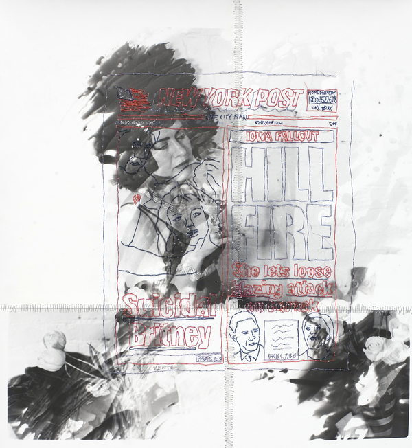
Zexter’s works contain no actual newspaper. Instead, she extracts juicy headlines and imagery from the front pages of sensationalist newspapers (in this exhibit, the tabloid New York Post,a Rupert Murdoch enterprise) and stitches them onto her own black-and-white photographs. There is an inherent tension between the two layers: the embroidery, predominantly bright red, black, and silver, which is graphic, while the photographic images are soft-edged and, sometimes, elusive. The attention here is not on the small details of our daily lives: instead, we are drawn to the lurid dramas of those whose lives play out in the public arena. In Zexter’s works, “embroidering the truth” may have a literal meaning.
In some works, the headline appears to connect directly to the underlying photograph. Heath’s Final Hours, for example, superimposes a picture of Heath Ledger, the headline “His Last Hours,” and several suggestive subheads over a photograph of an apartment building. While we don’t know that this is where the actor died of an accidental drug overdose, the barricade outside the building and the horde of photographers gathered there encourage us to think so. Another work—Bell Cops All Clear, about the shooting of a young, unarmed man on his wedding day by three New York police detectives, backs up text and images about the story with four identical photographs of a uniformed police officer, nightstick in hand, repeated four times in an ominous right-facing swastika pattern.
However, the connection between the headline and the photograph—often an unknown woman—is more tenuous in other works, as in Lindsay Lohan Stole My Coat—another exploit of the bad-girl actress, paired with Palin Teen Baby Shock; A-Rod, about the athlete’s relationship with Madonna; and Hill Fire, a mix of Hillary Clinton and Britney Spears stories. In none of these cases can we identify the female figure in the photograph as a character in the related headline, leaving us to interpret the association between the two layers as we choose. These re-edits draw attention to the drama intensified by the stereotypical casting of women as vixens or victims , which extends beyond cinema to news media as well.
*
Since newspapers are temporal and short lived, readers are protected from trauma of events. While headlines are dramatic, making the lurid facts of one's personal affairs more exotic for most readers (making events even more distant) local memorials, like obituaries, are reticent and have power to stop one's attention. Archivists who collect newspapers are faced with the burden of cataloging without prejudice and personal investment in the content of the newspapers. For both artists, transforming this information highlights not only the information printed, but what a reader's investment is in reading, gossiping, and mythologizing. This show shows how this everyday ephemera can become a memento mori, and a memorial.
- Melissa Zexter, Hill Fire silver gelatin print, thread, 2008
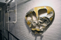
- Pat Shannon, Open House (detail) Boston Globe, real estate listings, 7/15, 2008
- artist: Pat Shannon, Beloved (detail), Boston Globe death notices 6/18/07, 2008
"Edits" is on view until November 22nd at HallSpace, located at 950 Dorchester Avenue, Dorchester, MA.
All images are courtesy of the artists and HallSpace.

