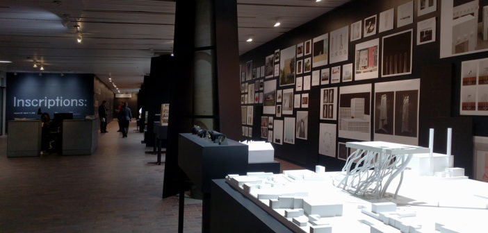
Inscriptions: Architecture Before Speech, the exhibition at Harvard Graduate School of Design’s Druker Design Gallery, attempts to map a sprawling field of experimentation from a youngish generation within the discipline of architecture. It uses three diagrams based on a “semiotic square” schema to sort all the images and models in the exhibition into categories, connecting them thematically with oppositional axes to reveal relationships and affinities. Two of the diagrams show techniques of the observer and of the author, respectively: Flat Affects to Jouissance, and Actual Architecture to Virtual Architecture—virtual being the only choice for most of the youngest architects of the group. In the third and central diagram on the wall, we see terms that deal directly with form or appearance for this curated set of “inscriptive” or “pre-speech” architectural objects: Encountered vs. Transcendental, and Immanent vs. Revealed are the two main dialectical “contraries,” with the word Original after each. This exhibition seeks to show a shared desire of origination, of creating something primal that could be seen as taking place before speech—meaning before an effort to historicize, theorize, etc., showing a fundamental and primal impression.
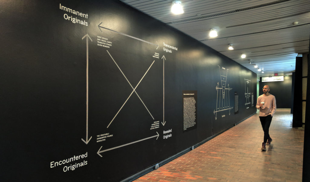
Semiotic diagrams, Inscriptions: Architecture Before Speech, Drucker Design Gallery, Harvard Graduate School of Design
In fact, these three diagrams actually make some sense, which in itself is amusing given the amount of parody and scorn that has been directed toward semiotic squares in architecture schools. No matter how tongue-in-cheek, semiotic squares cause eyes to roll. But, since the exhibition is very focused on defining “Positions and Modalities in the Ideological Field,” we should attempt to understand the curatorial posturing without recourse to irony.
Rosalind Krauss’s blockbuster 1979 essay “Sculpture in the Expanded Field” brought the logic of the semiotic square from literary criticism and linguistics to the disciplines of art and architecture. She sought to redefine the medium of sculpture given new art forms of the 70s: landscape art, photographic walks around industrial sites, sculpture that felt more like architecture. In her own words, the drive there was to neatly accommodate every possible gesture that could be called sculpture, and deal a blow to any loosey-goosey pluralism with regard to medium in art—therefore the goal was to delimit a field as well as expand it.1 The intoxicatingly axiomatic nature of the diagram begins and ends with the promise of being definitive and absolute; monumentally so. And this authoritarian cartoon is repeated, ten feet tall, on the wall of the GSD gallery.
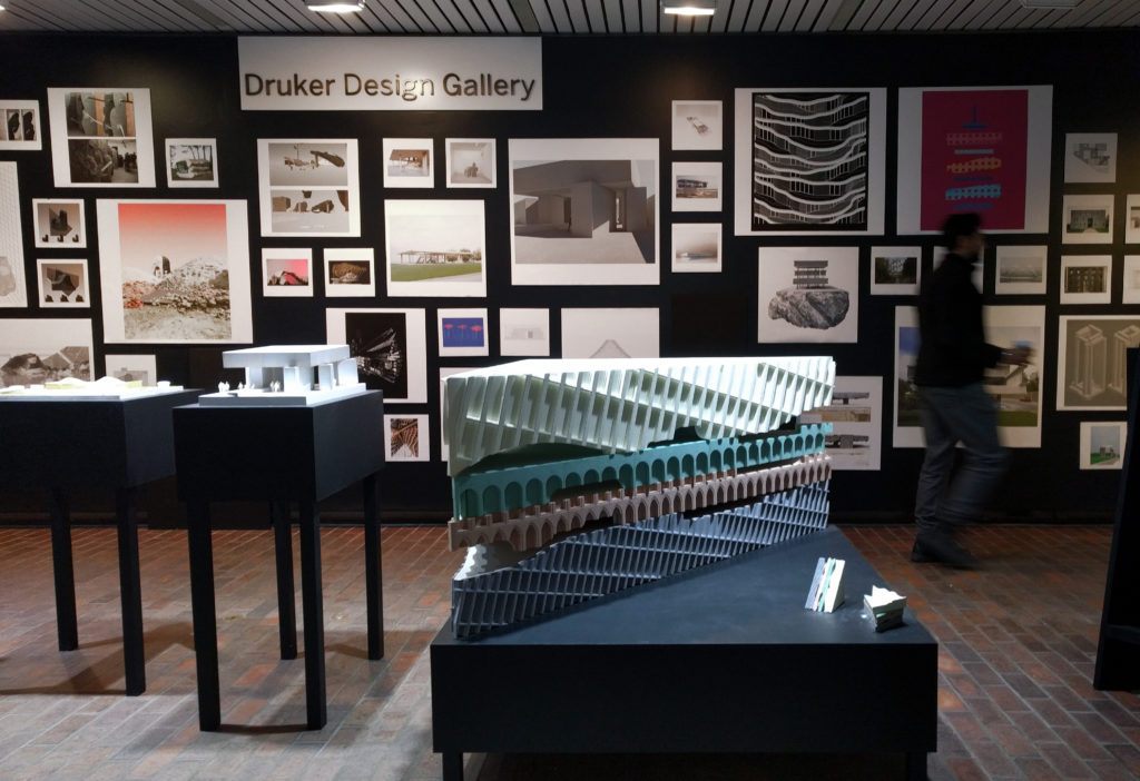
Installation view, model by Jennifer Bonner/MALL, Inscriptions: Architecture Before Speech, Drucker Design Gallery, Harvard Graduate School of Design
The exhibition contains about 300 printed images and about 20 models, which are sorted into 12 categories such as “Dirt, Earth, and Rocks”; “Eidetic Houses”; “Labyrinths”; “Anamorphic figures”; etc. The category names, for a viewer with some patience, are written in the four corners of the big semiotic square on the opposite wall. The first category, “Labyrinths,” has some compellingly complex line drawings from Young+Ayata, Office KGDVS, Ultramoderne, and some other architects that cannot be identified because some drawings’ title blocks are cropped off by the “Labyrinths” wall sign. There is one curious drawing by is-office that is hung 90° off its orientation as shown in the exhibition brochure, a slip that serves to underscore the fact that these are not so much architectural drawings as they are hallucinations of the rarefied and over-caffeinated. In fact, the square format of all the drawings and the sparse info (showing Author, Title, Year without description or other contexts) disallows any reading of these images except as impressions, with little regard to the difference between rendering, plan, section, photograph, etc. The models are without scale or measure. Instead, there exists only resemblance. This physiognomic theory of images is a fun way to find affinities between works, but it removes all other possible commonalities such as site, building type, program, etc.
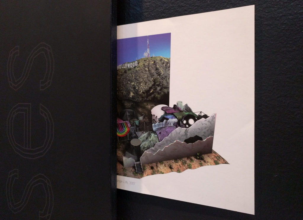
One of the other two large semiotic diagrams shows an axis between Flat Affects (Distracted, Bored, Absorbed, Impassive, Depressed) and Jouissance. It’s clear that everything we know is somewhat flattened, given short attention spans and a general fluidity of context for images and concepts, but this exhibition sticks to its particular strategy of difference-flattening, given that 100% of the wall text is about the curatorial schema and 0% is about the work. This is a fairly strange view of a pluralistic field, one that is slightly unhealthy to its constituents—it declares that we don’t care much about anything except the seductive (and reproductive) power of images and first-order likenesses.
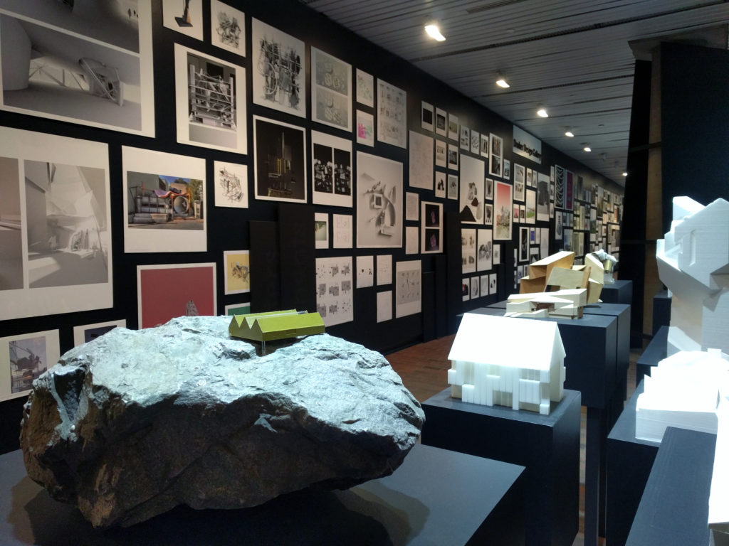
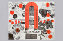
The more “architectural” projects, subtle work from the older generation represented—including firms MOS, WOJR, Pezo Von Ellrichshausen, Toshiko Mori—is quite good and seems to maintain some of the “pre-linguistic” verve shared among the more experimental pieces, even though they were forced out of the primordial image-soup and into built form. The strongest work from the younger designers represented comes from Nemestudio, First Office, Erin Besler, and especially T+E+A+M. Work by the designers of T+E+A+M shows up in categories across the board in this exhibition. With little else to go by other than the images themselves, their mastery of composition, color, and modulation of depth stands out. The Plastic Sunrise image hallucinates a disc cut from metamorphic plastic detritus standing before its own ghost-like apparition in the mise-en-abyme of a red horizon, rather like an Edvard Munch painting. It is both disconcerting and delicious, thing-like and spectacular—and feels most relevant to a cosmopolitical moment of today, a bourgeois shrug instead of a scream of anguish.
Many of the large models in the exhibition defer to a specific brand of formal abstraction, one that avoids specificity of information in favor of blank surface. Roof shape and roof form, for example, are too easily conflated by convenient diagramming. The materiality of material messiness is left out, where many of the renderings rely on just that for their uncanny effects. Notwithstanding, the most fabulous model in the show is an enormous cocktail sandwich by Jennifer Bonner/MALL, in which each layer is obliquely cut from some highly-processed Kraft-brand homogenous architectural product—“Moorish”, “curtain wall,” etc. On this model, the curatorial term “original” starts to shed some unlikely light.
The weakest of the bunch, mostly in the “Creaturely” category, show no effort toward complexity, resolution, tension, or simplicity. They amount to something you might see on the desk of a particularly lazy first-year architecture student—maybe the assignment was to test the 3D printer or play with the presets of a rendering plugin. No conceptual captioning could mask the true carelessness of certain works. But these unbaked projects are truly successful alongside the nuanced conceptual gestures and the realized buildings, in revealing a commonality among all these proto-lingual inscriptions: they are “Hello, world” and “first post!!!!1!!” projects, and serve at least to indicate a shared discontent with burdened categories such as typology, tectonics, and context. As architectural projects, their relationship to humanism remains to be seen—it might well be oblique, but carelessness and political quietism are not good responses at this time.
1 Roundtable discussion with Rosalind Krauss, Hal Foster, Yves-Alain Bois, and Benjamin Buchloh. Papapetros and Rose, Editors. “Retracing the Expanded Field,” MIT Press 2014.

