November 11, 2005
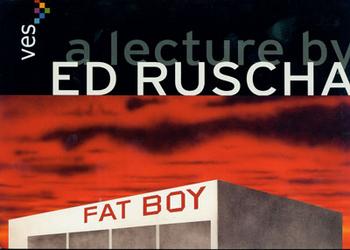
Last night, the California-based artist Ed Ruscha spoke to an overflow audience at the Carpenter Center for the Visual Arts at Harvard University about the exhibition “Course of Empire” which represented the United States at the Venice Bienalle. Another version of the site specific installation opens on Thursday at the Whitney Museum of American Art, where it will remain on view through January 28. He was introduced by Linda Norden, the associate curator of contemporary art for the Harvard University Art Museums. She and Donna De Salvo, the associate director for programs and curator of the permanent collection of the Whitney Museum of American Art, were the co-curators for the Venice project.
Shortly after she had returned from Venice I spoke with Norden on a range of subjects including the Ruscha project. At the time I wrote (edited) “What about Ed Ruscha I asked? There was a lot about the politics involved in acting as “Commissioner” for the U.S. Pavilion. The process has changed since 2003 particularly the jury and its current lack of funding. The prior ground rules mandated that the “Commissioner” be connected to an institution which would fund and administrate the project. This is no longer the case and Harvard stated that it would provide no support staff or administrative time.
“Under the current rules for American participation at the Venice Biennale an artist is selected who in turn designates a curator. Norden had previously worked with Ruscha. “I went out to LA,” she said and met with the artist. “Ed had wanted to do Venice for the past 30 years. He loved the building as well as the prestige of the Biennale. He said ‘What do you do?’ I said ‘I think it is crucial that the project be really specific to the space. I knew the building and we talked about its symmetry. Donna (De Salvo) suggested that we leave the rotunda empty which we did. I thought it was important that people not feel that they had seen the work before. He made new work for the installation. I particularly liked the earlier ‘Blue Collar’ series which was done in black and white (based on photographs of industrial landscapes). He said ‘How long will you be in LA’ and I answered ‘About a week.’ He said ‘Come back in 48 hours.’ He subsequently created a new series of works, in color, that relate to the original 1992 series.”
They were set up on opposite sides of the rotunda. Five each. The original works and the new ones. They entail some “degradation” she explained. “It is such a powerful idea,” Norden said. “The project was called ‘Course of Empire’ inspired by the series of works by Thomas Cole (The Hudson River School 19th century American landscape painter). Although Ruscha was inspired by Cole he “hates to explain his work,” she said. “But he is clever in articulating his work and is a good talker. Nobody discusses his work better than he does. He is a compelling phrase maker.”
“Why Ed Ruscha I asked? Particularly considering that being selected for the Venice Biennale is arguably the highest honor conferred on an American artist. Just where does he fit into the pantheon? Norden did not hesitate to rank him among the top five American artists of the second half of the 20th century.”
With such a strong endorsement, and out of my enormous respect for Norden, a dynamo on ever level, I was anxious but somewhat skeptical at the prospect of hearing the artist speak. Recently, we had been exchanging e mails about the relevance of making lists of “best.” And a dialogue about my recent Maverick deconstruction of the wildly diverse reviews of the Elizabeth Murray retrospective at MoMA. The issues I have been probing involve the nature by which artists are enabled in their careers resulting in being shown at the most prestigious venues including representing the United States at Venice. I wanted to learn for myself in order to better understand her position of regarding Ruscha on such a short list, just five, of best American artists of the second half of the 20th century.
During an e mail exchange she countered by asking to read my list of best artists. Respectfully I declined. Stating that the best work of any era exists in the margins and does not ultimately represent the mainstream. I argued that too often, for arbitrary reasons, important work is mispresented or subsequently neglected. The example that I used was the movement of Figurative Expressionists particularly the group that showed at the Sun Gallery in Provincetown, especially Jan Muller, Lester Johnson and Bob Thompson. Of the three leaders of the East Coast group (there were also the Bay Area artists and Leon Golub in Chicago) only Thompson has been given a major retrospective at the Whitney. It was a flawed project, poorly presenting him from the narrow focus of African American Art, which was badly received by critics and seems to have buried the issues of Figurative Expressionism from the mainstream of critical thinking. Consequently, their work is not included in the major text books and art students do not learn or think about that movement. This phenomenon is all too common a side result of botched projects and fuzzy math. Hence my resistance to the exercise of making lists which are simply not subtle enough.
As fate would have it I arrived at the lecture far too early. Later, when I was accompanied by colleagues waiting on line for the doors to open, they were amused to inform me that it was just 5 PM when I thought it was 6. There was some good natured banter about had I changed my clocks now that we are back on Eastern Standard Time. But it proved fortunate that I had miscalculated. We were at the front of the line and able to find choice seats. During her introduction Norden informed us that there was as many people lined up outside the auditorium as seated inside. It seemed that many were Harvard undergraduates and there was a section reserved for faculty and VIPs.
Norden who tends to be energized and staccato in her delivery briefly read from prepared remarks. She referenced the important of language, and text in the work and how that had made her see and think differently about those confluences. She declined to discuss the Venice project leaving that to the speaker but she drew attention to a recent article by a Harvard professor, Benjamin Buchloh, in Art Forum.
Overall, Ruscha was charming, lanky and laconic. There was a dry wit to the delivery which started with photographs of the gear shift handles of the cars, Ford and Chevrolet, as well as some details of the mechanical elements, that he grew up with. This was followed by a series of images of works that had influenced him including, significantly, a Roy Lichtenstein painting that, when he viewed it in the back from of Leo Castelli, had initially hated but eventually came to respect and understand as a launch for his own work. He had started by reacting to the thick paint and gesture then standard in art school education.
As he warmed to his topic, literally, he took off a well worn jacket to reveal a casual, vertically striped, long sleeved, pull over. It reminded me of the kind of tops that Tony Soprano wears. But Ruscha’s demeanor and persona is more California laid back than Jersey mafia. Actually, if there were a film about his life Sam Shepherd would be the perfect actor to portray him. There is that smart but understated, confident delivery. He ambled through his material much like a cowboy cantering over the prairie.
There was a detour to the highway and a shot of a gas station. He said he loved their vernacular architecture, overhang, the way they protect cars from inclement weather, and that he would actually like to live in one. He discussed shooting a series of gas stations which later emerged in the sharp diagonals of the “summer series.” We saw how they evolved and became ever more abstracted culminating in the LA County Museum of Art on Fire which resulted from a low flying buzz over LA which he shot. There were references to his artist books, like all the buildings on the Sunset Strip, which have been enormously influential. He discussed a detour with experimental materials and text. “For this one I used blackberry juice,” he stated. Later informing us that eggs were used to “paint” a picture. This progressed to a series of views of mountains both photographed, observed and imagined over which there were deadpan lines of non sequitur text. Often referencing signage he had encountered while rambling around the rural West. About the Mountain series he commented that “I ain’t no (Albert) Bierstadt;” the consummate 19th century American artist of that subject.
But he appears to think a lot about American painting and its paradigms. He showed the five views comprising “The Course of Empire” executed by Thomas Cole the leader of the Hudson River School in the 1830s. I have always loved those paintings which are on permanent display at the New York Historical Society. They present a view of a single scene, identified by a craggy mountain that records stages of progressive civilization and then its demise back to a state of ruins. The artists of Cole’s generation conveyed “That Wilder Image” but also pined for Europe and its romantic ruins. Cole is a typical paradox of his generation in his dichotomy between the popular New England and New York state landscapes, his bread and butter, and his more ambitious narrative series.
The Cole series well represents a central trope of 19th century philosophy and religious thinking. It was inspired by such epics as the historian Gibbon’s “The Rise and Fall of the Roman Empire,” or the novel “Ben Hur.” White Americans brutally settled and annihilated the native people of the West and pursued Manifest Destiny while from the pulpit they were informed that the end was near. It seems like a fitting moment to revisit that dialogue as aptly represented in the Ruscha paintings at the very time when HBO is magnificently presenting the mini series “Rome” which has been described as “Sopranos” in togas.
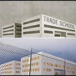
From the series of slides of the Cole series he then presented views of the paintings they inspired. The abstracted, modernist, minimalist buildings are viewed from a perspective angle from lower left to upper right. He showed before and after views with text. How the buildings and their signage in some instances were based on actually buildings such as one that “I pass by every time I drive out to the dessert.” So the theme comprises the notion of before and after. In one instance the signage is now Asian on the front with graffiti on the side. It is a comment on the shift of the global economy, a strong Asian presence in America, and the degeneration into hip hop graffiti culture. My interpretation but he did not elaborate. Other than viewing the slides of the work and its sources (Cole) I was not sure at the end of the presentation that I really knew much more about the work than I had been able to intuit on my own. I got more of a sense of the man than the work. But it was cool by me.
Less so for the members of the audience who asked questions. They seemed to want answers and were frustrated when they didn’t get them. A young woman made a passionate plea venting her frustration and need to know just why the artist was being evasive and laconic. He was calm and reflective in providing a non answer. He stated that he has no audience and doesn’t owe an explanation to anyone. That you do what works and perhaps even he does not really know why. “Telling you nothing may actually be telling you something,” he said. Which, of course, brings you back to the work. Through numerous dialogues with artists I attempt to get information but not expect answers about the work. They tell me that it’s my job to do the explaining.
Overall, I felt quite comfortable with the presentation. It was neither more nor less than what I had anticipated. Yes, I did come to better appreciate the depth of the work and Norden’s evaluation of it. Always, it is better to make efforts to know and understand significant work of our time. I don’t think that the experience changed my gut feeling about the relative importance of the work. But there we go into that dangerous realm of list making and rankings. So I will beg off on that.
During the reception that followed it was inevitable to compare notes with colleagues. They don’t like to be identified and quoted but the consensus was that he appeared to be “Very American, straight forward, unpretentious, and accessible.” Which, by the way, is not very Harvard.
Links:
Department Of Visual And Environmental Studies, Harvard University
The Whitney Museum of American Art
Beer and Burgers with Fogg Curator Linda Norden by Charles Giuliano, BRS #26
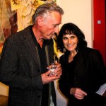
Photograph of Ruscha and Norden courtesy of Charles Giuliano.

