Entering the P.S.1 Contemporary Art Center world is not your typical high-end museum experience. Formerly a public school and now an affiliate of Museum of Modern Art, it is located in a modest urban neighborhood of Long Island City, Queens, near a bodega or two, and a Quiznos sandwich shop. While geographically not far from Manhattan, the atmosphere feels miles away, lending more a sense of risk to presentation of artwork at P.S.1 than at MoMA.
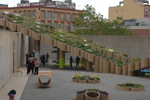
The concrete fortress walls of P.S.1 opened onto a bare, sandy plaza in the front and a behemoth work in progress. P.F.1 (Public Farm One) by WORK Architecture Company is on view until early September. Human-sized cardboard buckets in a modular architectural formation above our heads would later be filled with soil and green life and become a massive garden sculpture suspended in mid-air, a spectacle I hope to see in its final reveal – or harvest.
Intrigued by MoMA’s exhibition of his works, which apparently included room-sized, colored-light installations held that promise, Ventilator, simply an everyday household fan swinging and swimming randomly in the vast empty space above visitors to the atrium (It is hanging by its long cord and propelled only by its own fanning energy. Recent news footage shows children jumping under the spell of the flying fan. They resemble pet cats chasing a ball of yarn as they try to catch it from below). Expecting to be challenged in the unique environment of P.S.1, one would hope the exhibit would be exciting in person. Though, I was struck more by other visitors absorbing the newness of Eliasson’s works. My ambivalence and lack of excitement leads me to question my own expectations.
When Eliasson is on top of his poetic game, as he is in The New York City The New York City Waterfalls, I find the experience similar to images of Vik Muniz’s eloquent Pictures of Clouds - the ephemeral, cartoonish outlines of a cloud sky-written over Manhattan and Miami. This poetry can also yield drama in as simple a presentation as Beauty – a long dark room that centers on the “stage” created by a plane of finely sprayed mist that gently descends to the black rubber floor and acts as a falling curtain of subtle amber color through which the viewer can walk. Two young boys and their father were utterly ecstatic jumping back and forth through the rainbow mist created by the hydrodynamics. This is the stuff of contemporary art dreams for me, when spontaneity rules and kids can partake on some level. Even as I began to question the artness of this piece (“How is this that different from the joyful romps of children in the fountain at Boston’s own Christian Science Church?”), checking inner analytical demons and enjoying their revelry.
Take Your Time is a huge, slowly revolving, thick mirrored disc that hovers from the ceiling a few stories above the viewer within a cavernous room. This is, at the very least, a marvelous feat of engineering (How heavy is this thing?). It felt alienating to stand far below this monstrous, reflective U.F.O., but other visitors were impressed. Its size is certainly awesome. Perhaps the straight-on mirrored surface in this work is too literal - a reflection. However, while walking by an Anish Kapoor curved reflective plane turns you upside down, sideways, elongates the room or landscape, heightens the imagination. There is a more sophisticated play with complex space and illusion, sensual geometric form, mirrored space, and even kinetics in the current Kapoor exhibition at the ICA in Boston.
There was a small side room off this room. I genuinely felt that I was entering the exhibition’s gift shop for a moment or two. It seemed to be stocked, rather than curated, with geodesic models for his sculpture that were rather gift-shoppishly pressed together on floor-to-ceiling wood shelves. Here was a certain, personally annoying 60's-mod obsession with spheres and sphere-ish lamps. I find Eliasson’s work in general intellectually rigorous and yet so light and free. The 3-D models and glass/refracted/fractalized light and kaleidoscope pieces seem dated, simplistic, and don’t seem to have the touch of whimsy of his larger sculptures. I found them to be crafty, almost Sculpture 101, though certainly some wares that would look handsome if they were instead found at Design Within Reach.
This presentation, in particular, is fussy, crowded, and repetitive. On a personal level, I longed to know more about the models’ direct or indirect connection to the artist’s larger works. After seeing Eliasson describe the models as an architectural reflection of our “constructed” world and experience of nature in an online video, it makes some sense given how he represents the underlying built-ness of life, but just a few select models and more explanation would have sufficed in this room.
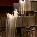
What should have been the crème de la crème piece in this exhibition, Eliasson’s signature Reversed Waterfall, was affected by the bringing it indoors, sinking it into a two-story opened basement room. This piece is a mini upstream precursor to the giant downstream waterfalls that are now making a splash in Manhattan’s waterways in national news. It has been sited outside in the woods in previous incarnations. In this dark, hard space were a couple of maintenance men mopping up the light puddles caused by stray bouncy drips from the waterworks, with cautionary signage moored to the floor nearby. I am all for authenticity: visitors’ voices over gushing water created an echoing earful of choral dimensions to the contained space. The transparency of seeing the industrial metal structure and mechanics of this backward fountain added greatly to this bubbling study of paradox.
But the unmasking of the workers from behind the scenes only highlighted the trouble with bringing rambunctious waterworks inside to the gallows of P.S.1. These waterfalls seemed to be a wild spouting beast now encumbered to a scholastic zoo - its ironic melding of nature and culture lost without the grace of atmosphere, full daylight, and greenery to contrast with its boxy steel mélange.
My father, who is a contractor, recently saw the The New York City Waterfalls on TV. His layman’s take was that he was impressed but wondered why they didn’t use a curtain to cover the tall metal scaffolding. In our made-up and made-over world, what lies behind the curtain and surface do not usually make for interesting sights, but this is not Broadway.
- WORK Architecture Company, installation shot of P.F.1 (Public Farm One), on view until September.
- Olafur Eliasson, Reversed waterfall, Scaffolding, steel, water, foil, wood, hose, and pump, 1998. –
- Olafur Eliasson, Beauty, Fresnel lamp, water, nozzles, hose, wood, and pump, 1993.
"Take your time: Olafur Eliasson" is on view April 20 through June 30, 2008 at P.S.1 Contemporary Art Center, located at 22-25 Jackson Ave at the intersection of 46th Ave in Long Island City.
All images are courtesy of P.S.1 Contemporary Art Center and the artist.

