Curated by Carroll and Sons, No Boys Allowed was developed through a collaboration between two of the exhibiting artists, Sheila Pepe and Carl Ostendarp. The exhibition investigates a variety of abstract artists whose work embodies the feminist perspective in late twentieth-century modernism. Rooted in 1960s anti-war and Civil Rights movements, feminism was initially a reaction against modernism's underfeminization, seeking to influence cultural attitudes and embracing alternative materials, imagery and techniques that lacked historically masculine references. The forms and methods of feminist art have since broadened and reflect a more globally informed perspective that still retain the goals of social, economic, and political equality.
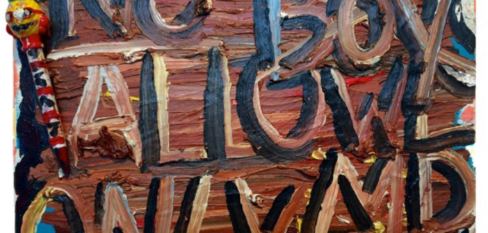
Entering the space at Carroll and Sons, you are greeted by two radically different paintings by two artists. The first is a small, thick and slightly messy painting that gives this show its name, No Boys Allowed by Alicia Gibson, and the other, Are ‘Friends’ Electric? by William DiBello, is a large acrylic on canvas work which focuses on language and process of painting and the inherent structures of and differences between digital and print media.
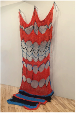
Sheila Pepe
Corner Piece Redux, 2011
Crocheted shoe laces and cord
13 x 6’
Crocheting, a skill Pepe learned from her female elders, begins to reveal the feminist underpinnings of her piece Corner Piece Redux, which appears in the center of the far wall in the show. This work is constructed of shoe strings and beings to display a web, or a continuous loop. The piece creates a curious dialogue with surrounding works and presents a softness in compliment to the hard lines and edges of the other pieces in the room. The softness of her craft provokes thoughts of femininity, the piece also compliments and re-establishes the form of DiBello’s work through the repetition of the continuous looping.
Another text-based work shows up in Ostendarp’s work as he flattens the spatial field in Charles Kynard, which channels both Pop and Abstract Expressionist aesthetics. The work is the most minimalist piece in the show; a canvas with the text “Carl” painted across. Ostendarp has a great interest in the history of American painting, specifically from 1965 to 1975, a time of radical redefinition which is represented in the work through his combination of both minimalism and textual symbolism.
Producing works that bridge the differences between painting and sculpture, Gail Fitzgerald’s Calling Occupants, Contact, and Origin are seen as bridges between the flatness of the two-dimensional work in the show and the sculpture throughout the space. Fitzgerald, an abstract painter who embraces material and form in her composition, makes work that is simultaneously flat and three-dimensional. These works are minimalist but showcase a complexity of craft. Fitzgerald’s work structures the works around it, allowing the viewer to move between the art and the gallery space.
Monique Johannet’s Pop styled work features cartoon-like figure, Joan Miro, is reminiscent of Lichtenstein’s images. She uses irony and re his iconic works by removing his signature Ben-Day dots. This slight alteration is a mark of difference.
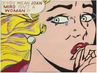
Monique Johannet
Joan Miro
Oil on canvas
18.5 x 24”
Johannet also changes the text of the word bubbles to communicate a feminist message. In this work, the text is a serious question of the gender of the famous artist Joan Miro. The question highlights how women have largely been left out of the art world, specifically during the modernist movement. Gary Petersen’s work, while overwhelmingly geometric in contrast to Johannet, appears at first to be purely abstract, but also shows an inclination pop culture and commercial design, specifically that of the 1950s and 60s.
Robin Dash, another abstract painter, makes work that carefully considers color and composition but manages to remain organic and free formed. In The Flowers 1-6, Dash paints gestural and abstract shapes in muted tones. The series fit neatly on a wall to create their own form as a grouping together. Martin McDermott’s work Still Life is disruptively placed in the center of the gallery and confronts sculpture via skepticism. The object’s surface mimics concrete and dirt to confront our idea of realism.

