I've been struggling to write a review of "Legibility on Color Backgrounds," the exhibition of Walead Beshty's photograms and sculptures currently on view at the Hirshhorn Museum in Washington, DC. I can't decide if the show is brilliant, too clever for its own good or just a repeat of ideas that are painfully outdated. It might be all of the above. Since every draft of my review has been mostly questions, I thought it might be more productive to post them here as a discussion topic.
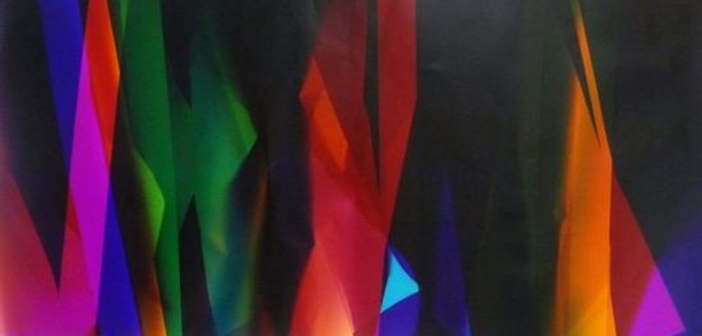
For those that haven't seen the show, Beshty has presented three projects that take different forms of critique. The largest are photograms, made by folding or draping photo paper (cut to the approximate length of the artist's body) and exposing them to light. There are some black-and-white images, and most are color. There is a loose, accidental quality to the forms, yet they sit in such close proximity to paintings by Frank Stella, Clifford Still and other Modernists that a dialogue between the photograms and the rest of the Hirshhorn collection is obviously intended. But what is that dialogue, is it reverence, or mockery?
Alongside the photograms are photos of the people who work behind the scenes in the art world. These are straight-forward, black-and-white images of workers at processing, framing and shipping facilities. Yet, it is unclear whether these images are attempting to glorify these people, or to call attention to the fact that art requires many people behind the scenes, or to criticize the system altogether? Are any of these fresh critiques at this point?
Similarly, Beshty presents a series of glass cubes, made of a shatter-proof material that resembles car windshield glass. These are made to the exact size of a FedEx shipping box, and always sent via FedEx from one exhibition to the next. The glass, which bears the small cracks and damage incurred in the shipping process, shows how roughly the artwork was handled along the way. Here, Beshty is clear about the intention of the work, invoking the Modernist cube while criticizing the itinerant nature of art exhibitions and the systems that transport the work. Again, is this new critique? I also think the use of the cube is problematic, as it has become such common shorthand for all things Modern that it borders on being a cliché.
All of this is to say that I generally support work that critiques institutional systems, and the Hirshhorn has definitely chosen to show work that critiques the particularities of the collection and the type of work they specialize in. Yet, this show also feels really safe, interested in shedding light on certain "unseen" aspects of the art system, yet not invested in any change. Then again, would a museum like the Hirshhorn actually show such work?
If you've seen this show, or other work by this artist, or even other shows that provoke similar questions, please consider the comments an open thread for discussion.
- Walead Beshty’s “Six Color Curl (CMMYYC): Irvine, California, July 18th 2008, Fuji Crystal Archive Type C, 2008,” Color photographic paper 93 ¾ x 50″ irreg. Courtesy the artist and Wallspace, New York.
- Walead Beshty’s “FedEx Medium Kraft Boxes ©2005 FEDEX 330504 REV 10/05 CC, FedEx 2Day, Los Angeles-New York trk#864049582968 & trk#867525901423, Priority Overnight, New York-Los Angeles trk#863133194810 & trk#86313319480,” 2007. Laminated Mirropane™ and safety glass, FedEx boxes, shipping labels, metal, silicone, and tape. Courtesy the artist and Wallspace, New York. Photo by Fredrik Nilsen
Both images via the Hirshhorn website.

