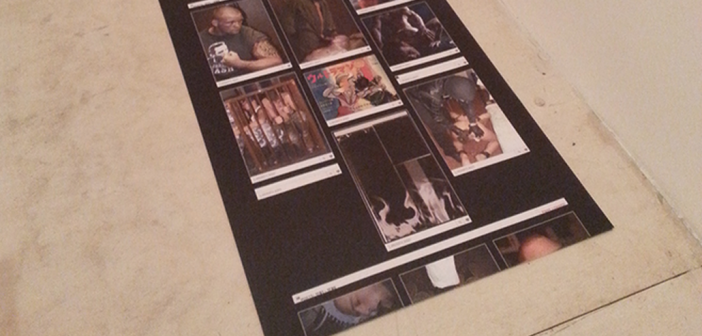
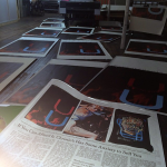
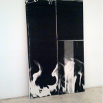
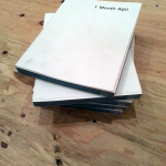
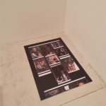
Last month’s New York Art Book Fair at MoMA PS1 was a massive affair, crammed with publishers and new artist projects and an incredible number of visitors. In one of the small side galleries, or "project rooms" on the museum’s first floor, Wade Guyton partnered with the bookstore and publisher Karma in an installation coinciding with the launch of his new book, 1 Month Ago. In the cramped gallery space, a vertical canvas leaned against a wall: one of Guyton’s large inkjet-on-canvas works, this one an image of white flames licking a black monochrome. Facing opposite was a spare wooden sawhorse table holding a few copies of the new book. The most recent of several book projects Guyton has undertaken, the publication is a thick, squarish volume with an unassuming, nearly blank white cover that belies its extreme content: page after gridded page of hardcore gay S&M porn pulled from sfcrewcut.tumblr.com, a gay skinhead blog, on which Guyton discovered a reposted image of his flame painting.
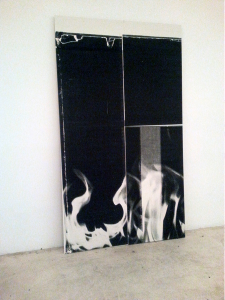
Wade Guyton/Karma Project Room at the New York Art Book Fair. Low quality phone pictures courtesy of author.
The book is in many ways typical Wade Guyton fare: it deadpan-copies existing visual material, divorced from context; it’s simultaneously shocking and boring; a sexy, visceral, alienating object. The explicit queerness of the whole project is what brings about a feeling that it’s more than an attention grab during a highly trafficked and fashionable art event—it’s a signal of something that has been lurking in the periphery of Guyton’s work for years. In 2012, during the run of Guyton’s mid-career survey OS at the Whitney Museum, critic John Yau offered up a well-developed analysis of the artist’s work and an explanation for the swift escalation of his mass appeal. He also hit on something most writers, curators and supporters have ignored—the latent homoeroticism of much of his imagery, and the contingent queer reading that can be brought to his work as a whole.
Guyton is often presented as an uninspired beneficiary of dumb luck. He is portrayed as having stumbled, almost by accident, onto his novel approach to making works that are fresh and seductive while safely entrenched in the sleek modernist signifiers of wealth, with enough attitude to suggest a subversion of those signifiers and enough ambiguity not to appear critical or threatening. The majority of writing on Guyton either addresses him more as a symptom of a glutted, obscene art market than as an artist of any real significance, or cites him as one of the prime originators of the much-bemoaned "Zombie Formalism" category of process abstraction.
However, there’s more to Guyton’s practice than empty blue chip canvases. Admittedly, his paintings can be extremely repetitive, though they ought to be, as reproduction itself seems to be one of his major preoccupations. This drive is even more evident in his limited editions publications. Black Paintings, a book project from 2011, features images of his works printed much in the same way as the canvases themselves: with too much ink on a substrate not meant to take it. The resulting book comprises hundreds of nearly identical black monochromes set onto white pages smeared with thumbprints, streaks and runoff. Even the publisher’s information at the back of the book looks as if it was pulled from a jammed printer. Guyton’s best moments capture the dislocation and entropy created by transitions between formats and a flagrant misuse of the mechanisms of reproduction. As a further step along this process of dislocation, Guyton’s book projects feel more developed than the actual canvases they illustrate.
Often when artists meet massive success in a relatively short time, the pressure to deliver on increasing demand makes for bigger and less considered versions of the work that actually got them there. I see this in Guyton’s practice, where the material at the margins—including the aforementioned book projects, plus his exhibition ephemera and earlier works on paper—tends to offer more than the towering black monochromes and Xs for which he is at this point very famous. Content is the elephant in the room with Guyton’s work. It’s there, but rarified, and certainly not in the most visible pieces. It’s for these reasons that the new book project, weighted as it is with such loaded imagery, fascinates me.
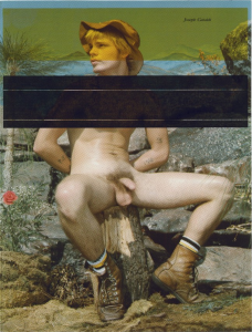
The homoerotic has skulked quietly around the edges of Guyton’s painting practice for many years, moving in and out of his strategically messy yet oddly hermetic vocabulary, which on the surface holds little evident subject matter. The large inkjet paintings on primed linen for which he is now known first evolved out of experiments printing onto pages ripped from books and magazines, X-ing or blocking out images from art history books, exhibition catalogues and vintage gay pornography. Displayed in groupings on long tables or wedged between panes of plexi in wooden frames, these smaller pieces seem to function as the preliminary "drawings" to the artist’s larger inkjet paintings. As Guyton’s work grew in scale and sophistication of technique, he began to refine and shed visual cues until only the methods of erasure remained, the subjects themselves taken out of the equation. The introduction of "bigblack.tif," a vertical black rectangle that functions as the template for Guyton’s monochromes, was originally introduced as a way of printing entirely over earlier canvases. The impulse to obliterate came to overshadow the actual content being obscured, and his present motifs—the big X, the big U, stripes and sometimes the image of flames present in the painting reproduced in 1 Month Ago—lingered as the now detached signifiers of that desire.
As Guyton’s work became increasingly non-representational, imagery found an outlet in exhibition announcements and other ephemera. The poster for his 2006 exhibition at westlondonprojects featured, in lieu of one of his paintings, a beefy, hairy torso cropped at the neck and pelvis. The show itself contained no such imagery, instead featuring a selection of paintings that each sported fat blocks of black Xs stacked atop one another messily, a forceful and imposing screen of a composition. For a 2008 show at Portikus, Guyton chose for his exhibition poster a black-and-white image of a fit, reclining male wearing a skimpy black-and-white striped bathing suit. A canvas from the same year appropriately sports the same diagonal stripes. Guyton’s canvases are simultaneously bold and reticent—a lot of volume, but few words. The rarified language of his paintings, seen in light of the occasional spurts of content that he injects around the works, provide clues to what the arrestingly massive silent monochromes are really saying.
In her essay "Rites of Silence" in the Summer 2008 issue of Artforum, Joanna Burton commented that the artist "…seems, if not programmatically, to put forward a kind of Neutral deportment, one that, per Barthes, ‘postulates a right to be silent.’ That does not, of course, keep his commentators from ascribing, almost compulsively, (and often aggressively), content and intent." Burton references Barthes in terms of his desire for the Neutral, an escape from the positional back and forth that rules philosophy as well as art for a new kind of subversion, an "exemption from meaning," an opting-out. Guyton’s big position is that he’d prefer not to. It fits his working process: a minimum of decision-making, the computer and printer doing the brunt of the work.
Both Burton and also Yau—two of the few writers who have attempted a critical examination of Guyton’s work beyond his market value—see this attitude as a kind of "passing," comparing Guyton’s shift away from content (and particular kinds of content) as a sort of self-closeting. Guyton does indeed treat abstraction as a form of erasure, of distancing the viewer from content, wherein the motifs and tropes of minimalism and high modernism are invoked as a filter of objectivity—one that, through the imperfect nature of the inkjet printer with its disruptive smears, streaks and drips, becomes subverted. Over time the work becomes less about recontextualizing particular imagery and more about the very breakdown of imagery, and of meaning. Even as the work becomes increasingly self-referential and seemingly without subject, the basic impulse continues to fall somewhere between desire, distance and a destructive impulse—an aesthetic triangulation that has been assigned by degrees to gay and queer artists since the '80s.
The flames, one of the few non-geometric or typographic images left in Guyton’s vocabulary, seem to act as a signifier for that sensuous self-destruction. In his own words, "Fire is always captivating. I thought of it as romantic, but camp. Destructive, but also generative. And of course hot."1 And in the 2008 exhibition on abstraction Oranges and Sardines, exhibiting participants were asked to select historic artworks to be shown alongside their own. Guyton chose Felix Gonzalez-Torres’s Untitled (Go-Go Dancing Platform), which was installed immediately across from one of his flame paintings. Not the same painting as from the book fair project room, but very nearly.
Sexy is a word that gets thrown around a lot with Guyton’s work. His paintings are sexy to people in the way that an expensive car is considered sexy. But I think there is something smoldering under the surface of the work that is far more powerful. It’s most present in his books, his exhibition posters, his early collages, and while harder to pull from his large canvases, it’s still there. It relates in part to the tension at play between visual sensuality and facile reproduction, the balance between an image’s purity and its breakdown. Read in conjunction with the content embedded in 1 Month Ago, which portrays a sexual aesthetic that smashes together hypermasculinity, nihilism, issues of control and submission, violence and a very specific sense of style, something bubbles up to the surface of those black canvases that’s much more complicated.
There is a history of artists using short-run publications, posters and the other ephemera that orbit exhibitions as a means of subverting an audience’s expectations of aesthetics or ideology, or even the platform of exhibition itself. A most notable example can be found in the work of Martin Kippenberger, an artist whose portrait Guyton used repeatedly in his inkjet on found paper collages. Like Kippenberger, Guyton is interested in the circulation of his work, how meaning is confused and disrupted as distance from the source increases—even more so in a networked culture. I think of Kippenberger’s 1993 poster Happy to be Gay, which featured the ridiculous slogan pasted over a tinted photograph of three men punching one another in the face. I think of how incredibly adept Kippenberger was at representation, treating an exhibition or advertisement as a medium itself, much like painting, to be deconstructed and used as a sort of code for the viewer to tease out.
And the book format is ideal for this. The increased interest in artists' publications of late not only allows for more accessibility to artwork, but also a density of focus for both artist and viewer. The artist can take risks, present unfinished work, intensive research, side projects or affinities—the things that get left out or misinterpreted in the hands of others. And viewers can spend more time, go deeper with the work and with a practice as a whole. For an artist like Guyton, whose work has become so broadly recognizable, a brand name attached to gossip column quality writing on auction prices, it’s an opportunity for his ideas to be circulated amongst and considered by an audience that is willing to go further.
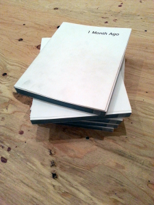
Wade Guyton/Karma Project Room at the New York Art Book Fair. Low quality phone pictures courtesy of author.
Whether Guyton is an accomplice to the critical flattening of his work in the larger culture is part of a much bigger question of whether any successful artist is in part responsible for the wide, shallow reception that comes with fame. When sexuality enters as a submerged subject in the work, it inevitably becomes a question of code switching. How does Guyton’s practice behave in different contexts? It’s not unlike the reception of Andy Warhol. Some of his works are so ubiquitous that they belong to the culture as a whole, are available on tote bags, stationary, whatever. It’s unlikely his three-minute Bolex films of two men having sex on a couch in the Factory are likely to ever get the same exposure. Like Warhol, and many other gay artists before him, Guyton has developed a body of work that functions in layers, with each level of meaning requiring the viewer to understand certain coded information to continue deeper.
1 Month Ago presents how Guyton’s images have been received within an extreme gay subculture, suggesting that a new yet affinitive reading of the painting could be born out of its juxtaposition with such graphic images. Much in the way that his abstractions degrade as they move from screen to canvas, the artist coaxing possibilities out of that breakage, a project like 1 Month Ago seems an attempt to rewire a reading of the artist’s work by exploiting the strange lattice of exchanges that exists between independent facets of contemporary culture.
Beyond that, it’s possible Guyton simply felt a kinship to the owner of the blog from which the content for 1 Month Ago was pulled, an anonymous figure aggregating images of hardcore gay sex in a seemingly endless stream. Presented in book format, as a static archive, it’s completely banal—not a series of erotic images so much as an overall picture of a particular erotic, much as Guyton’s black paintings together represent an idea of the monochrome rather than a selection of monochromatic works. The layout of the book, with two columns of images per page over a black background, carries a surprising formal relationship to Guyton’s double-column black paintings.
- Via Wade Guyton’s Instagram, burningbridges38: http://instagram.com/burningbridges38
- Wade Guyton, Untitled (Joseph Cataldi), 2011, Epson DURABrite inkjet on book page 11 x 8.5. Via ART BLOG ART BLOG
- Wade Guyton/Karma Project Room at the New York Art Book Fair. Low quality phone pictures courtesy of author.
- Wade Guyton/Karma Project Room at the New York Art Book Fair. Low quality phone pictures courtesy of author.
- Wade Guyton/Karma Project Room at the New York Art Book Fair. Low quality phone pictures courtesy of author.
[1] The artist cited in Exh. Cat., New York, Whitney Museum of American Art, Wade Guyton OS, 2012, p. 204.

