With the end of Big Red & Shiny’s first academic year quickly approaching, we’ve been taking stock of the past 8 months to identify our successes and re-evaluate where we’d like to have a larger impact. One part of our mission has always been to highlight new voices within our cities—emerging artists who are bringing exciting ideas and techniques to their mediums or those who may just be graduating into our arts scene. Around this time every year we are provided with some of these best new voices and, given the number of academic institutions in our area, we have quite a bit to choose from. It only seems fitting then that we take the time to recognize the important work coming out of our schools. We will, of course, only be able to represent a small sampling of those institutions, but over the next few weeks we hope to provide a snapshot of promising, soon-to-be matriculated Boston artists.
........................................................................................
Massachusetts College of Art and Design Master of Fine Arts Exhibition
One of MassArt’s major strengths is its horizontality. The programs, divided by media, function independently, and no medium is given an overwhelming precedent over others. MassArt graduate thesis shows are great because there is always serious range to the work. In past years, graduates were each given their own gallery space, producing the impression of a series of small solo exhibitions spread across three installation periods. But now the work is mixed together, and the number of thesis shows has been reduced to two. You can feel the difference. The show is crowded in places, and many groupings feel arbitrary, more out of necessity rather than any sort of visual or conceptual affinity. Despite this, it’s a strong crop of artists.
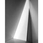
A handful of different ideas tend to hang around from year to year in each department, and inevitably MFA shows are going to repeat things that came before them in their respective media. Maybe it’s the nature of the medium, but photography thesis shows tend to take the term ‘thesis’ too literally. Unless the artist is messing with the form, many get stuck in a portfolio of images with little variation, illustrating an idea potentially already present in the conversation of contemporary photography. I don’t think there’s a problem with placing yourself, consciously or unconsciously, within stylistic or conceptual brackets, so long as you bring something new to the table. Fabiola Menchelli’s highly staged photographic abstractions of screens and angled surfaces are familiar, though bathed in a sheen of digital moiré that comes off as a pretty fresh signature. Some compositions resemble architectural elements, and the jagged beams of light that fall across them speak to the anxiety-inducing lighting techniques of film noir. But the standout image, a messy large-format Polaroid, works so well because it breaks the formula and lets some accidents into an otherwise rigid framework of compositional experimentation.
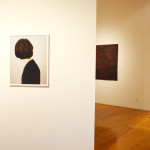
Steven Paneccassio’s pale, introspective images keep the viewer at an arm’s length, producing a sense of longing that is very much a part of contemporary image-making. The subtle gradation of ambient light on folded paper is the major recurring theme, but a set of images hung separate from the group leave a stronger impression: two prints side by side, the back of a woman’s head next to an image of a light switch, are the most emotionally tenable. It veers on cliché but the quiet intimacy of the images is pretty moving.
Hybridity underlies this year’s 2D selection. Material hybridity is present in Youjin Moon’s collaged canvases which show an eye for subdued color paired with loose, skittering application. A selection of whispy charcoal drawings, while frenetic as the larger painted compositions, are hauntingly atmospheric and reveal a highly sensitive hand. Sarah Fleming plays with the increasingly loose boundaries of painting with a series of painted sculptures. She brings surprising heft to jagged, folded slabs of stained chipboard.
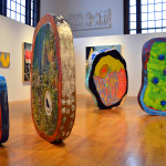
I kept returning to sculptural work in this show, and Zachary Hermann’s installation felt like the most fully realized body of work. His objects range in scale, medium, and presentation technique, yet maintain a consistency of tone and remarkable freshness from piece to piece. Large oblong forms that look something like colorized illustrations of cells or psychedelic cuts of meat crowd together, their heavily textured surfaces showing an excellent painterly touch. Smaller works, more painted foam cuts of meat and some blown-glass lozenges lie on a sawhorse table and pedestals, and the clean presentation method for messy, bodily work makes for a nice allusion to Paul Thek. It’s refreshing to see an artist playing with the push-pull of attraction and repulsion without taking it too seriously.
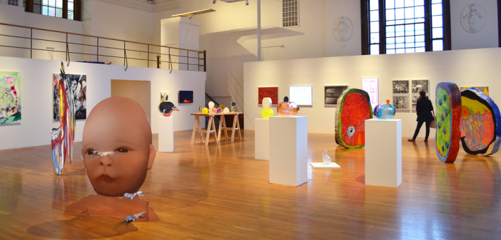
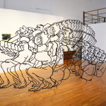
Nicholas Sullivan’s sculptures cast a wide net stylistically and referentially, but seem deeply invested in the boundaries of high and low culture. Some of his moves hit the mark perfectly, others seem to lose direction. His penchant for flatness works best in a truly fascinating line drawing in space made of silicone-coated steel, the source imagery a repeating pastiche of characters from Sunday comics. It’s probably the most interesting thing in the show, marrying the process-heavy aesthetics of modern and Ab-Ex sculpture with the disarming half-recognition that plagues the viewer in our image-saturated culture. Its presence is dominating but fragile, and it simultaneously demands and resists a detailed viewing. On the other hand, not too far away sits a translucent plexi cut-out of a baby head with silver iguanas poking out of it, which pretty much looks how it sounds. The juxtaposition of seemingly thoughtless visual material with a complex and well-executed fabrication process might in itself carry weight, even stand as a comment on the contradictory state of cultural production in late-stage capitalism, but it doesn’t do enough to save the piece from coming off as self-aware in its intentional weirdness. Regardless, Sullivan takes risks in his work, and his use of perceptual limitations as an entrance to discuss cultural amnesia makes for a potentially very rich practice. I’m excited to see more from him.
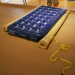
Self-seriousness affects plenty of people during grad school, and work inflected with a good sense of humor tends to stand out. Clive Moloney’s sculptures are set apart in the lofted space of the second-floor Paine Gallery, and poised above the rest of the show they look like disheveled actors on a stage. Moloney’s assemblages of everyday junk embody Sisyphean exhaustion and bodily awkwardness. Some function as easy one-liners (a diving board aimed at the lower level of the gallery), but others convey a sense of pathos through sensitive and clever associations. Dry Bed, an inflatable raft sandwiched by a pair of carved foam arms sprouting too-small hands, feels all too human lying prostrate on the gallery floor. Probably my favorite piece of the show is also the most simple: an oscillating fan trapped under a laundry basket, dragging itself around the gallery aimlessly as it tries to rotate. By my second visit the thing had fallen down the stairs, but was still plugged in and running, no better or worse off than it had been. It’s as good a metaphor for the MFA candidate as any.
Round 2 of the MassArt thesis shows, which I’ll be covering next week, opens this Friday.
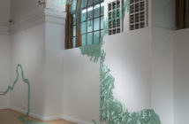
- Installation shot of the MassArt thesis exhibition. Photo courtesy of Evan Smith.
- Installation shot of a Nicholas Sullivan sculpture. Photo courtesy of Evan Smith.
- Installation shot of Zachary Hermann’s thesis exhibition. Photo courtesy of Evan Smith.
- Installation shot (l to r) Steven Paneccassio and Sarah Fleming. Photo courtesy of Evan Smith.
- Fabiola Menchelli Triangular Hall, 2012 archival inkjet print © Fabiola Menchelli 2012
- Clive Moloney Dry Bed, 2013 Photo © Clive Moloney

