Likenesses: Portraits of Artists by Other Artists
Including works by: Matthew Antezzo, Roy Arden, David Armstrong, Dawoud Bey, AA Bronson, Edgar Bryan, Heather Cantrell, Chuck Close, Anne Collier, Tacita Dean, Sam Durant, Nan Goldin, Feliz Gonzalez-Torres, Richard Hamilton, Peter Hujar, Deborah Kass, Mike Kelley, Richard Kern, Bruce La Bruce, Sean Landers, Robert Mapplethorpe, Jonathan Meese, Richard Misrach, Dave Muller, Paul Noble, Julian Opie, Elizabeth Peyton, Richard Prince, Wolfgang Tillmans, Ike Ude, James Welling, Neil Winokur, Joe Zane
Curated by Matthew Higgs for CCA Wattis Institute for Contemporary Art, San Francisco and circulated by Independent Curators International. Catalogue, 72 pages with 38 illustrations including essays by Higgs, David Robbins and Kavin Killian
Momentum 3: Kanishka Raja
Institute of Contemporary Art
855 Boylston Street, Boston
Through May 1
A portrait conveys to us what an individual looks like. Hence the title, “Likenesses.” But a successful portrait may go far beyond, or dramatically less than that. The image may flatter the subject. A Hellenistic Greek bust of the living god, Alexander the Great, bearing only an aesthetic resemblance to the features of the historical figure. Or a brutally honest, warts and all rendering of the features of a Roman citizen from the period of the Republic. There is the striking difference between the approaches of ideal and real. Add to that, as conveyed prominently in the current Institute of Contemporary Art exhibition, “Likenesses: Portraits of Artists by Other Artists,” the conceptual approach.
As the 19th century artist, John Singer Sargent, expressed it, “A portrait is a painting in which there is something wrong with the nose.” For all those who earned their daily bread by depicting the features of clients there is the notion of the “burden of portraiture.” A gift for capturing a likeness is both a blessing and a curse. Often the artist chafes in the traces of portraiture preferring to make a mark in some other manner. They strive to be known for more than just their portraits. Conversely, some masters, who are known for other work, have left us riveting portraits. Consider such paintings as Raphael’s portrait of Pope Julius 11, El Greco’s “Fray Felix Hortensio Paravacino,” Bronzino’s “Eleanor of Toledo,” van Eyck’s “The Arnolfini Wedding,” or the harrowing self portraits of Rembrandt and van Gogh.
The portrait as a status symbol of the bourgeois became a standard of the Dutch Baroque. During a fallow period, recovering from being shot point blank by Valerie Solanas, Andy Warhol traveled in Europe cranking out Polaroid/ silk screen knock offs of fat cats at $50,000 a pop. It made him very rich and able to afford to go back to making serious work. There was a show of those works some years back at the Whitney Museum of American Art. It was a piss awful show. What a whore Andy could be. It was his Liberace period.
Viewing an exhibition of contemporary portraits such as this focuses on the conundrum of motive and intentionality. How to sort through whether a particular work is bad by accident or design? There are a lot of really bad images in this exhibition. But are they bad bad or bad good or good bad? Is an artist like Elizabeth Peyton inept or clever? This is an ongoing and ever greater challenge of contemporary art. Then there is the issue of the relationship of the artist to the subject. In commercial jobs, like Andy sleezing his way around the Board Rooms of Europe, what makes them awful is that they are just one night stands. Sex for money. No love. Just grunt work. Not much fun in that. Andy turning tricks.
The implication here is that the artists are eager to make images of their fellow artists/ friends/ colleagues/ lovers. What makes these works different from mug shots and commercial portraits is the relationship and psychology of the artist and subject. Sometimes. When it works. A great portrait reveals something of the humanity of its subject. Perhaps.
Another triumph and pitfall of this exhibition is the issue of celebrity. Clearly a number of works are included in this show because they depict famous artists. Interestingly, there are several images of Andy but none by him. Instead of original riveting portraits by Warhol, at his best he was the finest portrait maker of his time, we get Canal Street knock offs by Deborah Kass. Her silk screened version of Cindy Sherman made up to look like Liza Minelli, almost looks like a Warhol. Just as a knock off of a designer bag or scarf, to the untrained eye, looks like the original. Why pay the big bucks when the clone is cheaper. If Andy could be a tart then just what does that make Kass?
The great works in this show convey themselves loud and clear. Robert Mapplethorpe was both an important artist and a magnificent portraitist. His image of the elderly woman warrior, sculptor, Louise Bourgeois, clutching a big cock under her arm, is arresting. She stares us down with the smug inner satisfaction of a diva. David Armstrong is another master, represented here by a familiar image of Christopher Wool. Peter Hujar was a fabulous photographer. But I would have preferred his studies of Warhol in drag or the poignant death bed image of Candy Darling. There is a sharpness and clarity in works by these contemporary masters.
The portraits of Warhol, Nan Goldin, and Mapplethorpe by Neil Winkour are raw and unflattering. They are badly lit and the subjects look at their worst. But in reading the notes for this show, that appears to be the technique of the artist “The graduation headshot or the police mugshot or my photos- they’re all the same. It’s basically; this is what the person looks like. I will tell you nothing about them. You can make up your own story about this person, because that’s all the information you really have.” So we have to give the work the benefit of the doubt or make up our own story. But just what is Ike Ude’s excuse? His images of Julian Schnabel in the studio or Shirin Neshat lounging on a couch just suck. Again the notes inform us that he is some kind of big shot artist who publishes aRUDE his own fashion magazine. But so what? The images are just a muddy boring mess. But is that good bad or just bad bad or just sucks?
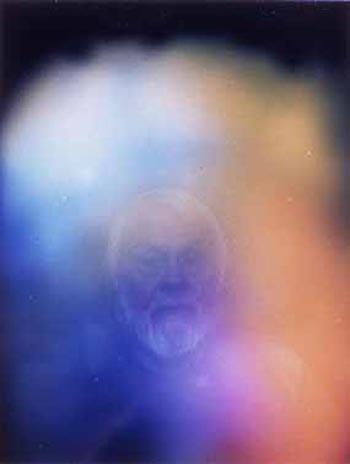
The exhibition includes several works that may be regarded as masterpieces. The first floor gallery is dominated by the mural scaled death portrait “Feliz Partz, June 5, 1994” by the Canadian, AA Bronson. The first time I encountered the piece in an exhibition at MIT, curated by Bill Arning, several years ago, it reduced me to tears. It was a tough and withering encounter with the end game of AIDS. The work has been shown widely since then and with each subsequent exposure looses just an increment of that initial reaction. Did it need to be in this show? Just what was the curatorial reasoning for including a work that in scale and intensity dramatically tips the balance of all the other work?
How, for instance, is a wall of small, witty engaging, casual snap shots by the British based artist, Wolfgang Tillmans, expected to hold its own in juxtaposition with such an overpowering neighbor? I enjoy Tillman’s work but it was a struggle to see it next to and upstaged by the Bronson piece. There needed to be a buffer, a bit of visual sorbet, between the courses.
A second masterpiece is a series of images “Talent” created using the services of a professional photographer and producer of theatrical head shots by David Robbins. The 1986 conceptual piece includes eighteen silver gelatin prints of his friends and peers. A version of this work is included in the current Lower East Side show in the rented quarters of the New Museum. The insight of the piece is to recognize several individuals who went on to great recognition and others who were of the moment and have now faded into obscurity. It is a fascinating time capsule of the ironies of fame and fortune. Its subtitle might have been Paul Simon’s song, “Slip Sliding Away.”
A third masterpiece “This Is Fiona” is an animated cartoonish rendering using a DVD and LCD video monitor by the British artist, Julian Opie. It creates a witty portrait of his friend Fiona Ray. I saw a gallery show of his work last year in Vienna that included both paintings and a couple of the animations. It was a vivid and memorable project. While of smaller scale and clearly more light hearted than the Bronson photo mural, this singular work by Opie also dominated the gallery in which it was displayed.
The 16 mm projection by the British artist, Tacita Dean, suffered no such competition and refrained from having any adverse impact on her fellow artists. This woman artist got a room of her own. In which to display a short film, not exactly silent but barely audible, of the Italian artist, Mario Merz, created in 2002, just months before his death. It is a disturbing and unsettling work. As I experienced a couple of years back when befuddled by a large show of her work at Tate Britain. The format and content of this piece was more modest and accessible. We encounter the artist seated in shadow under a tree. The next sequence is an extreme close up of his face that then pans back a bit. The short film ends with him getting up and going into his house. It is indeed a portrait of the artist, perhaps a powerful one, but it is difficult to grasp entirely why, or if it really works. It is that edgy quality that makes it interesting.
Overall, this was a difficult show to get a handle on. In some ways it is accessible, attractive and enjoyable. It is low carb. Less filling. Has its moments to be sure. But also feels like it has not really nailed down its topic with authority. You come away with something missing. Either there could have been a stronger selection of artists, or better works by these same individuals. Something just didn’t feel right. I missed Andy. It would have been great to see a really nifty Marilyn.
Similarly, while I applaud the ICA for its commitment to identifying and showing Boston artists, the installation of large scale, sectioned paintings by Kanishka Raja, was less than satisfying. The ambitious installation referenced in the work itself renderings of architectural details of the ICA and the specific gallery in which it was installed. The perspective rendering has us believe a conflation of interior space that pans from the ICA, to the waiting area of an airport, to the interior of the bedroom of “an African dictator now living in Connecticut,” to his bathroom. In the lower level are a large swirling rug in bright patterned colors and a set of stairs seemingly connecting the floors and rooms of different spaces. There is a kind of chutes and ladders sensibility as the artist leads us through a labyrinth of levels and meanings. The problem resides in the issue that words are adequate to describe this text driven narrative work. But the direct visual experience of the work is less satisfying. This functions as ideas but not as painting. The artist does not appear to have much direct involvement with or passion for the medium. The use of paint is just a means to an end. The subject might well be depicted in another medium such as a Wilson Sisters’ video exploring a complex space. The work connects to the tradition of Surrealism but without the key understanding that Dali and Magritte were very skilled painters. Part of why their images work and this does not comes from the ability to suspend reality and evoke illusion. This work just doesn’t allow for that possibility. Icarus.
Links:
The Institute of Contemporary Art
"Likeness: Portraits of Artists by Other Artists" and "Momentum 3: Kanishka Raja" are on view January 19 - May 1, 2005 at The ICA.
All images are courtesy of the ICA.
Charles Giuliano is a Boston based artist, curator and critic. He is a contributor to Nyartsmagazine, and the director of exhibitions for The New England School of Art & Design at Suffolk University. He periodically sends his column "Maverick Arts" via email, and Big Red & Shiny is proud to reprint it here.


