Restorying Chelsea Creek: 100 Views, Part One
Atlantic Works: A Collaborative Space for Art and Ideas
80 Border Street
East Boston
For info and hours: Stacy Chacker 617 567 5882 Ext. 241
Through January 20
This community based project and exhibition brings together several elements and organizations. The focus is to bring attention to the much neglected urban blight of the Chelsea Creek. This is an inlet from Boston Harbor that accesses fragile salt water marsh. It has been the cause of much concern that enormous tankers deliver fuel and natural gas to storage facilities along the shoreline. They are an all too attractive target for terrorists as they snail along just feet from the shore through a narrow channel.
Reports in the Boston media have speculated that vast areas of the inner city would be leveled in the event of an attack. Including our home in East Boston. But also historic Beacon Hill just across the harbor.
One of the ironies of our home in Eastie, in a working class neighborhood, is that from our roof deck we look across at the magnificent Boston waterfront and its spine of high rise offices and residences. We enjoy the obviously better view and cheaper prices.
That has changed a lot in the almost dozen years of our homeownership which has seen property values increase about 500%. There is much talk of the gentrification of Eastie. That is already evident as part of the old project has been torn down and replaced by a mixed income development with magnificent views. A community that was originally largely Italian American is now more diverse. This past week, however, the Boston Herald extensively reported on a vicious East Boston based, El Salvadoran gang with ties to Al Quaeda.
A combination of affordable housing and work space has slowly attracted a growing community of artists. There are a number of studios in a loft building on Border Street which includes the cooperative Atlantic Works. Their shows are mostly focused on residents in the studio building and other local artists. For the current exhibition they have offered the space to the Arts and Community Landscapes Chelsea Riverway Project in cooperation with the Chelsea Creek Restoration Partnership which is associated with Neighborhood of Affordable Housing (NOAH).
The artist Mark Dannenhauer has worked with a number of teens and adults to create a series of photographs documenting and responding to environmental issues in the Chelsea Creek. A selection of these images have been digitally printed and handsomely installed.
The enthusiasm and pride of the young artists was palpable during the opening. There was a strong turn out of youngsters and others involved in the complex and insightful project. Chatting with the kids they just beamed when I asked them to show me their work. Some of the images were remarkably beautiful and sophisticated. Clearly they were very involved and excited about the process of making their prints and then seeing them exhibited.
I asked a girl to discuss a rather beautiful view of shore line and reeds. It could have been a detail of a painting by Monet. But her response surprised me. “That growth is invasive,” she explained. “It is choking out everything else.” In an accompanying image she documented a friend attempting to pull out some of the vegetation. “You wouldn’t believe the root system. It really spreads.” Turning to her friend who was listening she said, “That’s you.” The response was “Oh, my God is that really me?” She was photographed from the waist down. “We all worked at picking up trash and trying to pull out the invasive weeds.”
So this was a whole lot more than the usual exhibition. Here were kids really involved in art making. Who knows what may come from that. But the project seemed deeper and more relevant as it involved labor and cleanup, studying the environment, as well as imagery and documentation. One of the organizers told me that already there is a beautiful park next to the Creek. Just a short time ago it was a dump. “I never thought that was possible,” she said. “We have meetings once a month. You should come.”
The sad part of this is that the Herald covers Eastie’s gang violence on its front page. Which gives the community a bad reputation and casts a dark shadow over potential development. Even disgraced former Boston Globe columnist, and current Herald employee, the working man’s hero, Mike Barnicle, was prompted to slip in from Posh Lincoln and spend a day, with armed escort and interpreter, to offer a hasty, poorly researched sidebar on the gang wars. So far the media hasn’t seen fit to cover grass roots, community based efforts such as what’s on view at Atlantic Works. Or write about the many hard working adults and good kids. Obviously, if it doesn’t bleed it doesn’t lead.
---
The South End Galleries
---
Leslie Wilcox: Weightless
Boston Sculptors Gallery
466 Harrison Avenue
Through January 22
Tuesday through Saturday 11-6 PM
On a local, national, and global level, Boston Sculptors Gallery, is one of the most unique and significant artist run organizations of its kind. Its very special mandate is to present sculpture. The roster of participating artists and resultant programming is just superb. It should serve as an inspiration and paradigm for similar ventures in other arts centers.
This third exhibition of the season, in its new, relocated, South End venue, a spacious and handsomely configured gallery, includes a veteran of the scene, Leslie Wilcox. She has shown over the years with Barbara Krakow Gallery so I am familiar with the basic premise of the work which entails variations on the theme of ways to bend, twist, bundle, crease and fold metal screening.
Discussing this new exhibition she explained that she wanted the pieces to be “Weightless.” Indeed several pieces hang from the ceiling. There was also a new series, entailing irregularly configured cones of crushed paper, with a range of bright colors, arranged along a shelf. Next to another wall were several vertical, long, thin pieces that struck me as slinky female forms. Very thin, headless, tubular women evoking new paradigms for Venus, or alien women. Because of the layering of the mesh there was a lacy feeling like lingerie that further enhanced the feminine sensibility. “This is your Victoria’s Secret phase,” I observed to Leslie who burst out laughing at the hyperbole. But, no joke, these are slinky and wonderful pieces. Several of the long, thin, hanging pieces were sold out of the studio prior to the show. She reported that one of them is installed in the spiral staircase of a Colonial home.
Bill Armstrong
Gallery Kayafas
450 Harrison Avenue
Through January 29
Tuesday –Friday, 1-5:30 PM, Saturday, 12-5 PM
One of the great dichotomies of photography has been, from its inception, the ability for recording and mechanical reproduction, or as a vehicle for process and non objective imagery. It entails the difference between realism and documentation or non objective treatment and abstraction.
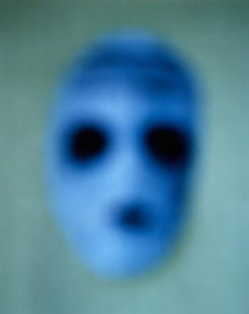
The provocative and stunning exhibition by Bill Armstrong, with cunning legerdemain, combines elements of both approaches. We are presented with brilliantly colored, richly saturated chroma, what we would expect from paintings, with a range of imagery in several groupings. There is a series of targets or mandalas. Then another theme of ghostly masks, and yet again, clusters of people.
Just how does one create such riveting images with a camera? Apparently, the artist creates a collage using brightly colored paper. This is then photographed out of focus. In and of itself this is not unique. There are a number of artists and photographers who explore the theme of blur and smear, but what is compelling here is Armstrong’s complete control of the conceptual process. Some visitors were overheard commenting that they found the masks creepy and spooky while others gravitated to the new age mandals. Ohm. Within the definitions of the premise he produces a great range of responses from calmness and peace through a potential for agitation.
Steve Novick: Recent Objects
O.H+T Gallery
450 Harrison Avenue
Through January 29
Hours: Tuesday through Saturday 11 to 5:30 PM
A consistent theme over the past several years in the work of Steve Novick has been variations of what was first defined in the work of Marcel Duchamp as the assisted readymade. This is the found object that has undergone a level of subtle intervention on the part of the artist.
In the earlier work the resultant piece conveyed the notion of its original functional object. One could all too readily decipher the source of the chrome plated or rubber object. So the transformation to art object was subtle if not indiscernible. There was the response that the piece might still be used to make toast or brew coffee.
With this new work functionality is no longer readily evident. Another development is the use of wall mounted vitrines which further enhance the uniqueness of the objects. Putting a piece into a glass box always seems to connote preciousness and value. Like viewing Duchamp’s “50 CCs of Paris Air” or his sanctified comb, encased in glass boxes, in the galleries of the Philadelphia Museum of Art. This concept of reconfiguring from ordinary to venerable has long intrigued artists.
A couple of objects in this exhibition were particularly absorbing. In one we view a tondo surrounded by a flat, one inch wide, white circle. It framed a piece of bright, red fabric under glass. Mounted to the glass was a white half sphere. The way the elements came together was just arresting. So simple, yet strong and elegant. Another work involved a small, horizontal rectangle of different parallel bands of color with a smaller band of a third color attached to it. The combination evoked a Barnett Newman painting or the fabric configurations of the German minimalist, Blinky Palermo.
Isabel Riley: Girl Feelings
Genovese/ Sullivan Gallery
47 Thayer Street
Through February 1
The Genovese/ Sullivan Gallery, a pioneer in the South End scene, is known for its ambitious scale and risk taking programming. The current exhibition, featuring the emerging artist, Isabel Riley, scores on both levels. The installation takes full advantage of the great space of the gallery and also underscores presenting challenging, museum scaled new work.
The vast piece in the Interior Room “Loom Project Reprise (let your hair down)” at 31 x 18 x 10,’ configured with wood, paint, nylon yarn and hardware, too closely evoked similar large installation works by Shelia Pepe a former Boston artist (shown here at Bernie Toale last fall) now living in New York. Indeed there are a number of artists working with the process of yarn, crochet and weaving.
But a further and deeper inspection of the six works on view in the other space, and one in the office, revealed a greater range than confluence with familiar sources and influences. The work does startle the viewer with its inventiveness, madcap genius and compelling command of craft. It is little wonder that the artist is being touted as the next great one. Until the inevitable fame and fortune take her on to other frontiers. For now enjoy a fabulous talent in our midst. Kudos to the gallery for its continuing ability to shock and awe.
Caleb Weintraub: See How They Run
Galerie Swanstrom Art Advisory
450 Harrison Avenue
By appointment
The cult film “The Cook, the Thief, His Wife and Her Lover” has a shocking final scene. The lover of actress Helen Merrin, a remarkable role, has been killed by her hoodlum husband who has a passion for fine dining. The Wife arranged to have the Cook of the Thief’s favorite restaurant concoct a special feast, by invitation only, for her husband and his band of thugs. It proved to be a clever and vengeful trap. The unsuspecting gang is held at gun point while the Cook wheels out on a gurney the exquisite corpse of the Lover. He has been succulently roasted a golden brown like a human turkey. This surrounded by a garnish of vegetables. The crooks are forced to dine on his remains. In the ultimate gesture of cannibalism the Wife slices off her Lover’s genitals and forces her husband to eat them.
Some years back while staying in Chicago, I enticed my host, the deceased artist, Al Ford, to see that film with me. The trick was that I offered to pay for the tickets and failed to preview the film. He loudly protested all through the screening that it was the worst film he had ever seen. Call me strange, it is one of my all time favorites. Up there in the realm of weirdness with Browning’s masterpiece “Freaks.”
There is a painting by Caleb Weintraub in his current exhibition that clearly, but less compellingly, stages a similar feast of cannibalism. Here nude erotic children, his trope, surround a corpse and feast on his human flesh. A girl munches on or gives head to a dismemberment. I wonder what Al Ford would have thought of this provocative exhibition.
Oddly enough, Weintraub’s mostly inept, over the top, tasteless work also reminded me of both Henry Darger, his naughty, gender blending kids and, of all things, masterpieces by Titian in the Prado, that I have always found fascinating. In one Titian work, a Bacchanal, a cherub pisses on the bare foot of a naked, passed out goddess. It always gets a howl when I show the detail in art history class. After all, great masters are not supposed to show such explicit vulgarity. Another work is a pedophile fantasy of masses of cherubs cavorting before a standing sculpture of Venus. Just what was that about? The painting puzzles and intrigues me.
But, compared to masters like Titian and Darger, Weintraub is strictly low rent. He paints ok, sort of, but other than shock value, the canvases and drawings are a mess. They slam together cluttered and frenzied compositions with cheap kiddie porn. The artist is a hung up adolescent crying for attention. Give him a bottle or pacifier. There are naked kids with enormous erections poking them into anything that moves. Like London’s Chapman brothers. Or slutty naughty girls with pendulous breasts. During the busy round of opening night festivities this was the show that created the most buzz. Indeed, sex sells. But the artist, a stretch to use the term as it lends too much dignity to this crap, needs a good shrink. And a restraining order to keep him away from kids.
Daniel Dueck: Song Birds for the Deaf
Lily van der Stocker
Allston Skirt Gallery
450 Harrison Avenue
Through January 7
Hours: Wednesday through Saturday 11 to 5 PM
Once again Allston Skirt presents a tandem of shows that focus on youth, whimsy and funkiness. Dueck is doing something about birds and van der stoker is making scratchy little drawings with text. Other folks, whom I respect, appear to support and admire the work. It is getting serious critical and curatorial attention but I just feel out of the loop. What is it that I don’t get? Have I grown too old for whimsy? This work just seems too art school for me. Where do these ideas come from and what is sustaining them? When do we outgrow this and start getting serious? Or am I just getting to be ever more the curmudgeon?
New American Paintings: Number 55
Open Studio Press
450 Harrison Avenue
The gallery of Steve Zevitas’s Open Studio Press was closed during the recent First Friday openings. Too bad, as I always enjoy chatting with him. But I did recently receive the latest issue of the bimonthly, juried publication featuring painters and mark makers who won the competition for the Pacific Coast edition.
I have long discussed and debated with Steve the mandate for painting to the exclusion of all other material and process. It strikes me as reactionary and cutting against the grain of the expansive contemporary scene. Why fall back on such traditional limitations? That said there is an endless range of possibilities. Truly there will always be painting. So it is enjoyable to thumb through the latest volumes which work their way by region around the country.
In this case virtually all of the included artists were unfamiliar and hence the potential for insight and discovery. Of course there are limits to viewing art through reproductions. The original is inevitably better or worse. In terms of style and manner this volume appears to include all the usual suspects from realism and representation, stripes and non objective, whimsy (see Allston Skirt above) and mark making. It was relatively easy to identify aspects of race and gender, rage, serenity and ennui. Here are a few random highlights. The paint by number blue drawings by Michiko Yoo. Reminded me of works by Andy Warhol from the 60s that pursued that theme. These are busier and less ironic. Thought the geometric abstractions by Leslie Wilkes were derivative, strident and labored. The plaid grids of Maggie Tennesen are compelling and subtle. The goofy, big headed kids by David Stratas are just awful. The figurative paintings by Jonathan Parker play the race card ineptly. The monochromes of Megan Murphy were virtually undecipherable. Clearly you have to see her actual paintings to form an adequate opinion. Ditto the interesting looking abstractions of Joe Macca. The illustrative, pop, grisaille nostalgic images of David Lyle remind me of recent work by Marty Mull. Interesting. The architectonic renderings of Liam Jones, ersatz sets from “Dangerous Housewives” are featured on the cover. So they must be good. Meg Harders and Tanya Hastings do trees differently. Joseph Gerges draws the figure strongly like Al Leslie. I wonder how carefully Sherie Franssen has been looking at Cecily Brown? I would like to see more of her work. Tom Fowler, Ha Ha. The blue monochrome, realist fantasies of Tony de los Rayes remind me of current Mark Tansey without all the philosophy. He made the back cover so must be doing something right. Ready for prime time.
Big Red Green
Exhibition, Event & Fundraiser
Boston Center for the Arts, Mills Gallery
539 Tremont Street, South End
January 28, 7 to 10 PM
Music by Gretchen Elise
Admission $12 at the door. Raffle of stuff, 9:30 PM
Looking forward to the gala benefit event and exhibition, one night only, for the web magazine Big Red & Shiny. They are doing wonderful work getting the word out. Let’s support them to the max. The theme of the evening is art and money. I will be showing a selection of ten images from a new series of large digital prints of currency. It takes money to raise money.
Links:
Atlantic Works: A Collaborative Space for Art and Ideas
Boston Sculptors Gallery
Gallery Kayafas
O.H+T Gallery
Galerie Swanstrom Art Advisory
Allston Skirt Gallery
Open Studio Press
All images are courtesy of the respective venues.
Charles Giuliano is a Boston based artist, curator and critic. He is a contributor to Nyartsmagazine, and the director of exhibitions for The New England School of Art & Design at Suffolk University. He periodically sends his column "Maverick Arts" via email, and Big Red & Shiny is proud to reprint it here.


