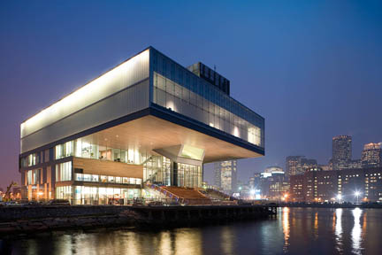
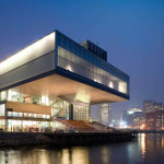
This past Thursday, Big RED was one of many press outlets given the opportunity to view the new Diller Scofidio + Renfro building, the new home of the ICA. While workers were continuing to add the finishing touches to facility, we has an opportunity to tour the building with Ricardo Scofidio and Jill Medvedow, who spoke of the conceptualization that went into the to what we were seeing.
From the renderings and the preview images we have seen throughout the past year, we were expecting nothing less than the impressive design we had the privilege of touring. After having seen it firsthand, what can this facility provide the artists of Boston that the other venue could not? How will the public receive it?
As far as the people it entertain, to promote visitation, the Target sponsored free admission on Thursday nights are a nice gesture to the public to interact, but will they stay for the show (or the meal in the Wolfgang Puck branded Water Café, or buy a Diller Scofidio + Renfro rendering of the building on a t-shirt)? As for what it provides Boston artists, an expansion seen in the showing Foster Prize finalists and the development of a permanent collection are a start of something that could prove to have much promise. Perhaps a next step would be to offer commissions or residencies for local artists, giving experimental, unpopular work a chance, allowing the public that are drawn out to the waterfront a very concentrated opportunity to see very contemporary art, work that is not yet part of the commercial sphere.
The main inaugural exhibit, Super Vision, while a impressive collection of artwork made in the past decade (with a few exceptions), it represents an established, mixed bag of impressive names, which becomes a low risk, high profile show under the guise of a very, very broad curatorial orientation. The ancillary exhibits–the Foster Prize finalists and the latest installment of the Momentum series featuring new work by Sergio Vega are the most challenging and provide the best example of how and what direction the new gallery space could best be used in terms of size and customization.
However, these are the most visual components and are the most featured, and therefore carry a large burden of scrutiny. What else is there? Not any lesser, and are perhaps the greatest benefit to the new building is the 325 seat theater which can accommodate a diverse array of programming: performances, dance, film, and multimedia, Also benefiting from the upgrade are the digital studios for the Fast Forward program, offering kids a chance to use the space to write, shoot and edit their own video projects. These two features alone might showcase the most unique and inventive work to be experienced at the new ICA.
-
While much of the fanfare will on the design of the structure (not lacking warrant), it would be hard not to overlook what this space is intended to provide. What will this do for the art it is to exhibit, and how will the viewing public interact with the new exhibition space this facility provides? What can we see in other fantastic buildings that also have double duty as a museum?
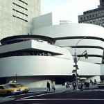
For example, in terms of building versus exhibition, the New York City and Bilbao venues of The Solomon R. Guggenheim Museumare examples where the container can overshadow the contents. These facilities, designed respectively by Frank Lloyd Wright and Frank Gehry, were designed to not only provide a haven for art collections, but were intended as a monument representing the time it which it was built. In short time, the architects and buildings become one image are objects themselves, promoting art tourism for the facility regardless of what is inside (historical aside; the New York outlet of Guggenheim Museum, completed in 1959, met debate and criticism on day one. The architect, Wright, had intended the building to be a monument reflecting the modernist aesthetic of the time. Interestingly enough, Though he projected the same hope of spiritual catharsis though rigid formalism, Wright abhorred modern, non-objective art it was to house, and made few concessions to accommodate how his design would constrain the varieties of exhibition design. In retrospect, it is reflective of the self-manifested heroics that much of the movement would come to represent. Wright one-upped the paintings and sculpture as though it were a contest).
The Guggenheim Museum(s) are just for example. What about an institution whose mandates are similar to the ICA? As the ICA is now a collecting museum with a diverse array of programming, is there an institution to mirror?
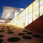
The Walker Art Center in Minneapolis, MN, was established in 1927 as the area’s first public art gallery. In 1971, the architecture was expanded with a north wing as a space to house the style of art it was to feature - minimalist and modern art. Though, unlike the Guggenheim buildings, the Walker space was developed for visitors to experience the space uniquely, but without distracting from the focus on the displays. The intent was reticent enough to let the artwork breath, and as impressive a space for not taking the spotlight. The Walker campus has since expanded in a number of additions, the latest in 2005, keeping the philosophy of form following function and continues to provide an outlet for contemporary and experimental artwork, from new media to performance. As the demands of the artwork change, the needs of the architecture should follow. What can't be contained in the space, the Center also has an outdoor sculpture park and uses its presence online to promote community through blogs and discussion.
Does the Diller Scofidio + Renfro building create a showcase for the artwork it will showcase or does it envelope and overcome the ICA's mission, becoming the feature event? All intents point to yes - the exhibition space in the new building is three times the size of the Boylston building, much of the gallery space being open and modular, allowing for a much more customized exhibition layout. Once again, the question: Will the building provide the intended function, or will it overshadow the individual works it is to contain?
The view of the new ICA will change over time, as the patina builds up on the stainless steel. What can be definitively said now, as far as the venue is concerned? The new ICA offers much promise and excitement, perhaps because it represents such a focal point for a diverse set of desires from the people in the city. It is so many things to different audiences, and not necessarily with like intentions. Art as entertainment comes in all sizes, and entertaining is its own art (especially if you’d like to rent out part of the building for a cocktail party).
Ultimately, the venue will bring people to have some sort of experience, which pitches one out of ordinary domesticity, out of the everyday. More importantly, it also represents the shift in the city's economy - where the infrastructure is, the high stakes the culture follows, and likewise, the real estate, and sometimes symbiotically. The building can’t fulfill everyone’s individual wishes, but it can help prevent the city from becoming a stagnant and keeps the city from becoming its own dusty museum. Besides, if developers were going to build something there anyway, better than another office space, it might as well be something where we have an invitation to visit.
----
Links:
Institute of Contemporary Art
See Issue #46 for James Hull's preview of the ICA in progress. Also in the same issue is Ariel Pittman's history of the ICA.
"Super Vision" is on view from December 10th until April 29th, 2007 at the Institute of Contemprary Art, located at 100 Northern Ave., Boston. The museum opens to the public on Sunday, December 10th with free admission.
Institute of Contemporary Art image courtesy of the ICA. Guggenheim Museum and Walker Art Center views from Google Image Search.
- Will the design of the new ICA building outshine the art it houses? Will it become an historical object itself, or an evolving institution, reflective of the culture it represents? Top image: the new Diller Scofidio + Renfro ICA building; middle image: the Frank Lloyd Wright designed Guggenheim Museum; bottom image: the new wing of the Walker Art Center in Minneapolis.


