Cut
Chris Nau, Randal Thurston, Debra Weisberg
Curated by Laura Donaldson
Mills Gallery
Through January 9
Boston Center for the Arts
539 Tremont Street
Boston, Mass. 02116-6338
Abstracting Thoughts
Linda Leslie Brown, Keith Francis, Peter Harris, William Frese, Reese Inman
Curated by James Manning
Alternate Currents Presents at Space 200
Through December 5
Marketplace Center
200 State Street
Boston, Mass
This tandem of intelligent and insightful exhibitions have been curated by two solidly established, mid generation curators: Laura Donaldson, director of the Mills Gallery of the Boston Center for the Arts, located in the lively South End of Boston, and James Manning, for the relatively new, ground level gallery, Space 200, in the lobby of a tall office building, steps from Quincy Market/ Faneuil Hall.
This fall, next to the BCA is a new high rise residence, owned by Druker Development, that includes a new theater. This venue complements BCA’s several smaller theaters and an enormous rotunda which is used for large projects and trade shows. This increase of development has translated into a greatly expanded audience for the Mills Gallery, one of the respected, cutting edge venues in the city. Space 200 also benefits from street level visibility and intensive foot traffic.
Fittingly, these highly visible spaces are presenting first class work in well thought out programs. It speaks well for the status and growth of the visual culture of the city. Prior to taking over at the BCA, last year, Donaldson, a fabricator of fanciful furniture, had been acting director of the Montserrat College of Art Gallery in Beverly, Mass. Manning, an artist/photographer, who just turned 30, has over a hundred exhibitions in a variety of venues under his belt. I have followed with great interest the studio work and projects of these curators for a number of years.
It is significant to note that both curators are putting together compelling projects drawn entirely from their own community. Their mandate is to identify and work with emerging and mid career artists. The results are intelligent and provocative. Manning in particular has long been noted for being the first to show significant emerging artists. Very often, artists first presented in his shows, while ignored by the media in general, go on to be “discovered” by more main stream curators, gallerists, collectors and venues. The efforts of these curators, staying on top of emerging artists, and the scene of many alternative spaces, makes an enormous contribution toward our ability to identify new tendencies. It is little wonder that curators tend to cherry pick from their shows.
Actually, I was readily familiar with the work of two of the three artists selected by Donaldson. Both Randal Thurston, who makes silhouettes, and sculptor, Debra Weisberg, are colleagues whose works I have shown in solo and group exhibitions. The work of Nau was new to me.
The installation of “Cut” is terrific. It makes very clear and effective use of the space. The long, U shaped gallery, with storefront windows at one end, has been evenly divided. Thurston’s sprawling installation covers the wall on the right, Nau’s takes up the wall on the left, and Weisberg command the floor and base of the end wall in between. This spacious arrangement gives fair play and breathing room for the separate but similarly premised works. The theme of “Cut” is immediately evident in the work of Nau and Thurston but takes a bit of explaining regarding Weisberg.
Overall, I feel that the whole, for which Donaldson deserves full credit, has more impact than the sum of parts. Closer examination of the works raises some critical issues.
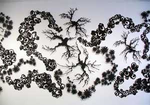
Of the three bodies of work, which indeed resonate nicely with each other, the piece by Thurston “Ouroboros” is the most resolved. Having followed the work over a long time, this is his strongest effort to date. It is commanding, mystifying and evocatively poetic. My read on it was as an Oriental landscape. There is the element of stripped bonsai trees, roots and branches bare and inching out like exploring fingers or tentacles. Mixed in are clusters of flower buds, no stems, like chrysanthemums. Then there are clumps of organic circles. I read them as perhaps surrogates for cloud formations. Donaldson informed me that they reference blow ups of microscopic organisms.
While I don’t know what this clustering and dialogue between tiny trees/ shrubs, flowers and organisms quite means, I also feel that I don’t really have to know, in order to fully appreciate the work. It is possible to just absorb its elements and how they command the wall and space. The breathing room and dialogue of elements. I looked up the title “Ouroboros” in my unabridged dictionary but could not find the word.
The process of Nau involves drawing overlapping, swinging oval forms onto the wall with graphite. This is done spontaneously with no preliminary studies. When the drawing is fixed the artist cuts into the wall, isolates and extracts elements from the plywood backing. These sections of sheet rock are then refined on their edges and reattached. Shims are placed behind them so that the wall has an uneven texture of elements. The many nails are spackled and painted to disappear to the eye. But the elements of drawing, erasing and smudging remain as a part of the work. There is no color other than the white sheetrock, graphite borders around shapes and smudges.
While the work evokes spontaneity it is the extension of that premise which makes it feel arbitrary and unresolved. There is nothing precise about the areas, composition and form other than the organic sense of the swing of the arm in making the original gestural drawing. Much of that feels like what professors told us when we did abstract paintings back in the 1960s to “paint from the shoulder” and not with the hand. It is interesting how those ideas recycle. My response, however, is somewhat, “yeah but?” Just where does it go from here?
Ironically, this was, for a time, the method and process of the work of Weisberg who carved into and built out from gallery walls. An epic example of that site specific, relief work is a part of her exhibition, through December 18, at Nao Projects, 535 Albany Street, in the South End.
Here and in the gallery exhibition, Weisberg is showing a new direction in the work. It entails building up of glued together sheets of material that are then “cut” and shaped. There is a treatment of the final outer surface with uniform black ink. In the exhibition the many individual elements which vary in shape and form are configured through the space. Some are stacked up mounds of the material, like rocks and boulders, while others flow and spread like skeins of larva. They are both free standing in the space as well as hugging along the base of a wall.
As an installation the impression is strong. But detailed examination of the elements and forms is more unsettling. Basically, I don’t understand the jagged rough textures. How were they formed and just what do they mean? It is abstract work but what are the elements and how do they conflate? While it is involving to view experimental new work, you sense that its issues have yet to be fully absorbed and resolved.
Upon entering Manning’s exhibition there is a similar initial impact that this is a brilliant installation. He is correct in stating that this is one of his best and strongest shows to date. It was significant that I was familiar with the work of only one of the five artists, Linda Leslie Brown, another colleague whom I have shown in one person and group exhibitions.
As the title states “Abstracting Thoughts” this is a selection of non objective works including paintings, digital prints and sculpture. It was wonderful to see how it settled into the space. Manning moves us through the small gallery quite marvelously. Upon entry we are immediate confronted by a panel with “Circular,” by Peter Harris, a large, abstract C Print mounted on aluminum. Against a mostly black ground are restrained elements of color and texture. The overall mood is subtle and absorbing. There is a glossy finish to the surface which runs to the edge with no frame. It floats a bit off the wall and just shimmers in space. A gorgeous piece. He will show with Boston’s Kidder Smith Gallery in January.
Entering the gallery on the left wall are three works by a hot, emerging artist, Reese Inman, who is booked for a debut at Gallery Naga later this season. Onto varied colored grounds the artists creates grids of multi colored and richly patterned small dots. They resemble pixels in a computer design. But are hand painted and configured. It is not surprising that there is a feeding frenzy for these works among hip collectors.
The framed, mixed media, simple abstractions of Keith Francis are suspended in mid air fixed there by steel cables attached above to the ceiling and below to the floor. This allows us to walk around them and observe that they are visible on both front and back of their supports. While the presentation was riveting the works themselves were less so.
Which brought us to the back of the panel where Harris’s work was mounted, to encounter an image by Linda Leslie Brown. This piece “Lonely Wars” continues her multi media approach of making digital prints on vinyl and then layering over them with concoctions including resin, acrylic, sugar and glass. My last exposure to this work, a one person show at New England School of Art & Design, was just stunning. Wow. But, this time, the alchemy seems too heavy and the coming together of the elements lacks the former grace and layering. The application of splashy, expressionist, glossy, black resin is so strong and insistent that the under layer of digital print is all but lost. You wonder why the artist doesn’t abandon that conflation and just make big paintings on more traditional supports. In this hanging, for example, the vinyl sheet is suspended and buckles in space where we feel that it needs to lay flat. It is just that too much is being demanded of the support. This may be the time for Brown to just move on, if the direction is to make more aggressive, expressionist paintings. Here, I both feel and feel for the artist.
The work of the final artist, seen along the outer wall, and visible through the exterior window, is a bit of a head thumper for me. It involves some kind of horizontal structure, a band of carpeting, and ersatz wooden, white painted antlers or horns. There is a second element of several lengths of narrow, hydrocal casts laying on a sheet of plastic stuck in an awkward corner. With a sign that says, please don’t touch. I would suggest a sign that states, “Please explain.”
(Note that you will find some of these essays as a part of the website Big Red and Shiny. This came about through the invitation of the artist/ entrepreneur, Matthew Nash. I am pleased to participate in this lively, artist run, on line publication. Check it out.)
Links:
The Boston Center for the Arts
Alternate Currents / Space 200
Images of artworks courtesy of respective galleries.
Charles Giuliano is a Boston based artist, curator and critic. He is a contributor to Nyartsmagazine, and the director of exhibitions for The New England School of Art & Design at Suffolk University. He periodically sends his column "Maverick Arts" via email, and Big, Red & Shiny is proud to reprint it here.


