By JASON DEAN
Approaching the museum from 5th avenue I could see people already lined up across the street, against the wall, facing the MoMA entrance. There was a pretzel vender on the sidewalk, listening to the radio and I thought That must be audio for the piece, until the commercials kicked in. Instead, the city was the soundtrack and at certain points it fit perfectly. I was happy to take my headphones off for once and pay attention to the honking cabs and to the radio on the pretzel cart, it was a part of the work now.
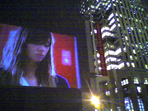
Right away I liked that the films broke out of the museum onto the front of the building and continued around the corner into a parking lot, and then into the MoMA sculpture garden. The garden is rarely open from the street and never at that hour. I walked through the crowds of people silently staring up at the museum in the dark, like a silent fourth of July. I think it was a good compromise between institutions, MoMA can feel like they are relevant again, and Doug Aitkin is more visible than anything else going on inside the museum.
The films themselves looked great -- anything looks incredible projected 50 feet high on the side of a building. This work would fit in perfectly alongside the latest Nike ad. It’s practically one of those pseudo-guerilla marketing campaigns. Advertising and Art, all blurring together on a midtown Manhattan skyscraper. I can’t help but think it must have been mistaken as marketing by some passers-by.
In addition to emulating all style, no substance language of ads, it had the help of a pretty aggressive ad campaign for the films themselves; movie-type posters in the subway and on busses probably adding further confusion to this art movie/pseudo ad. On Creative Times’ own blog Brent Burket addressed the work being seen as too commercial:
I don't see the design of the piece as a problem. I think that it's essentially cool. I think that that augments the distance that is part the work. I've heard other people mention the "corporate" nature of it, but I don't quite get that. It's all too slow for that. You couldn't sell shit with this thing.
If there was a luxury product logo in the last 5 seconds of these films, they could sell anything. This is perfectly in line with advertising where they create a spectacle with well-known actors who do things not related in any way to what they are selling and then the last 5 seconds fade to black with a logo. “Honey, look at Claire Danes dancing. Oh is this the new Doug Aitken video?... No, it’s for the GAP.”
The work further aligned itself in using A-list actors. I realize the reasoning may have been to provide an entry point for the average viewer, but on top of the recognizable talent, it used all the trappings of a big budget blockbuster: smooth tracking shots, high speed, slow motion, ambient lighting. I saw families with their kids braving the cold, but I wonder if they had been completely misled into seeing some kind of free film festival starring the witch from Chronicles Of Narnia.
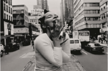
The films all started the same: the characters get up, take a shower, brush their teeth, have a cup of coffee. They continue to follow the exact same storyline, shot for shot, when one character stops to look in a shop window, all of the characters simultaneously look in a shop window, the only difference is the objects for sale. All socioeconomic classes are represented, from successful businessman to bike messengers, all taking the same journey, at night, leading to the same outcome: the world slowly starts to slip away, through some type of repetitive movement -- a dance on top of a cab, spinning in a mailroom. They all end their mundane workday simultaneously in a climax of blurry transcendence. How much of this was a choice? This piece seems full of compromises, and I couldn’t help but ask why can’t work like this be more specific? Is it inevitable the work will suffer by committee? is it a necessary evil in order to be shown like this? What will it take not to become another meaningless billboard or advertising noise. As much as the piece “broke the rules” in having visitors enter forbidden spaces, it watered the content down. Of course, I have no idea the restrictions placed on an artist in today’s world, dealing with a public art piece in midtown Manhattan, but isn’t this what makes the work so problematic and pointless? Is it better to attempt work on a smaller scale where you can meaningfully relate to the viewer, instead of creating a spectacle for everyone and no one. Then again, I guess you can get away with a lot more if you are vague, and leave everything up to interpretation. When art no longer means what you want it to mean, The Gates were just orange pieces of fabric in Central Park. At least that’s what they have to mean to the Parks Department.
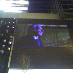
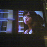
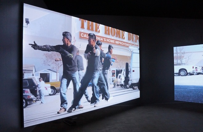
- Three views of “sleepwalkers” at MoMA
"Doug Aitken: sleepwalkers" is on view January 16–February 12, 2007 at MoMA.
All images are courtesy of the artist and MoMA.
Photos by the author.

