
NON FINITO: WHAT TITIAN AND CO. CAN TEACH A CONTEMPORARY PAINTER
Less than a month remains to visit the Boston Museum of Fine Arts exhibition Titian, Tintoretto, Veronese: Rivals in Renaissance Venice, one of the finest collections of Venetian painting ever assembled in this country. Rivals next stop is the Louvre. As a contemporary painter accustomed to stripped-down art, I'm thrilled to see paintings dripping with color, light and textural effects and jammed with people and things. I'm curious to find out what I think about the Venetian artists I was taught to revere and then taught to forget. At a point in time when American Elizabeth Peyton can be famous for jewel-like glazes, and British painter Richard Wathen can parody Flemish and English old masters, why not look at Venetian pictures? Everyone else is and you've got to keep up. Will the Francis Bacon show look better or worse after the Big Three?
Framing the exhibition in terms of the rivalry between the three masters isn't a brilliant move only because it's true, but rather because it brings them to life as it sweeps the viewer into active comparison of their work. So who's best? Titian is best at color, flesh tones, and soft light. Tintoretto is amazing at placing the figure, at creating impossible space, and at using tone. Veronese is the ultimate perfectionist; his work is always balanced and has both strong color and a dynamic sense of space. Titian is sensitive, Tintoretto is pure energy and Veronese is a chameleon, changing his style every time he paints.
The show is just the right size. Five large galleries present the paintings in varying light and according to their different themes. Some galleries are dark allowing the figures to emerge glowing out of the darkness; other rooms are bright so that the compositions practically assault you with their bombastic power. Pictures are grouped thematically to make comparison easy. You can see how the artists change with each assignment and who shines according to the subject: religious, allegorical, portraits, and nudes. In a sixth smaller gallery entitled "Beneath the Surface," a large Tintoretto Nativity has been x-radiographed to reveal the layers underneath. While scientific investigations of paintings are often dry, this is an exciting discovery in which a painting that started out as a verticalCrucifixion ended up as a horizontal Nativity. While you puzzle over the painting's alterations, you realize how elastic the painting style and workshop practice must have been in Venice at that time.
The show begins with a dark and scholarly gallery that establishes the historic and stylistic context from which the Venetian revolution in painting sprang. Although many wonderful paintings hang in this room it was not until I stepped into the light-filled second gallery that a Tintoretto arrested me. Saint Augustine Healing the Lame, a swirling landscape in a cool, austere palette, is a prime example of Tintoretto's ability to invent space and people it. St. Augustine hovers above a barren canyon littered with numerous half naked figures. The space, a landscape devoid of any natural features, is created instead by a tunnel of outstretched arms running from the foreground to the background. The light is unnaturally bright, and as Saint Augustine flutters in mid air,the sky seems to pull backwards while the men in the foreground tumble forward. The limited palette of grays, blues, tans and a few splashes of orange enhance the spatial effects and dreamlike atmosphere.
Three versions of the Supper at Emmaus, one by each artist, also hang in this gallery. The Veronese Supper, however interesting, is so small that, it cannot take part in the duel between major paintings by a youthful Tintoretto and a seasoned Titian. The subject and scale of the two Suppers are nearly identical but there the similarities end. Initially the most striking difference is paint handling: Titian describes solid specific forms, and Tintoretto appears flatter and sketchier; he leaves forms unresolved. Tintoretto favors spatial gymnastics over color or form, and Titian does the opposite. Compositionally Titian has stacked everything- table, people, landscape, in parallel rows; Tintoretto's design is full of severe angles, starting with the walking sticks crossed in front and strong perpendiculars, such as the table and the sign, pointing out from the window. Titian's meal is delicate and specific, and his drapery is stunning. Tintoretto's meal consists of the barest symbols and his clumsy drapery is just a vehicle for moving line. Even the animals seem to have been painted in opposition: Titian's superb fighting cat and dog provide a necessary charge to an otherwise frozen dinner, and Tintoretto's little bun of a cat keeps still in the chaos.
And where does Veronese shine? Everywhere: each of his paintings is a masterpiece; you just wouldn't know they were by the same painter. Veronese has been called a combination of Titian's restraint and virtuoso coloring, and Tintoretto's spatial ingenuity, and many pictures bear this out. But is it good to combine these approaches? Much of Veronese's carefully modulated color winds up looking artificial, and his jutting forms, distinct in a way Tintoretto's are not, look contrived. But I wouldn't mind the saccharine color and campy poses if they were part of a unique point of view, in fact I might actually love them. Instead Veronese's greatest works look like they were painted by different master painters and his lesser pictures by meticulous copiests.
This sounds harsh, but take two works by Veronese, Saint Menna and The Temptation of Saint Anthony in the Sacred Themes gallery, both masterpieces by any measure. Elegant Saint Menna with one rakish elbow leaning against his niche and an armored toe sticking beyond the frame, looks like he would come to life if you offered him a cocktail. But what does he have in common with the moody, nightmarish Saint Anthony, which is full of weird muscles and limbs wriggling in the shadows? Whereas Saint George, Saint Louis, and the Princess, while it may differ from his other works, is unmistakably by Tintoretto.
One of the most beautiful and controversial galleries is the collection of nudes the curator aptly called in the catalogue Tactile Vision: Female Nudes. Although flesh tones have never been better, some viewers may be turned-off by the endless procession of submissive women in sexual poses. In the ability to capture the buttery weight of flesh Titian is unsurpassed and he does it again and again. You can go from Titian to Titian and marvel at how he creates the illusion of dense yet soft human flesh. Layers of opaque paint and glazes are magically transformed into cellulite before our very eyes. For Veronese and for Tintoretto there are works that stand out. Veronese's masterpiece is Venus and Mars United by Love, – a giant picture in which two huge figures, a horse and cupids are crammed into a gorgeous but shallow space. I was so entranced by the color and design I didn't even notice that Venus was squeezing milk out of her breast while Mars undressed her. Susannah and the Elders, always a creepy scenario, has the most luminous nude in the entire show. Susannah may be rather flat but she glows, and the shadows on her body are also light and airy. Typical of Tintoretto, one of the most striking things about the painting is his use of perspective. The screen of roses and Susannah's mirror are both set perpendicular to the canvas, then the reflected objects in the mirror are again perpendicular to it (but parallel to the canvas edge). Although the reflected brushes are just two smudges of gray paint the use of these angles creates an astounding spatial illusion.
In the final gallery dedicated to late styles, two paintings stood out for me: Titian's Saint Jerome and Veronese's Perseus and Andromeda. The precise yet gentle paint handling of Saint Jerome is distinctly Titian, but sketchier, and it might feel anticlimactic if I weren't glutted with previous more substantial pictures. It epitomizes the concept of "non finito," which the wall plaque explains is the concept of a conventionally unfinished painting being in fact complete because the artist says so. Does this sound familiar? Perseus and Andromeda is, on the other hand, highly finished and vibrantly colored. This is a huge and theatrical canvas, with figures caught in impossible poses and the best sea monster ever. Your eye follows the color pink from Perseus's costume to Andromeda's cloak and back to the sea monster's open mouth. Tintoretto would have blurred things to show speed but Veronese has suspended time so that you can admire Perseus's foreshortening and each of the sea monster's fantastic teeth. Besides being funny, no one but Veronese could have placed those figures with such grace and skill, and at the same time animated the scene with such a charming palette.
Which of these painters is the most relevant today? The obvious answer would be Tintoretto, with his expressive line and bold disregard for what doesn't interest him. He impresses with his spatial genius and also satisfies a modern craving for flaws. Titian seems to ask too much time from an audience. Only gradually do his luxurious color and form relationships reveal themselves. But what could be a more welcome antidote to our hyper world of digital nothingness? Titian's late Saint Jerome, though, seems very "right now" in that barely-been-painted way. Veronese? You could also make an argument for him in the way he changes with every new idea. Is he a Gerhard Richter constantly re-inventing himself? His chilly perfectionism also could be seen as contemporary: his paintings are always too resolved. Is my expectation that Veronese should have a personality misplaced? Or is the lesson from the rivalry, don't do it better, do it different?
I had the pleasure of discussing the exhibition with its curator, Frederick Ilchman who offered several compelling reasons for the timeliness of this show. First, because painting on canvas was very new in the early sixteenth century, this was an exciting moment when artists were searching for form and expression. The move from panel to canvas greatly freed artists technically and economically. They could work on a large scale without worrying about the weight of huge wooden panels. Artists had far greater independence because canvas was cheap enough to "work on spec" and light enough to ship without having to work on site among meddlesome clients. Canvas prompted technical changes in the use of the paint because of the way it can catch in the weave and create a sparkle, and the way paint sinks into canvas allowing for greater depth of field than on panel where it sits on the surface. The flexibility of oil paint itself offered many more possibilities than the quick drying strokes of egg tempera. Oil paint could be loaded thickly onto a brush, it could be thinned with oil and solvents, and many layers could be built up. To quote Mr. Ilchman: "Painterly painting is indebted to Venice".
Something else which appeals to contemporary viewers is the way in which the painting process is revealed throughout the finished work by areas of underpainting left as they are, by impasto, and by pentimenti, those ghostly traces of design changes which appear centuries later, Finally, Mr.Ilchman rightly points out that the concept of "non finito" has plenty of contemporary fans. Belgian painter Luc Tuymans, for instance, insists on finishing a picture in one day and doesn't allow himself to go back into it. The premise that unfinished art offers a different kind of visual expression may no longer seem cutting edge, but I was surprised to learn that the concept dated back to sixteenth century Venice!
What attracts Mr. Ilchman to the Venetian school personally? The bold gesture and its grand drama: "Vermeer is not my bag at all."
-
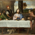
- Titian, Supper at Emmaus
-
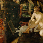
- Tintoretto, Susannah and the Elders
-
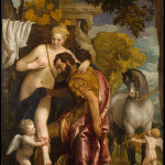
- Veronese, Mars and Venus United by Love
"Titian, Tintoretto, Veronese: Rivals in Renaissance Venice" is on view Mar 15 - Aug 16, 2009 at the Museum of Fine Arts Boston.
All images are courtesy of the MFA.
Note: This piece originally appeared on at the website Old Masters New Perspectives and is reproduced here with permission.


