
A CONVERSATION WITH CRISTI RINKLIN
Cristi Rinklin makes epic paintings of richly layered spaces. Her new exhibition at FP3 Gallery, "Boundless," features a series of new paintings and smaller drawings that explore space, color and form in complex ways. I met Cristi at the gallery to talk about her work and ideas.
----
MN: We're here at FP3 Gallery, looking at your new show "Boundless." These are definitely "painter's" paintings, but you seem to be mixing this classical style with a more cartoon-y look. I know this has been evolving for a while. How did you arrive at this mixture of styles?
CR: Well, the interest in the landscape -- as a specific genre of painting, not how it exists out there in nature -- the landscape how it is contrived as an image in a painting is something that I've been inserting into my work in a number of different ways for a while. Originally it would find itself in little thought-bubbles, as if the painting was dreaming of its past. Other times it was more incorporated. There have always been these more tangible elements that start to become very cloud-like, and start to resemble vaporous forms.
With this recent work, what I really wanted to do was capture this idea of a very vast space and a very particular kind of vantage point, to have that wide view -- an almost God's-eye view -- that's really associated with the sublime. With these, especially, there is a lot of referencing of Hudson River School painters. I am working with this notion of creating something through painting that evokes this feeling of the sublime that's in combination with this feeling of being taken out of a familiar scene. You're not able to place yourself. The landscape in these is incorporated and embedded in the scene, unlike my previous work [in the exhibition "Big Bang"]at the DeCordova, where the landscape was quoted within the painting in thought-bubbles or other ways that set it outside the scene.
MN: It seems like you are pulling from a lot of different directions at once in these paintings. You mention the Hudson River School, but there is also an almost Barry McGee-ish mark in some of these cloud shapes, too. Other paintings seem to incorporate a graffiti style, in some of these translucent shapes. When you are pulling your references and creating these scapes, how does that process work for you? When do you choose a certain type of painting or mark-making, how do you combine these references?
CR: A lot of times, those are different ways to create layers of space, ways to snap the viewer into focus... For instance, these graphic areas [in the painting After the End of the Beginning]are a way to change the way the viewer sees the space. I think of them as snapping the viewer to a different level. It's crisper, it's more graphic and it sort of anchors the painting a bit, rather than letting it all float away in too much atmosphere.
With this one [After the End of the Beginning], for example, there is this cartouche that is projected on there. Where that comes from -- there are echoes of things that feel cartoon-like or graffiti-like -- but really where these are coming from are graphic images associated with Renaissance and Baroque art, as well as a little bit of Asian art, although I feel that's moving its way out of the work.
What I'm really interested in is the graphic representation of something that's intangible. It's like the way you'll see smoke depicted in a 15th century woodcut, or the way you see a cloud depicted. Those things are usually fleshy, and they serve a role where they actually suspend bodies, or they divide heaven and earth. They have these specific functions because they are more than just a cloud or more than just a bit of smoke.
The decorative element that's in there is coming from that Rococo or Baroque language of cartouche that embellishes paintings and images in various forms. Previously those elements were on the outside of the paintings, in wall paintings, I used them to surround the paintings with that kind of framing device. Now I'm allowing them to be in the painting, I just want them to be a participant. They're present, they are slightly transparent, they are visible but they also become a way to cradle the form that's in there.
MN: You said that these are referencing landscape painting, but are they really a form of anti-landscape? They feel like they are deliberately denying the kind of fantasy that those earlier landscape paintings evoke.
CR: Yes, exactly. It's because they are not about the subject that those paintings were about. They are about those paintings, and so it becomes about this one-step of removal. I'm also interested in this idea -- I have to be careful here, because I'm really talking mostly about a very contemporary, somewhat westernized or digitalized culture -- but I feel like these kinds of experiences are so mediated by interfacing with a screen. So our relationship with the landscape, most of the time, is mediated through watching TV, or watching a movie or looking at it on the internet. It's not that I necessarily want to comment on that, I don't have any moral imperative with the work, but they do become these strangely distorted memories of the landscape.
MN: The one area where I feel you are really picking that apart is in the use of color. Most of these pieces use a very broad palette, but it's also a very didactic palette, with very cold and warm colors slamming against each other. In the smaller pieces, we see that didactic palette in its extreme: red & cyan, orange & cyan... They become almost like graphic design in their color combinations. Is that part of a larger strategy?
CR: Well, it really is synthetic color. These are colors that are derived from Photoshop. They are the kind of colors that you'll associate with the different kinds of curves and filters and color manipulations that you get when you jack up the color on a screen. I don't want these to be Photoshop-y paintings, but I am interested in the way in which that color scheme starts to evoke something that's not of nature, it's not of our experience and it does feel like it's technologically derived.
I want that sensation to communicate itself to the viewer. I want the viewer to look at these and feel as if this is something that was constructed artificially, but then comes back to exist in the physical realm. That's why I feel it's important that these are paintings, rather than if I were to just do them in Photoshop and make them really big.
MN: Looking at your painting style, you're not one of those goopy, thick-brush-stroke painters. These are pretty clean, worked surfaces, as far as most paintings go.
CR: In my earliest days of learning how to paint, that was how I always wanted to paint. I like the smooth, blended style.
It's weird because I see the foreground elements of these paintings, the parts painted in oil, as very physical. When I'm painting them they are very physical, but it's more of a low relief and they are kind of stratified in terms of how they're built. You can see the planes and the layers very clearly. But the background is meant to feel as if it is very weightless and airy. It's done with an air brush so it's more soft-focus. I want that space to fall back really deeply, and that contrast between that part that is painted with oil and the background to heighten that sense of distance.
MN: Is that what you want to evoke in the title of the show, "Boundless"? Is it about that depth, that space?
CR: Yeah, exactly. I mean, titles aren't my forté, but when I kept thinking of this show and considering what would be the overarching theme in all of these, that was the word that kept coming to me.
I want these paintings to feel like they are epic, like they are either at the beginning or the end of some kind of event. So, I think a word like that, which is so lofty, seemed to fit the show.
-
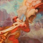
- Cristi Rinklin, After the End of the Beginning, Oil and acrylic on Dibond Aluminum, 2009.
-
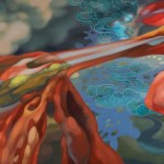
- Cristi Rinklin, The Persistent Nature of Past, Present, and Future, Oil and acrylic on Dibond Aluminum, 2008.
-
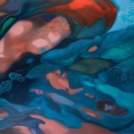
- Cristi Rinklin, Restless Vapor, Oil and acrylic on Dibond Aluminum, 2009.
"Cristi Rinklin: Boundless" is on view May 8 - August 15, 2009 at FP3 Gallery.
All images are courtesy of the artist and FP3 Gallery.

