
The main problem with the 2006 DeCordova Annual Exhibition, aside from its predictable unevenness, is that the work within doesn't interrelate very well. Each of the thirteen artists selected (counting a two artist team) presents a body of work that seems to inhabit its own world. There are some common themes, to be sure. According to the museum's summer newsletter, these include "the social and visual impact of science; the dynamic relationship between architecture and experience; the visual power of language; increasingly diverse uses of drawing; and ordered and disordered systems within nature". These are all more or less relevant, as far as such abstractions go. Still--and though I realize it is entirely typical of survey shows like this one--the show feels more scattered and diffuse than it needs to be. All of this is particularly difficult for the reviewer, who wants to make such a show seem more coherent and collectively meaningful than it is in the flesh.
A good place to begin might be the work of Anna Hepler, one of the show's most interesting artists (okay, my personal favorite). Her work is also the shows best represented, with numerous pieces in various two and three dimensional media. There is a nice balance of consistency and range. Hepler's signature motif here is a series of spheres made up of a wobbly net of linked dots. It is repeated in several media: hanging wire balls, sketches, and (most interestingly) in a series with ink on layers of plexiglass. These accomplished pieces are reminiscent of the German-Venezuelan artist Gego's hanging wire sculpture, as well as works by Terry Winters.
More unusual, and less formalist, are her five Conduits, done with gouache on paper and mounted on hanging silk screens. These are made up of a staggered grid of gray, surrounded by white lines. Within each block is a white womb-like ovoid, also reminiscent of comic strip thought bubbles. Each of these connects to the outside of the block via a dotted tail, and contains reddish shapes. These alternately resemble intestines, tangles of string, clouds, stars or rings. The paintings play out a struggle between organic growth and architectural confinement.
Broadly similar in theme, but far less successful, are paintings by Alexander Ross and works on paper by Evelyn Rydz. Ross' paintings, based on photographs of clay models, are strikingly ugly. These fungus-like forms are rendered in decidedly unappealing shades of bluish or yellowish green . Of course, there is a noble tradition of the grotesque within painting, but these pieces are simply too arbitrary in both appearance and construction. Why the shaped canvases? Why combine clearly separated color-areas with thick impasto? Why work from photographs? Similarly, Rydz's scrolls contain conflagrations of abstract mechanical, plant and insect shapes that offer very little to justify their initial off-puttingness. The relentless use of thick black lines and the arbitrary splotches of background color (traced in pencil, for some reason) bring these uncomfortably close to the worst kinds of graffiti and juvenile science-fiction art.
Also childish, but more interesting is a room of paper drawings by the self-taught Jon Sarkin. These are reminiscent of the likes of Saul Steinberg and Ray Johnson, and combine cartoony figuration with handwritten wordplay, quotations and the names of various artists and other culture heroes. Unfortunately, these are hung top to bottom on the walls and scattered across the floor (some of them had been trampled before my visit). Sketchbooks are stacked on a table. This teenager's bedroom style installation doesn't help us see the work, but it does reinforce the tedious myth of the "outsider" artist.
Sculptor Frank Poor's work also relies heavily on text. His lettering, appropriated from antique signage, bespeaks an elegant graphic design sensibility which couldn't be more different from Sarkin's. The lettering is fragmented and overlaps, but you can make out words like "ghost" and "five and dime" (refer to the titles if you need help). Collectively, they evoke Poor's rural Southern upbringing. These cover architectural and furniture forms which are sober and stately.
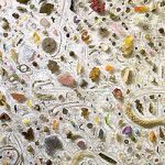
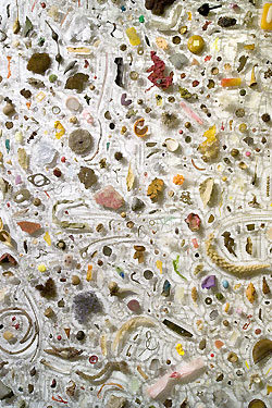
Jen Simms' wall installations are another highlight of the show. Three similar sized blobs are arranged in a row, almost touching each other. Each gathers countless small artifacts pinned to the wall. The outermost layer of each is composed of watercolor "stones". Then comes a layer of translucent mica flakes and another of stones. Finally, the core is made up of a dazzling array of specimens, both natural and artificial. Not everything is easy to identify. Some of the contents include: moss, leaves, honeycomb, bits of rope, seed pods, ribbon, fruit peel, plastic bits, foam and wire. Aesthetically pleasing, they also encourage us to reflect the various ways in which we relate to the fecundity of the material world.
The wall behind the DeCordova's main stairway frames Gregory Miguel Gomez's tall, bronze Bad Equilibrium. It resembles a U-shaped tube holding a small quantity of liquid at the bottom. The liquid spills over to the left side, apparently defying gravity. This is dramatic stuff, better experienced than written about.
Two "new media" installations, by Christopher Gray and the two-person team of Gretchen Skogerson and Garth Zeglin are likely theAnnual's weakest contributions. Gray presents a 24 minute video. In it, the artist gesticulates in an exaggeratedly theatrically manner as he adresses a small yellow Constructivist sculpture, attempting to discover (or invent) its meaning. His monologue is meandering and tedious (I had serious trouble paying attention for longer than a minute or so at a time). Of course, the object itself is mute, which is the all too obvious joke. The sculpture itself sits in front of the video. Skogerson and Zeglin occupy the adjacent hallway with their curved, convex mirrors. These are of the style commonly used to mask surveillance cameras, but in this case hide speakers. At first, these speakers appear to address the viewer, which is disarming enough. From there however, the speeches devolve into self-involved complaints about trouble with money, relationships, gender and the like. This is faux interactive art.
Naoe Suzuki's stiff, careful drawings occupy a hallway by the museums cafe (hardly an ideal location). Each drawing features a vaguely medieval looking baby, often swaddled. He or she is linked by tubes, vines, and blood vessels to improbable groupings of the animal, mineral and vegetable. Her "Mysterious Syndrome" series, all of them 15"X11" and all of them named after ficticious diseases with silly, surreal names like Oneirologothymia, have a formal edge over the larger, more awkwardly put togetherTransgenic History series.
Adjacent to Suzuki's pieces are two rooms clearly intended as the shows natural conclusion. This is good news, since the work within is among the strongest in the show. Matthew Swarts layers patterns derived from internet sources over his own blurry, somewhat banal photographs. The photos depict faces and other body parts (sometimes to mildly pornographic effect), while the patterns range between chaotic swirls and wallpaper like geometry. The overall effect suggests a psychedelic Gerhard Richter. One particularly striking piece (all are Untitled) overlays a man's head and upper body with white tracery resembling Gothic architecture run amok.
Photographer Joe Johnson's night-time architectural dramas are an excellent way of wrapping up a visit to the Annual. These large images dazzle with their towering vantage points, fragmented geometries, and juxtapositions of light (often eerily colored) against dark. Although taken in Manhattan's Upper West Side, they suggest both the anonymity and potential for human drama implicit in urban architecture almost anywhere. All of this despite the near absence of the human form. For example, 10 Windows, which gives us exactly that. The camera is tilted at an oblique angle and the windows are uneven in size and positioning. The light from the windows is white, blue, orange, purple. One window reveals a hanging skeleton, another houseplants and fragments of two men, perhaps watching television. This and much of his other work suggests the apartment building as curiosity cabinet, strange and beguiling.
Links:
DeCordova Museum and Sculpture Park
"The 2006 DeCordova Annual Exhibition" is on view April 29– August 20, 2006 at The Decordova Museum.
All images are courtesy of the artist and The DeCordova.
-
- Joe Johnson, Fire Escape with Flower Pot, photograph, 2005.
-
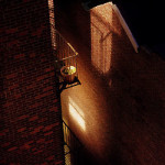
- Joe Johnson, Fire Escape with Flower Pot, photograph, 2005.

-
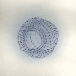
- Anna Hepler, Homage to Ucello #4, drawing/installation with Plexiglas and ink, 2005.

