2008 ICA FOSTER PRIZE FINALISTS: A CONVERSATION WITH ANDREW WITKIN
On November 12th, the 2008 James and Audrey Foster Prize exhibition opened at the Institute of Contemporary Art, Boston. Andrew Witkin is one of the four artists competing for the $25,000 biennial prize, and Big RED editor Micah Malone caught up with him for a conversation about his work. This is the first in a series of interviews with the Foster Prize finalists.
----
Micah J. Malone: I wanted to first ask about the photographs. Perhaps you could talk about the subject of the photos, or maybe the structure of how they operate in your work. So many of them boxed, framed, displayed behind each other, etc. It is almost as if their sheer existence as photographs, as documents, is as important as what they are actually depicting.
Andrew Witkin: You are right. I think of a lot of my activities as research and sketching. The images I capture via photography, for me, serve as notes, sketches, reminders, among other purposes. I continually fight the urge to let photos stand on their own. Too easy, too definitive (or something akin to that) for me. I start off by considering them discrete and then question that decision by asking, "now what?" I find that some of my photos are beautiful and/or interesting. Others are less so, but to someone else, it may be the reverse. Recognizing this, I accept that they' are part of my continual challenge not to accept things as they are but to study and learn from them.
As for publicly presenting these ‘findings’, even though I have been working for a while in private with discussions and presentations to a few people, in terms of public presentation, it is still very new to me. How/when/if to present things that I make/find/arrange are questions that I am just starting to understand as the public context is a whole different arena...
MJM: I was struck by the statement/story you sent me about the two brothers. It points to a very elegiac, but also, (partly) language based practice.
AW: agreed.
MJM: Indeed, as I sift through your work, it all seems very dependent on "reading"…
AW: One of my goals is to make presentations on multiple levels - to be read, viewed, explored, whizzed through, lived in, etc. To be celebratory, elegiac and other emotions in between. From the vastly different responses, experiences and preferences that people mentioned in talking about my project at Allston Skirt last spring, I think I can say I was able to do that, somewhat. What I am guessing you are responding to is the way I sent you the document that serves as a digital walkthrough of the exhibition. I try to be aware of every way the work is explored and so it intrigues me, this digital experience you have had, the way I designed it made it 'dependent on reading' for you. This is something I am definitely exploring.... but back to the question: Image and text go hand in hand in the document I sent you, so as to help understand what are the elements, but in the actual show, there were numerous ways to experience it. The checklist was incredibly specific in terms of the information that I provided (some things fully explained, other things incredibly generalized) but there was no necessity to have that piece of paper as you explored the space(s).
With all that said, writing and reading do play a large part in my activities, but no more or less than the other elements, at this point. To explain my response about your experience, I have wondered at various points if I should just focus on text, but much like my reluctance to present photos as finished works, the idea of presenting "a text" as a "work of art" seems too didactic, too definitive, too bold, too _____, and so perhaps I need to work on that more, making sure text does not overpower.
MJM: I was actually thinking more of how the literal descriptions of the elements really change how one engages with the objects…
AW: The checklist for the show had all the pieces as "untitled". Dimensions were all approximate. The descriptions were in the media used and the dates, yet they, for the most part, gave a scale (if that's an appropriate term?) of the works - aka how long I worked on them, how many elements are included in a closed box, etc. Yet, one did not need to know all that to have an engaging experience with the elements, or at least, so I hope. I would like to think that there is no "must" in my work, but merely different elements and options that provide different ins and outs.
MJM: I quite like the term scale because it suggests the important aspect of time to your work. I think your use of the term is similar to how I was using "reading." Not in a literal sense, like my digital walk through, but your time spent. It seems there is a duality with time (or is it paradoxical?) with many of the pieces. I'm thinking of the archival boxes with years of photos marking a finite period versus the pieces that play out in "real" time, like the two mirrors…
AW: On the whole: yes. A couple additions/clarifications: 1) the mirrors: while one progressively gets dirtier, the other one continually needs cleaning. It is ongoing in both the additive and subtractive way. 2) the boxes had certain elements in them for the exhibition, but that changes - by addition, subtraction, massive and minor changes, etc. some boxes were found/built/used specifically for certain types of works, while others are more flexible. Even pieces that have 'left the building' will change and be altered at various points, I assume, so there seems to be an element of continual change (to different degrees) in the work.
MJM: You mentioned much of this work was kept private. When you decided to start showing, how did the process go for you? I'm wondering specifically how the elements become formalized for you. While there is a very private nature to the work (closed boxes, sly and subtle rearrangements, domestic mirrors meant for private moments, etc.) it is also very formal in a gallery setting.
AW: Formal or organized? or perhaps both!?
One of the many challenges in taking the work out of the private realm was what sort of context it could/should be in. My first attempt at this was in a show Douglas Weathersby put together in a loft in Chelsea. I felt comfortable because it already had a few elements: a chair, a bed, a rug and a nightstand. I ended up cramming a lot of 'data' into the space I had been allotted and as time passed, I found that my favorite element was this little vignette of it where I had added some blankets and sheets to the bed, placed the bedside table and rug in a specific way and added one painted coat-hanger on the floor under the bed. That made me realize how little I actually had to ADD to make something work. So... when I had the chance to use Allston Skirt Gallery, I was at a loss as there was nothing but some movable walls! So, unless I wanted to do an homage to Yves Klein's 1958 "Le Vide", I would have to add elements, so I spent a long time trying to decide how to arrange the walls. Once I had a setup that felt right, I looked at that arrangement and tried to figure out what I had 'made', as in what the rooms 'were'. The whole thing began to remind me of a railroad apartment of sorts, so I started thinking about what should be in each room and then it became a process of becoming 'show rooms'. In the end, I feel like I put too much in, but I think it was a very good learning experience for me and I can't thank Randi and Beth enough for being willing to let me do it. Selfishly, I got a lot out of it. I just hope others did, too!
In terms of being very formal, I have a continual internal conversation between order and mess, with order normally having the upper hand. I like to be able to understand where things are and if there are things I don't need, I'm fine with them not being seen, but my memory is still pretty good (although reminders are helpful!). I think, although I need to continually push myself on this point, the arrangement at the gallery, hopefully, has very little that was aestheticized for presentation to a public. It followed a logic, partly hermetic, partly perhaps understandable by others, but it was not led by a desire to make something to be JUST looked at, but as you said before, read and experienced, perhaps lived with, too?
MJM: For those who haven't seen the exhibition yet, can you walk people through the installation at the ICA and touch on the performances that will happen throughout the exhibition.
AW: As for the performances, there will be four short, relaxed performances by musicians who are friends as well as artistic colleagues on Sundays at 3:30 pm in the space where my exhibition is
January 18 Joey Meyer
January 25 Kimon Kirk
February 1 Stephen Prina
February 8 Lucky Dragons
Joe performs solo and with his wife, Eleanor. Kimon has performed in numerous roles, whether with Session Americana, The Heygoods and Aimee Mann, among others and will be performing either solo or with one or two accompanyists. Stephen Prina is a fantastic artist who has been involved with music since his high school days and luckily for us, currently resides in the greater Boston area. Lucky Dragons, in this incarnation, is Luke Fishbeck playing solo. All are people I care deeply about, have been close to for different amounts of time, I have been involved in their musical developments to different degrees, and respect their work quite highly. They are friends/artists/musicians. Just like the space is somewhere between public and domestic, presentation and private, etc, the ability to take these relationships that all have an element of tender intimacy and present them to the public is a real thrill for me. The space they will perform in is small, much like a house show. The concerts are not long. More of a taste, a tidbit, a treat. I like the idea that just as I will be changing the installation over time, these performances provide continuity and variation, as well as other people’s visions.
MJM: Beyond the different performers, how does the installation change over time? Is it due to your arrangements that get customized for each performer?
AW: I went in to arrange the presentation and put certain things in certain places. I went back numerous times to continually alter, or as I thought at the time, 'improve' the presentation. After doing this a few times, I realized the honest thing would be to leave it open so that I could alter it as time moved along, as that is how I feel most resolved with the work (by not resolving it!). So... what I will move, add, rearrange, etc, I am unsure, but each time I go, I seem to move things around a bit. Sometime imperceptibly to others, but always in a way that 'works' in some way.
MJM: I'm thinking of this project related more with "participation performance", "relational aesthetics", "social practice", etc., in essence, work that strives to include spectators as integral to the work's content.
AW: I am not sure it 'strives' to, but it can't avoid it, or so it seems from the interactions that I hear about, am told about, observe, experience, set up, etc...
MJM: This seems like a different process for you in that your last project felt very inward, cataloged, almost coded.
AW: How do you feel the Allston Skirt show was more inward? It did have three spaces as opposed to two corridors and one space, but the ICA show feels like it is a little less vocal with its information. Can you explain your comparison a bit?
MJM: I am thinking of the work as "inward" due mostly from the photograph arrangements. Boxes of them accumulated over a long period of time, even the boxes themselves, plus the other objects in the exhibition (whether found or constructed) have a "particular" quality to them that makes me think of private collections, accumulated possessions that are intrinsic to an individual. I thought, in general, the work at Allston Skirt had an element of walking into someone's privacy. Was there a different process at work for you?
AW: The difference in process comes from the experience of that which has come before. With Allston Skirt, I had a structure but was unclear of exactly where different elements would go and what would be a part of what. As the show was experienced, I was asked questions of how to engage with it. I, myself, was confused and so I gave various answers (yes you can touch, no you cannot touch, yes you can but.., no you can't but.., etc). With the ICA project, I had a similar sense of a structure, but I had a clearer sense of what groups would be together. However, it still very much was open as it was installed, and will continue to be as the show continues (and hopefully, afterwards, too!). It's all a learning experience for me and hopefully for visitors, too. Some questions get answered and things get clearer, other questions stay unanswered and sometimes things get even murkier...
MJM: In general, it seems the ICA project stresses a different atmosphere.
AW: Interesting you say that. I keep going back and forth and the responses from viewers do the same. Some say each of the projects are more open or closed...
For me, I hope that the Allston Skirt show and the ICA show live along the line in the middle between public and private, legible and closed, welcoming and not, etc etc.
Each project has had elements that lean in each direction. Legible/illegible materials. legible/altered 'furniture'. displayed/hidden imagery, systems of organization that look organized but question/answer why, questions and answers, answers to questions not asked, questions with no answers, directly related things, unrelated but presented and juxtaposed things, etc etc etc…
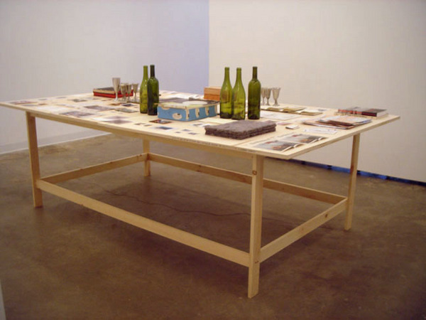
- Andrew Witkin, untitled, 1997-2007, approximately 54 groupings in assorted media on table, approximately 31 x 96 x 56 inches
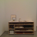
- Andrew Witkin, untitled, 1996 – two magnifying glasses, two pieces of candy, two mirrors, one present, wrapped in craft paper and sealed with drafting tape, one empty metal frame and accompanying custom-cut matboard, one pair of safety glasses, one glass jar with coins, one pencil sharpener, one spool of thread, one wine bottle, one compass, one watch, assorted unframed drawings, sketches, plans, writings and newspaper clippings, assorted pods, plastics, metals, rocks and fabrics, assorted photographs (some mounted on cintra), assorted drafting tools and supplies, a number of boxes with numerous drawings, tickets, clippings and other small papers, selected rolls of adhesive tape, several electrical diagrams, several rubbed bands, various unaltered found papers, some plumbing elements, collected found objects, baltic birch plywood and stainless steel square-head screws, stained papers, foamcore, matboard, portfolios & plexiglas, among other materials that will be altered, rearranged, added and/or removed periodically 36 x 72 x 32 inches
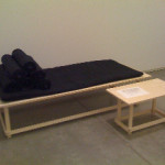
- Andrew Witkin, untitled, 1992 – twelve cotton and burlap packing blankets, baltic birch plywood, stainless steel square-head screws and ink on paper installation dimensions variable, with two elements: 1) approximately 28 x 72 x 32 inches and 2) approximately 16 x 28 x 16 inches
The Institute of Contemporary Art
"The James and Audrey Foster Prize Finalists" at the ICA is on view November 12th, 2008 - March 1st, 2009 at the ICA.
All images are courtesy of the artist and LaMontagne Gallery.

