
I have an image burned into my memory of a seafoam green floor and a pink face. I think of the 80s. Excess. Commercialism. Poor packaging. Bad design. Unflattering lighting. Shitty taste. Cultural decay. Death and meaninglessness. David Hockney’s colors scare me out of my mind.
I have always had an equally strong, but opposite, reaction to his photo collages. They are handsomely presented: each expression and gesture is presented as a discrete object, within an appropriate context. They are complex, but clean. This is not to say that Hockney’s paintings are untidy. Rather, his subjects’ skin seems to be unnaturally smooth and their clothing almost cartoon-like in its plastic perfection. His depictions of water and glass are so stylized they’re downright chilly. They are unsettling.
Having a show of portraits at the MFA means you are a Great Artist (i.e. in the tradition of Picasso, who is mentioned at intervals throughout the show so you are reminded to compare the two). And David Hockney is a great artist. He is a master drawer and painter, an accomplished photographer, a strong writer and rigorous researcher. He engages in a wide array of artistic practice, has phases and interests, and is consistent only in that he does exactly what he wishes to do at all times. Cubism, Abstract Expressionism, and Cezanne appear, but only to be played with, internalized and set aside.
Any artist worth their salt will make pieces in various styles, all variously pleasing to the people looking at them. That’s the fun of the job. But what struck me seeing this exhibition was my overwhelming need to resolve these works into a show (“Portraits”) with some meaning or unifying principle.
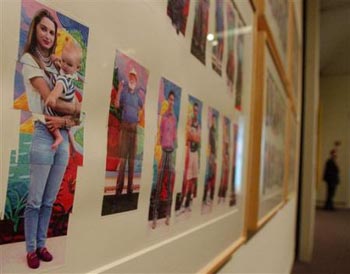
This is what I came up with. In the piece 112 LA visitors, Hockney photographs people who come to his studio. He uses several shots of each person, and then puts them together to form the whole body. How do you bring the humanity back to a place like L.A., which is really more of a dreamworld? In parts and pieces. A little at a time and always inadvertently. Hockney uses the composite to put lots of little things together to make something that is whole, more than whole, or maybe just grasping for wholeness. All of his works have this searching, groping quality in one form or another. He doesn’t have the answer and he’s just piecing it together like a puzzle he hasn’t got the picture for. He uses pairs and halves and pieces to resolve daily existence with a belief in the sublime, and an attempt to show that it exists even in the ugliest things.
Hockney’s colors are our daily existence. They are Los Angeles in all its shiny creepiness; they are mortal and flawed. He looks for something more perfectly beautiful in the infinite moment of his collages and the technical perfection of his camera lucida drawings. Those colors have no place in these works, which are disconnected from the daily reality. They float above it.
-
I’m uncomfortable with this set of conclusions because I needed them. Criticism is weirdly self-conscious art form in which you (theoretically) become a conduit for meaning and when it came to this I found myself stretching for something that probably doesn’t exist. After all, it may just be a question of taste. I’m sure I’m not the only person horrified by the color seafoam.
Links:
Top image found here
Middle image found here
Bottom image found here
"David Hockney: Portraits" is on view until May 14th at the Museum of Fine Arts.
-
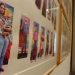
- David Hockney, 112 L.A. Visitors, Photo Collage, 1990-91.
-
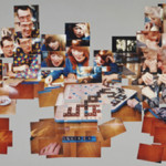
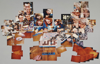
- David Hockney, The Scrabble Game, Photo Collage, January 1, 1983.
-
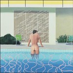
- David Hockney, Peter Getting Out of Nick’s Pool, Oil on Canvas, 1966.


