
By KAREN S. FEGLEY
Located in the central lobby of South Boston’s Distillery complex of artists’ live/work spaces and small businesses—is a rough-and-tumble sort of place, a white-painted room with utility pipes, metal diamond-plate entry ramps, industrial lamps; a space where the door to the freight elevator is built into one wall with the entry to a woodworking shop in another. And yet it might be just the right sort of place for a “face-off” between two traditional modes of photography. Black & White vs. Color is a mock competition between two teams of photographers, one presenting black & white photographs and the other exhibiting color work at the Distillery Gallery.
The debate among photographers—professional and amateur—and critics about the relative merits of black & white or color photography has continued for decades. In a nutshell, black and white photographs look artistic; in a polychromatic world, color photographs look more realistic. The split originates in pre-digital times. Photography, initially monochromatic, was an innovation in and of itself, but a differentiation occurred mid-twentieth century with simplified color technology that prospered in a post-war culture, forcing a differentiation amongst practitioners and public alike.
Many photographers, however, continued to work in black & white, at least in part because it was a simpler technology, one that was easier to control from start to finish without the services of an expensive professional laboratory. This encouraged a “stick with the basics” purity of mind and process. Another factor in the split was film. When faced with the necessity of buying, stocking, and loading two different types of film, it was simpler and less expensive to focus on a single technology (though some professionals routinely used two cameras, one loaded with black & white film and the other with color film). While the digital revolution has made both modes accessible within a single camera—digital black & white is, after all, digital color stripped of its hues—and professional-quality desktop printers have moved processing out of the lab and into the office, the split remains.
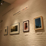
Each Black & White vs. Color team is made up with a Distillery resident and a guest photographer. Team Black & White includes long-time Distillery resident Walter Crump, originally a painter and printmaker, but now known primarily for his work with pinhole cameras of his own construction. His photographs for this show—a mix of toned and bleached pinhole and gelatin silver—are contemporary creations that carry the feel of the past. Crump’s teammate, John Hyde, works almost exclusively in black and white. He has also experimented with more eclectic cameras, but for this contest he has concentrated on a traditional technique and style, small gelatin silver prints (7” x 7”).
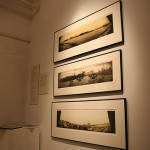
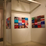
Team Color includes Distillery resident Jim Siegel and guest Mary Flatley. Siegel, a student of the abstract, has a special interest in the small, subtle, not immediately recognizable details of everyday objects. His contribution to the competition is a series of three large assemblages that he calls “photo grids,” each composed of 16 unique rectangular color prints mounted on black foamcore in a 4x4 grid, and a single smaller color photograph. His teammate Flatley, who uses a more traditional color photographic process, is showing a set of inkjet archival prints that chronicle one particular aspect of the United States: the part of America that lies outside the mega-urban context, with its unpredictable juxtapositions of the weird and the wonderful, the odd and the ordinary.
On opening night, gallery visitors were encouraged to vote for their favorite team and for the MVP. According to Scott Chasse, an artist and the gallery manager, 50 to 60 guests participated in the vote. (The results? See below*.) The show has some rough edges, yet it is lovingly presented and worth seeing for some of its gems.
For example, Punxsutawny, PA, Flatley's woman with braids, wears an aqua and white plush jacket and a hood bearing the label Endangered Species. John Hyde’s Holly, a nude woman, is viewed from the waist up, watching flares of sunlight on a wall. Walter Crump's intriguing “antique” works, with their distorted perspectives, atmospheric blurring, and yellowed and sepia tones complement well. One photograph in particular caught my eye - Laili Laili, in which the face of a woman appears in an irregular, roughly rectangular open space in the center of the photograph. Her face fills the opening; the border appears scraped and scratched as if it were an ancient, worn, silvered mirror. Is this the reflection of a woman looking into the mirror, or is she trapped in the mirror and looking out at us?
The exhibition is also worth a visit for its proposed broader message. Western convention has pitched us into a system of arbitrary binaries (liberal vs. conservative, town vs. gown, cat-lover vs. dog-lover, neatnik vs. slob) that we still abide even in spite of the post-modernity we were supposed to have inhabited and put aside by now. This proclivity is evident from the broadest societal levels to the smallest tribes. Even art has its competing tribes, black & white vs. color being only two of many. Abstraction vs. Realism, Formalism vs. Conceptual Art, painting vs. photography, fine art versus craft—all have generated reams of dispute and hours of argument. Also, we have a penchant for considering any point of view that is different from our own as inherently inferior. Perhaps this exhibition is telling us that it’s time to get over ourselves, to evaluate based on communication rather than on conformity to our own point of view.
*(And yet this was a competition, if only in jest. The results? Scott Chasse, the gallery manager, reported that Team Color won by a landslide and the MVP was Mary Flatley.)
-
- Head to head: Mary Flatley and John Hyde
-
- Installation shot of work by Walter Crump
-
- And in this corner: Jim Siegel
The Distillery Gallery
The Distillery Gallery - flickr
"Black & White vs. Color" is on view until April 17th at the Distillery Gallery, located at 516 East Second St., South Boston.
All images are courtesy of the artists and the Distillery Gallery


