
The CMCA, Rockport's Center for Maine Contemporary Art, is doing something right. Its Biennial, which closes next Wednesday after a 2 month run, showcases the work of 17 artists who live and work, at least part-time, in the State of Maine. At 60, the Center seems to have taken a swig from the fountain of youth.
When it comes to art, Rockport, a charming small town on the Midcoast, has to contend with the same stereotypes and preconceptions as many a New England destination. Absent from the white post-and-beam structure were the craggy shoreline landscapes, sun-lit sailboats and lobster-buoys one associates with the region. There is nothing inherently wrong with that picture—as someone with ties to Maine, I can attest that there are plenty of such landscapes to be witnessed, and that their weathered beauty and salty starkness easily moves one to paint and photograph—it is but one facet of a place, whose inhabitants and artists have far more diversity of temperament, influence and interest than many exhibitions have allowed. The work on view possesses the formal maturity and inquisitiveness anticipated in contemporary practices, regardless of where they occur.
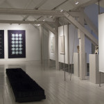
Adding to the challenge of curating a cogent show is the biennial format itself. Frequently, the temptation in these surveys is to include as many artists as possible, reflecting the range and diversity of a population. Not only does that approach lead to confusing juxtapositions, it rarely does justice to any of the exhibiting artists, who are represented by one or two lone works extracted from a life's effort. In this instance, the curators Suzette McAvoy and Daphne Anderson Deeds ignored the tendency, selecting a smaller group of artists in order to accord more space to the work of each participant, and shuffling up the work rather than committing each name to a section of gallery real-estate. Seven artists were invited and 10 others picked from a pool of 415 submissions. I'd be hard pressed to guess which are which.
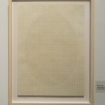
 Kate Russo
Typical Me, 2012
Colored pencil on graph paper
Certainly, the work isn't somber. It is perhaps pensive. Subdued. Contained. No piece vaingloriously overwhelms its neighbor. Each quietly but firmly holds its ground. Every single one of the artists was new to me. Names that I committed to memory instantly were those of Kate Russo, Jonathan Mess, Luc Demers, Benjamin Potter and Robin Mandel, though I was drawn in by the work of many others, returning to look again several times (partly out of the sheer excitement of seeing so much thoughtful art gathered in a single space.)
Kate Russo uses the structure of graph paper to create patterns reminiscent of traditional ginghams, but possessing the same method, precision and understanding of tone as Sol Lewitt's early colored-pencil wall drawings. Their muted modesty is shifted entirely aside when you catch sight of Russo's titles. Each drawing hides within it oval shapes, and the number of shapes leads to associative wordplay: a grid of 9 ovals is titled The Line-Up, a combination of 5 is called The Band, the single oval is named Typical Me—which rang in my ears with Morrissey's plaintive sarcasm. Here is a perfect example of how allowing an artist the room to unfurl can turn a discreet wallflower into a show-stopper.
 Jonathan Mess
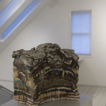
Landfill #16: Northern Cross Section, 2012
Various clays, glazes and stains. 50% recycled
12" x 13" x 3"
Across from Russo, slabs of accumulated sediment and glaze cracked at their blackened seams. Jonathan Mess combines clays and recycled materials to create his sculptural cross-sectioned Landfills. The palette and texture of these pieces, their heft, density and proportion, their fictional geologies, were magnetic to me. Creating an aesthetic mass from waste and matter brings to mind the strata of accumulated trash that have formed the foundation of so many of our cities, or the more modest archaeology of household dumps, full of broken crockery and glass medicine bottles unearthed when seeding the vegetable garden. Between the layers of silty stuff came the ooze of the man-made: colors as un-natural as Velveeta and marshmallow.
Luc Demers's Darkened Rooms exert a similar draw on the eye, through their use of line, contrast and shape. Here too much is left to the imagination, where the rooms are confined to shadow. Demers's work feels staged, in some cases for a loosely narrative purpose when the contrast between light and dark gives each opening an aura, practically a halo; in others, the observation is of shape, shading, repetition, geometry. Depending on the setting revealed by the little light allowed, the rooms are sexy, haunted, neurotic, embittered, serene, lonely, timeless, almost as though it takes darkness to uncover their true nature and histories.
The challenge of reviewing large group shows is always to devote enough attention to the artists. This article cannot possibly do them all justice, so I'll take a leaf from the curators' book and, rather than going wide, will finish it with one last focus, in the hope that you'll take the time to look at all of the included works via the websites below.
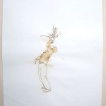
 Benjamin Potter
Hungry, 2012
Milk on paper 18"x15"
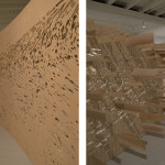
Benjamin Potter exhibited both sculpture and drawing. His drawings are done with milk, which as it ages turns a burnt sienna and, one imagines, emits an curdled, sour smell. This organic patina builds up in the center of the paper, so that the characters and objects hover on their ground. The earthy tones suit the subject matter: people bundled in loose coats, hats, scarves, hoodies or ski-masks, performing simple gestures and daily activities, or just living, or just feeling what it is to live, to be hungry, to be cold, to put an arm around someone.
Next to them, occupying the main space as you enter the CMCA, stand 2 standard size 4x8 feet sheets of plywood that have been die-cut, repeatedly sliced on the back side and shimmed into curves. The natural color of the wood matches that of the drawings. Here the negative space of the die-cut maps out terrain—it could be the place the milk characters inhabit, but for the title Foam. I was drawn to the theatrical flatness of these landscapes, contrasted to the bare-bones strategy of shoving shims into cracks to give them dimension.
There are only very few days left to see this exhibition, but I encourage you to visit it and discover, as I did, the many hidden talents at work these days in Maine. If for nothing else, do it for the work I didn't cover here, which includes videos by Robin Mandel and, as a bonus alongside the Biennial, an installation by veteran sound artist Joel Chadabe.
The CMCA Biennial Exhibition ran from September 29th to December 2nd, 2012
162 Russell Avenue, Rockport, ME 04856
cmcanow.org
Exhibited artists:
Tom Butler, Rockland, ME
Kenny Cole, Monroe, ME
Grace DeGennaro, Yarmouth, ME
Luc Demers, Portland, ME
Lauren Fensterstock, Portland, ME
Cassie Jones, Brunswick, ME
Lisa Kellner, Rangeley, ME and Hanover, VA
Lynda Litchfield, Cape Elizabeth, ME
Robin Mandel, Cushing, ME
James B. Marshall, Brunswick, ME
Jonathan Mess, Jefferson, ME
Benjamin Potter, Belfast, ME
Kate Russo, Rockland, ME
Aaron Stephan, Portland, ME
David Stess, Cherryfield, ME and New York, NY
Katharine "Kitty" Wales, Vinalhaven, ME and Boston, MA
Erik Weisenburger, South Portland, ME
-
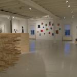
- Lower Gallery at the CMCA Benjamin Potter (foreground)
-
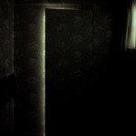
- Luc Demers Powder Room, 2010 Color photograph
-
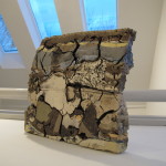
- Jonathan Mess Landfill #16: Northern Cross Section, 2012 Various clays, glazes and stains. 50% recycled 12″ x 13″ x 3″
-
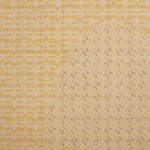
- Kate Russo (detail) Colored pencil on graph paper
-
- Benjamin Potter Foam, 2012 Wood (low angle view)
-
- Jonathan Mess Unearth, 2008 Various clays, glazes and stains, 50% recycled 20″ x 22″ x 12″
-
- Upper gallery at the CMCA Lauren Fensterstock (sculpture in foreground) Grace DeGennaro (background)
-
- Benjamin Potter Hungry, 2012 Milk on paper 18″x15″


