.................................................................................................
Avram Finkelstein: I’d like to speak today about deploying queer codes in the public sphere—in particular the two collective endeavors the Silence=Death project and Gran Fury. As the only member of both collectives I’d like to consider two of the best-known works from each of these collectives and describe some of the differences in how the two collectives constituted themselves and operated. I choose this comparison because they represent divergent tales of queer collectivity and they reference questions of visibility, access, authorship, image, and valuation—in short, late-stage American capitalism.
If you’ve seen the show downstairs, you already know that I’m a red-diaper-baby. The Rosenbergs came to the utopian colony we summered at, my folks met at an International Workers Order summer camp, my brother gave me a copy of Mao’s [Little] Red Book when I entered middle school, and my grandmother came to anti-war marches with me. When I was sixteen I stuffed envelopes for the Poor People’s Campaign, when I was seventeen I canvassed for the Student Mobilization Committee against the war in Vietnam, and my first job was silkscreening strike T-shirts.
So I came from a very political-left background, but regardless, to be young in the late sixties was to be political anyway. It was a very political moment. And growing up in New York, the East and West villages in New York were papered with manifestos, with meeting announcements, with demonstration flyers. When young people needed to communicate with each other we used the streets. . .
In 1981 the first man I loved started to show signs of immunosuppression before AIDS even had its name. By 1984 he was dead, before Rock Hudson was outed by the disease and died, before Reagan ever uttered the word—it was a time you could feel most alone. So I started a consciousness-raising group with a few of my friends in late-1985, we met every week for support during that terrible moment. Two of us had leftist backgrounds, one of us was raised in a lesbian household, four of us had a history of political engagement, and the group was loosely organized around the feminist principles of consciousness-raising. We began each week by talking about our fears and anxieties—whether we would meet anyone, whether we would die, would we ever have sex again—but by the end of every evening we found ourselves talking about the political crisis that we saw forming around AIDS. I realized shortly after that that we weren’t the only ones who saw it. Then I remembered that when New Yorkers need to talk to one another there’s always the street. So I proposed that we do a poster.
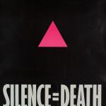
The primary objective of the Silence=Death poster was two-fold. I wanted it to prompt the community to organize around the political issues surrounding AIDS but I wanted it to also imply to people outside of that community that we already were organized. In order to speak simultaneously to these multiple audiences, the poster would need to be densely coded. And in order to prompt an activist response, which is what the objective was, we decided to draw on the same strategies that were employed in the selling of everything else in America—that is the language of desire.
The poster needed to be cool, it needed to intone knowing, it needed to be both rarified and vernacular at the same time, it needed to create the impression of ubiquity, and it needed to insinuate itself into being. In short, it needed to be advertising.
It took six months to design Silence=Death. We put the posters to bed in 1986. We started wheat pasting it in February of 1987, just weeks before the formation of ACT UP. As I said before, we hoped that the poster might stimulate some kind of collective action, but we were unprepared for what was actually coming. In a way, ACT UP was the response I dreamed about, but it was more than I had actually hoped for.
We decided at that juncture to open our collective to include ACT UP without actually letting ACT UP know that that was what we were doing and surrendered the use of this image to [them]. It turns out to be an exercise in coalition work that I think is noteworthy. I feel like we may have designed Silence=Death, but ACT UP actually created it; at least as we now understand it. If ACT UP hadn’t come along during that short window that the poster was up. . . the poster could have come and gone in the night and no one would have ever heard about it. The fact that it managed to give voice to a community is the essential truth of this poster that I believe to be its worth. I feel that it’s important to spell that out because it’s one thing to look at a poster or read about it in a book and be told that this was a very significant work, but without context you really have no way of understanding how that might be.
In particular, to harken back to an earlier conversation about the dual audiences that we were addressing with this poster, this image of the poster is how it eventually became to be seen, but in its original context on the street there were two running lines of modifying text that talked about the political, social, economic, religious questions that were coming to bear and they were all staged in an interrogative fashion so that it drew the audience in. "Why is Reagan silent about AIDS?" "What is really going on at the FDA?. . . the Vatican?" It talked about various questions that were coming up that were surrounding AIDS. . . and then there was the brief declarative line at the bottom of the poster "Turn anger, fear and grief into action." It suggested what some of those actions might be: boycotts, voting, etc.
When I talk about it deploying queer codes, the pink triangle is of course a reference to the Nazi concentration camps. When we were crafting this poster (as I said, it took us six months to design and we went through many images and ideas before we arrived at this set of images) we realized that in order to signal to the lesbian and gay community we were addressing we would need some sort of agreed-on symbol and we hated all of the visual reference points. The rainbow flag didn’t appear to have the gravitas that we were looking for. The labrys was lesbian-specific. The lambda had class intonations and we actually rejected the pink triangle because of its victim intonations. We even toyed with the idea of creating a new symbol for the lesbian and gay community but we realized that would be a separate campaign and that would take another couple of years and there just wasn’t time for that. And so we just turned the [pink]triangle upside-down, which ended up being controversial.
This poster was wheat pasted alongside movie posters and fashion posters by professional wheat pasters. In NYC you can’t just put posters up on the street. If you’re in a turf that’s already papered by one or two companies—snipers—then they will paper over them. If you’re in someone else’s turf then yours get papered over. If you pay [the wheat pasting companies]they guarantee that if someone else papers over yours that they’ll replace yours. So we purposefully chose this context so that we could be seen as an official voice or that we were appropriating the voice of authority.
The choice of the black background of the poster helped to find that neutral space within the urban context and to help zero the viewer in on very provocative messages. And then the modifying text, once you were drawn in, conveyed the message we were hoping to deliver. I should also say that this poster was meant to be the first in a series of posters that would call for increasingly radical responses leading to riots during the 1988 presidential election. So we were working anonymously.
ACT UP was more than I hoped for, so we decided to open our consciousness-raising collective to them and surrender its use to the group. We provided posters for the second and third demonstrations, proposed and paid for the first run of buttons, ushered their sticker and T-shirt projects through to propel the image’s ubiquity. We joined the outreach, fundraising, coordinating and logistics committees and became fully integrated into the organization’s collective activity.
As an aside, we were advised by an attorney that if we didn’t copyright the image someone else could and could prevent ACT UP from using it. So we did. We copyrighted it and we never prevented any use of it, not even by an anti-abortion group that appropriated it. It was our train of thought that as a consciousness-raising project, in order for something to stimulate thought and raise political consciousness it had to be part of our vocabulary. And it didn’t matter so much how so long as you were calling to question on various levels what the image or text was asking you to think about. It was used by Keith Haring; Warner Brothers used it in the opening demonstration scene of The Pelican Brief; U2 used it in a video. I got a letter from someone in Austin that some boot-maker there had made a boot with it and that I should send a cease and desist. We never did send a cease and desist, again, because the point was its usage and not its ownership or the context in which the image would be seen.
When curator Bill Olander from the New Museum saw Silence=Death he decided to offer the windows at the New Museum to ACT UP. I organized the ACT UP committee that worked on that project and out of it Gran Fury formed. Although Gran Fury prefers not to be referred to this way, it would not be unfair to say it constituted itself as an art collective. We had eleven members that had varying histories of political engagement, it formed around a museum project, over half of its members were artists, a minority of its members worked on ACT UP committees around issues or operations, and most of the work was funded by art sources. Our legacy has been documented within academia and we have work in the permanent collections of the New Museum, MoMA, and the Whitney. The collective began as an open committee within ACT UP but soon afterwards found it too difficult to work and finalize projects as an open committee and decided to become a closed collective. So within this context I wanted to consider one particular work by Gran Fury—it’s a piece that [was]on display at the ICA [in This Will Have Been]called Kissing Doesn’t Kill—and give you a sense of context for this work.
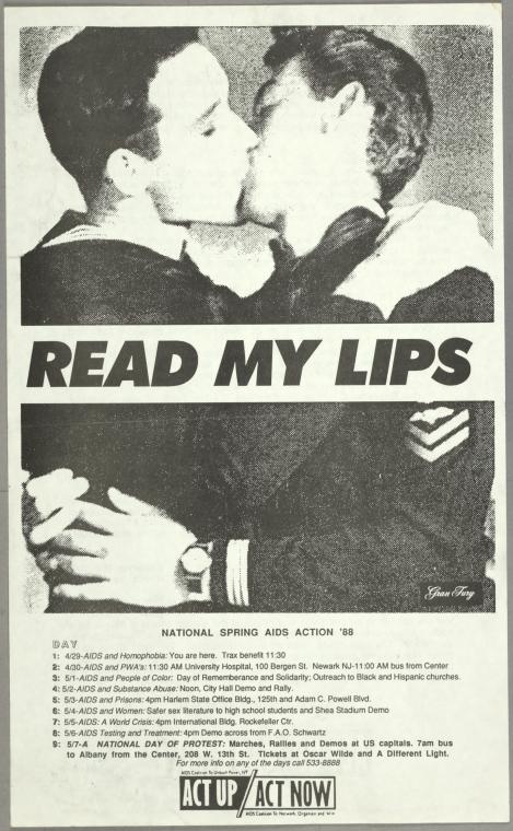
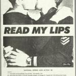
Shortly after Gran Fury formed, ACT UP needed a poster for a demonstration about AIDS and homophobia. One of our members suggested recycling a line that George Bush Sr. was using in his stump speech "Read my lips: No new taxes." We saw an opportunity and the power of the image we crafted was fairly hard to argue with. We combined a found archival image of two men kissing from a soft-core porn magazine from the fifties with this text. Tom Kalin, a member of the collective whose brainchild this poster was, had studied with Barbara Kruger. And it was part of Gran Fury’s practice to hold everyone’s feet to the fire, so we lifted Barbara Kruger’s font. We wanted to put other artists into positions where they would have to consider what their response would be in the context of the AIDS crisis. We stole pictures from Annie Leibovitz that we published in ArtForum, and it was snotty, but not without reason.
The poster brought us a lot of attention and it quickly came to symbolize a growing queer nationalism, which is a piece of the story of this moment. But we got sucked inadvertently into a larger debate. It’s kind of hard to imagine in the post-gay twenty-first century but images of queers kissing were earth-shattering at that point in our culture, while it was grappling with the question of queerness superimposed as it was over the question of AIDS. These images brought down networks, careers, and triggered boycotts.
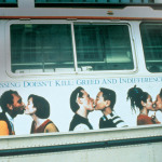
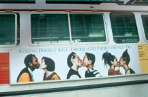
Almost immediately we were offered our first public commission as a result. We decided to expand on the themes of homophobia and also to take on the question of saliva transmissibility of HIV, which was hugely controversial at the time. Nobody knew how AIDS was actually spread. Even within the AIDS community there were huge debates over whether kissing was infectious. So we conceived of this work, Kissing Doesn’t Kill, as a challenge to the borderless imagined utopia of the then-ubiquitous Benetton ads. Again, a throw-down this time with the fashion house over what political engagement might actually look like, at least as we imagined it. Benetton was like Starbucks. Literally there would be two or three of them every few blocks—they were everywhere. They had this ad campaign that imagined one world in a boundaryless shared experience where there was no race or gender. We wanted to push that point and created Kissing Doesn’t Kill, appropriating their visual vernacular.
In our first meeting with the arts-funding partner who had approached us about this [commission]we were asked to remove the phrase "Corporate greed" from the work because they were seeking pharmaceutical money to fund the project. I’m pretty sure I lunged across the table at them during the meeting and there was a lot debate in the collective but we decided to proceed with it anyway. This is how the piece appeared on bus sides throughout the country. We struck a deal with the arts-funder for this content modification—they would pay for a run of posters, it would be a fundraiser for ACT UP that included the original tagline "Corporate greed, government inaction, and public indifference makes AIDS a political crisis." In a way, it almost doesn’t make sense without it. That situating text, that rejoinder, is so essential. So I feel like this work became unnecessarily cryptic as a result of this modification and one of the issues I have with regard to art in institutional settings is that it rarifies it. The questions of class—who gets to look at the work, how we think about the work, how much education you have to have in order to understand it—all of those questions that exist in a gallery setting. I feel like the point of the public sphere is to circumnavigate that. You’re in a public space, so you need to be less coded and less cryptic. So it was censored but it didn’t seem to inhibit the bite of this work and we were unprepared for some of the things that would happen when it hit that public sphere.
I just happened to be in San Francisco visiting a dying friend when the first public viewing of this work was mounted [on the sides of busses]. I happened to be on a street corner with a camera when a bus rolled by and took a picture. In the tradition of feminist interventions into advertising space. . . if you haven’t read Jill Posner’s Spray It Loud, it gives you a sense of how in the UK there was a string of that [graffiti]prior to this point. Lesbian activists had apparently, I’m just guessing, [used white to]spray-paint out the non-lesbian couples [in the Kissing Doesn’t Kill poster].
In Chicago, the converse response. The Illinois state legislature attempted to pass a law making it illegal to depict same-sex couples kissing on public transportation, which we came to affectionately refer to as "The Gran Fury Law." There was a tremendous amount of anguish in particular over the black male kissing the white woman question because it intoned that black men were spreading AIDS to white women. But it was also homophobia—there was no way out of that—that led to this obliteration. I sort of feel that toggling between the two, the black-out and the white-out and the equal levels of obliteration articulates how we mitigate information in the public sphere and how the audience has the opportunity to layer their own meanings onto it... That is one of the most interesting things about the public sphere in my estimation; something that I feel is frequently missing from gallery settings, which is why I was so thrilled by it. We used to go around New York and photograph graffiti on our posters as a way of absorbing this kind of dialogue.
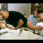
When Benetton saw the stir that Kissing Doesn’t Kill caused they approached us about doing a campaign for them. And we declined. This is that ad that they came up with on their own which was hugely controversial and in a way that we felt uncomfortable with. So here is another way in which dialogue in the public sphere can spin out of control, in much the same way that Silence=Death was appropriated by that anti-abortion group, which we did not feel comfortable with. Benetton decided to create this beatific rendering of the AIDS "victim." But it’s the time in America there was a huge resistance in the AIDS community to depicting people as victims; it was a self-empowerment movement.
I’d like to offer an observation that might guide you when considering this material and put some meat on the bones as to what was happening in the moment. Even in the earliest of moments of AIDS, within its swirling vortex, the outlines of its cultural meanings were detectable. Playing out as it did in the public sphere was impossible to overlook. Assumptions about it formed quickly in our shared spaces and almost immediately began to crystallize into a canon. I felt very ambivalent about participating in the historicization of this moment because what happens is that once we begin to think that something is being done about [an issue]we start to put our feet up. There’s a distancing that happens when you’re told that there’s a response. You start to think that something’s being done so maybe it’s all going to be okay. And I felt like as long as people were dying it was politically retrograde to participate in its historicization and as a consequence there was a tremendous amount of tension in Gran Fury about these questions—who was funding us, whether we would work inside of galleries at all (we navigated that issue by insisting that if we did a gallery show there would have to be a public component as well that was institutionally paid for or in the case of the content modifications that there would be a poster campaign that was institutionally funded as a fundraiser in resistance of that censorship).
Still, I felt it to be politically retrograde to participate in those discussions. Part of that has to do with the fact that the extent to which art can be described as a reflection of culture is in itself a gesture that superimposes a presumption of assent. So you become a part of a way of communicating that is culturally validated and you are participating in culture even if you are in resistance to it. The work of both of these collectives had potency, without doubt, but canon is one of the cultural mechanisms for diminishing radicalism and for de-fanging dissent. Canon that elevates an "art of dissent" simultaneously domesticates it, making it easier to privilege cultural production over messier and more disorderly truths, and I’m referring here to resistance.
[With my new work] I’m trying to reinsert ideas of more radical political and social responses into everyday lives, [ideas]that counter the cannon behind the small poster on the wall that you understand to be a symbol of agency. You actually get to think about what created the agency to begin with. My thesis about the Gran Fury show last year in New York is that in order to "un-domesticate" it, in order to reinvigorate the work rather than having these small, discrete posters on the wall that only had a historical sense to them, that we blow everything up to be huge wall-sized murals. So that it would approximate the social proportion of the confrontational nature of this work as it appeared in the streets. You see, same sex-couples kissing doesn’t seem radical now but we did a poster where literally people were following us around tearing them down as we put them up. I felt if we could shift the balance of viewer and work so that the work could be as confrontational—so that you’re not peering into it, it’s coming at you—it might be an approximation of how this work functioned.
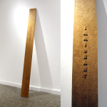
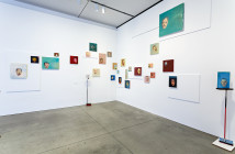
Engagement is frequently disorderly, agency can be messy, and in the case of AIDS, agency existed without any canon at all. People were sliding through our fingers like sand. If you can, please try to remember that when you’re picturing this body of work. It’s the thing that is the most difficult to explain about this moment, the social movement for this set of work, the political responses, the patient advocacy that existed. One of the pieces in the show in the Harbor Gallery is a woodcarving and it has the word "Immigrant" on it. It’s a reference to the fact that after a certain point when people asked me about the AIDS crisis and I would try to explain it to them I began to feel more and more like an immigrant trying to talk about the old country. Or in more extreme cases, like a soldier trying to explain the terrors of war. It’s impossible to convey the trauma of this moment. . . There’s basically a lost generation of people who have experienced this terrible trauma and have been suffering with an under-described PTSD.
There is a tremendous movement among young queer artists to try to piece together this missing chunk of our history. All of the people trying to reimagine the work that might have happened if these people hadn’t died or trying to connect this moment to a post-AIDS world. Grappling with the idea that there are so many less older gay men than there would have been. What does that mean to the tribe? Communities need our own touchstones, we need our social histories, we need our elders, we need the folk language of queerness, which might be the thing that’s missed in the academic vision of what being queer is. To be queer in the world is to find a place for yourself. Frequently it’s about looking for yourself, looking for your face in the public discourse. Or reading between the lines to find it.
The hardest thing to explain about this body of work is what caused it. If you can try to resist the domestication of the work and see it in some deeply personal terms, it might help you to understand it better.
Read the question and answer period that followed this lecture here.
- Headscarf, Workers No. 2 and 3, Avram Finkelstein, 2013, printed cotton, 22 x 22″ Photo: Brian Christopher Glase
- Woodcut, Avram Finkelstein, 2010, Carved cherry wood, 97 x 18″ Photo: Brian Christopher Glaser
- AIDS David Kirby, artist Oliviero Toscani for the “AIDS David Kirby” Campaign, United Colors of Benetton. Original photo by Therese Frare for LIFE Magazine
- Kissing Doesn’t Kill: Greed and Indifference Do, Gran Fury, presented first on postcards, then on NYC buses by Creative Time in 1989. Published by the Whitney Museum of American Art for AIDS Awareness Day, December 1, 1989. Photo via creativetime.tumblr.com.
- Silence=Death, ACT UP New York. Courtesy of the New York Public Library, Manuscripts and Archive Division.
- Read My Lips, Gran Fury, ACT UP New York, 1988. Courtesy of the New York Public Library, Manuscripts and Archive Division.
The preceding text is a transcript taken from an audio recording of the event and is printed with permission of the artist and Professor Areford. It was transcribed by Brian Glaser for BR&S.

