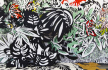
The deCordova Biennial includes twenty-one artists from all six New England states. In terms of media, it is richly diverse. Generally speaking, the work has a noticeable trend towards very strong colors and reflexively abstract compositions.
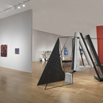
From Rachel Gross’s prints to Jilaine Jones’s sculptures, much of the work feels architectural. Both the presentation of space—even if it is abstracted—and the transformation of space seem acutely now.
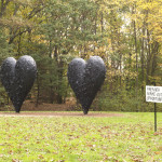
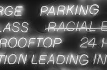
Pat Falco’s signs greet you as you enter the park. I have never really been moved by Falco’s work before, but curator Lexi Lee Sullivan has skillfully edited it. In this presentation, Falco’s work is very effective in pointing out art’s affectations and slyly raising questions about art’s presentational environments. The works are all one-liners, but now that these one-liners have been relocated, they are revealed to be more universal, and not just aphorisms taking advantage of individual moments.
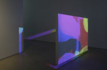
Bahar Yurukoglu’s moving installations, located in one of the smaller galleries, seems like a private solo show compared to the work in the second floor’s main gallery. This benefits the work.. If it were in the larger space, the white of the wall would dwarf the work, and it would seem like it was a framed environment instead of contiguously whole. When Yurukoglu is able to present her work as an installation, it really comes alive. This also distances her objects from a pure photographic index, and distinguishes her work from and other artists, such as Eileen Quinlan.
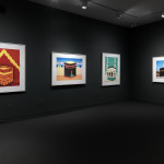
Hamra Abbas’s large-scale photographs present the Kabba as a formal mediated image, first created as miniature paintings and then photographed. In addition to playing technical tricks with size and scale, Abbas’s work questions the presentation and commemoration of a scared space. Meanwhile, J.R. Uretsky’s work tampers with what was once a private, everyday space. She disrespects an unsuspecting victim’s space and leaves behind art, an action both generous and creepy. Uretsky’s work may be the most skillfully edited in the Biennial, as it is a wider vision of her art than just one object or a tight presentation of self-similar work.
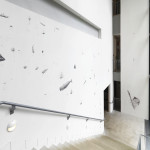
Ethan Murrow’s drawings are always detailed, and are often large, but, as he is using the cavernous staircase to present an unintelligibly large set of small drawings, this work is denied its intimacy by the architecture. The placement creates a sense of vertigo; you cannot help but see the wall’s height as larger than it is. This shouldn’t be seen as a bug in the system, but a feature. The work creates a historical myth, reflecting our relationship with the sea. History and the ocean are both big. They are vertiginous in nature.
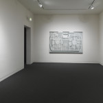
Lynne Harlow’s Rhythm…Distance takes advantage of the oversized architecture of the main gallery. It hangs over the viewer, but doesn’t collapse the room and create any feelings of claustrophobia. It seems physically light for something so large and minimalist. The sounds are subtle enough to be missed, but engaging enough to be enjoyable when you are viewing the nearby work.
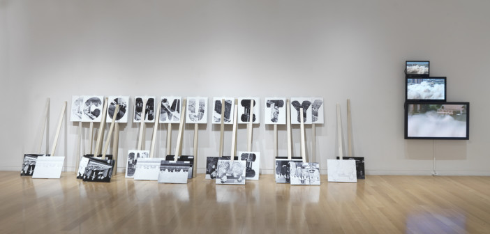
Jonathan Calm’s installation unexpectedly turns the focus on the white cube and how we distill art’s presentational environments to the bare minimum. His work exploring the legacy of cement dominated, utopian construction projects would be as comfortable in a public square as it is in a gallery, but being that it is in a gallery, we have to recognize that the space "white washes" it. Rather then being an immediate statement or protest, it is an historical document that seems rather polite in its prescribed silence. The protests and personal stories that surround the demolition of such buildings are rich and complex. The work seems somehow finite, like a book you’ve already read.
John C. Gonzalez’s Home Depot House is removed from the museum’s architecture, creating a presentation zone of its own. Engaged in Gonzalez’s social practice, it is a premeditated, inverted time clock of Gonzalez’s other work life. He is at the Home Depot House when he is not at the Home Depot. It exposes the push/pull of having a second job to support your first job. When the second job takes up more time than the first job, it gets messy, and you have to stop and consider which is the actual first job. He will be in residence on the weekends in October, creating landscape paintings and talking with visitors. Guest artists will be in residence through the run of the Biennial.
Patty Chang and David Kelley’s three-channel video Route 3 is a great addition to the show. Tackling nationalism and the flows of capitalism, as supported by large-scale building projects, this video is 90% dry, sly, and literal, and 10% comedic surprise. The three-channel perspective creates a fractured view enhancing the philosophical problems inherent in creating a new capitalist zone. Rather than being an emerging market that is hungry for multi-national brands, the Route 3 we experience is a frontier economy. It seems oblivious to current trends, moving at its own rhythm. Factually, the introduction of roads creates an economic incentive to create and grow resources that are needed globally and fall within international norms (rubber trees instead of opium is one example that is given). The comedy slips in when a moving curtain dances around the landscapes, using the new roads as an anarchic free space, external to the capitalist structure that the road propose. Where the economist sees a natural resource thoroughfare, the artist sees a roller skating rink.
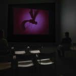
Nancy Andrews's video Behind the Eyes are the Ears strays a bit too close to surrealist tropes and is slowly repetitive. However, formally it’s very inventive and, even if it seems like it’s from another era, is an enjoyable music video. It reminds me of Mary Reid Kelley’s work, but with fewer puns. The bio-essentialism that our five senses limit us to a limited range of understanding, and the pseudo science that we can just change those limits, seems to play with rejecting the psychedelic sixties ethos of "better living through chemistry." The work is filled with collages of eyeballs and the fractured perspective of a multi-lens bug’s eye. Slowly building the metaphor that artists see that which is not shown, one of the twee songs brags "my eyes are hot mental orbs." Along with Xylor Jane’s numerological paintings, it is one of the only works that doesn’t seem to be about architecture.
- Jonathan Calm, Community (after Pruitt-Igoe Housing, St. Louis, MO), 2013. Mixed media installation, dimensions variable. Courtesy of the artist. Jonathan Calm, Scudder Towers Down (after Scudder Homes, Newark, NJ), 2013. LCD flat screen monitors and video, dimensions variable. Courtesy of the artist. Photograph by Clements Photography and Design, Boston.
- Hamra Abbas, Kaaba Pictures 3, 2013. Archival pigment print, 49 ½ x 40 inches. Courtesy of the artist and PILOT, Istanbul. Hamra Abbas, Kaaba Pictures 1, 2013. Archival pigment print, 40 1/3 x 50 ½ inches. Courtesy of the artist and PILOT, Istanbul. Hamra Abbas, Kaaba Pictures 7, 2013. Archival pigment print, 40 1/5 x 51 inches. Courtesy of the artist and PILOT, Istanbul. Hamra Abbas, Kaaba Pictures 5, 2013. Archival pigment print, 38 1/5 x 47 2/5 inches. Courtesy of the artist and PILOT, Istanbul. Photograph by Clements Photography and Design, Boston.
- Nancy Andrews, Behind the Eyes are the Ears, 2010. Dimensions variable, 25 minute projected video. Courtesy of the artist. Photograph by Clements Photography and Design, Boston.
- Pat Falco, Untitled Sign Installations, 2013. Enamel on wood, dimensions variable. Courtesy of the artist. Photograph by Clements Photography and Design, Boston.
- Ethan Murrow, Flotilla, 2013. Ballpoint pen, dimensions variable. Courtesy of the artist. Photograph by Clements Photography and Design, Boston.
- Anthony Palocci Jr., Empty Fridge, 2012. Oil on canvas, 20 X 16 inches. Courtesy of the artist. Anthony Palocci Jr., Window Fan, 2013. Oil on canvas. Courtesy of the artist. Anthony Palocci Jr., Knob, 2012. Oil on canvas, 12 X 8 inches. Courtesy of the artist. Anthony Palocci Jr., Cap, 2013. Oil on canvas. Courtesy of the artist. Photograph by Clements Photography and Design, Boston.
- J.R. Uretsky, Aggressive Love Project: McMillan Family, 2011. Video (5 min) and mixed media sculpture. Courtesy of the artist and the McMillan Family. J.R. Uretsky, Aggressive Love Project: Nina Gara Bozicnik, 2013. Video (7 min. 33 sec) and mixed media sculpture. Courtesy of the artist and Nina Gara Bozicnik. J.R. Uretsky, Aggressive Love Project: Dina Deitsch, 2013. Video (15 min. 3 sec) and mixed media sculpture. Courtesy of the artist and Dina Deitsch. Photograph by Clements Photography and Design, Boston.
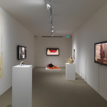
- Installation view of The 2013 deCordova Biennial. Photograph by Clements Photography and Design, Boston.

