It’s now an old story—art fairs contribute to globally homogenized tastes in art. Galleries travel around the world and bring their artists with them, so the same aesthetics start appearing in museums and collections everywhere. But what if the art fairs’ venues promote the homogenization of artworks? We wander in corridors of cubicles; galleries can only display small samplings of art in each. Our attention blurs and we zone out—"zombie distraction." Might these conditions, both external and internal, engender a blandness in the art we are expecting, or able, to see?
For Boston gallerist Camilo Alvarez of Samsøn Projects, these exact circumstances make art fairs into an excellent, timely challenge. He noted that the visual experience of any artwork at the fair will mix with all kinds of rapid sensory input—"interruptions, and videos, and seeing a friend, and the smells from the kitchen" of the on-site pizza counter or gourmet café. Because the art fair "synthesizes exactly how manic and crazy the world is," Alvarez points out, it is a very "useful condition" for seeing artwork at this historical moment. In other words, if gallerists can make art stand out from the blur of the fair, that art is more likely to succeed in gaining a place amidst the frenzy of any potential buyer’s life.
As I toured the art fairs during Armory Arts Week in Manhattan in early March, the work that stood out tended to engage creatively with its surroundings. Site-responsive installations could be deliberate, as when Boston’s Steven Zevitas Gallery secreted a fun-house immersive labyrinth of Franklin Evans’s day-glo collages behind a more formally modernist area of Ann Pibal paintings. Or they could be unwitting, as in the several galleries showing black-and-white photography at one fair: the work’s palette sizzled nicely in conversation with the venue’s grey carpet.
Altogether, as I analyzed the architecture and interior design of nine art fairs, I realized that the homogenization of viewing is not their hallmark, even if exhaustion is their result. Each fair had a unique set of conditions to which the gallery installations could respond, and for visitors, design details gave each fair its own flavor.
The Armory Show was one of the only fairs that didn’t hype its layout as alternative, but that makes sense because it’s the venerable ur-fair—the "satellite fairs" revolve around it and define themselves against it. The twin exhibition areas of Piers 92 and 94 were connected by a rickety, open-air stairway of thin metal, visible from the floor of the Contemporary wing (Pier 94). Its surprisingly ramshackle vibe continued throughout Pier 94, where the carpet was thin and visitors lamented the uneven heating. An Armory Contemporary visitor can see all the way down that pier’s long, main walkway; one must breathe deeply and resolve to "Dive in!" Edgier galleries had small booths at the far end, where an oblique angle in the floor plan matched their offbeat sensibilities.
At Pier 92, upstairs, thicker carpets and lower ceilings contained the crowd’s chaos more effectively, contextualizing generally older works with basic elegance. The Modern pier’s corridors were also broken up by short walls in unexpected places: the circulation felt like a labyrinthine crafts bazaar compared to the Contemporary’s faster-moving, product merchandising display hall. Yet both piers of this largest fair concretized internet consciousness. Galleries tended to hang many artists’ work at once, and I found that I saw totally new work whenever I walked along any corridor in the opposite direction.
This year, both of these piers were much busier than VOLTA, next door at Pier 90. Was this a function of the site’s design? Though VOLTA’s architectural structure resembled that of the Armory Show, its interior design felt more upscale, albeit nouveau riche. Corridors were so wide that visitors’ engagement with the work dissipated, sinking into the dark carpet. Sunlight through large walls of windows only sometimes brightened the atmosphere. In window areas, booths were built away from the walls and some artworks faced outward; I saw almost no one touring these "outer banks."
While attendance numbers were up this year at VOLTA, one couldn’t sense it. In past years, venues on 34th Street (where the design felt more like a mix of Pulse and Scope—see below) and in SoHo had more bustling energy. Zevitas said that the SoHo site’s design had made him refrain from participating during those years, when only the main level of the fair’s multiple floors was getting good traffic. He returned for this year’s one-floor set-up, and for the fair’s location next to its Armory Show partner fair, but I didn’t see many people going from one to the other. Was it fatigue or a lack of signage? In previous years, visitors exiting the Armory Show would see an intriguing line of people, and then a free van with VOLTA emblazoned on it would whisk the group directly to other location. Surely VOLTA could be more visible in this location.
The limit of one (or two) artist(s) shown per booth promises that VOLTA won’t be as dizzying as the Armory Show, yet in this new venue the constraint worked with the corridors to compound a draining of the concentration. Instead of creating distilled focus, it felt like a slow Boston Duck Tour. While the shorter pier length made the fair less overwhelming than the Armory piers, this layout was not visibly clear from the entrance, which is overshadowed by a second-floor conference area. It’s like entering through the docked nose of a floating 747.
The design features of the now-familiar pier played out differently at the new Art On Paper fair, on the east side of Manhattan. The high-ceilinged architecture was abuzz with calmly engaged energy; wide corridors created not a drifting lassitude, but a casually regal promenade. Why? The gray carpet’s lighter hue brightened the space, and extremely high, brightly lit white walls enabled each booth to offer the excitement of arriving at a destination. Since the manageable layout of the not-too-long pier was always visible, visitors felt more control over their passage than at VOLTA. Several gallerists pledged their allegiance to this fair because of these design features. Here, the second-floor deck behind the entrance blocked nothing, but rather opened up the space; people at a balustrade looking over the entire fair drew the gaze upward. The see-and-be-seen crow’s nest vantage point—and nearby enormous, visitor-activated, cardboard sculptures of moving figures—created the festivity of a pool deck on a cruise ship.
The Art Show, run by the Art Dealers Association of America (ADAA) at the historic Upper East Side Armory building on Park Avenue, took other VOLTA features in new directions. The carpet here was also plush, but never crunchy—its deep pile mirrored the luxury of the richly stained wood in the walls’ ornate carvings. The carpet did not necessarily extend into the booths; many galleries installed their own flooring and even wall treatments, to create not just destinations but separate universes. The effect could be mind-blowing. In one gallery, rows of vitrines had visitors constantly looking down at small works by Wade Guyton, while in another, flagstones underfoot and textured stucco on the walls created a breezy, Mediterranean-inflected patio for works by Cy Twombly and Brice Marden (who have worked in Italy and Greece). A cornice across the top of each booth furthered the self-enclosed illusion by containing the interior space, and galleries’ names were not visible from within this enclosure. Lighting defined and sealed each "stage set" from the darkened expanse above, so that entering a booth felt like a commitment, a Mary Poppins moment of jumping into the sidewalk’s fantasy land.
At this Ritz-Carlton of art fairs, fittingly, many galleries showed established artists from diverse eras and cultures. To see younger, up-and-coming artists, the Pulse and Scope fairs were better bets. Their floor plans were more square than rectangular, making them feel more like rabbit warrens. An absence of carpets made everything move faster, and the light grey floors at both reflected the ample light to brighten booths and spirits. These lights were hanging from exposed white metal trusses; showing the mechanics of the system gave these fairs a DIY, maker-fair mentality. This approach was made literal by an art shipping company that created a booth interior from packing cardboard and duct tape, fashioning an ersatz Mondrian, which I happened to see on the painter’s 143rd birthday.
Pulse felt more conventional than Scope, the oldest of the satellite fairs, but ‘aged’ does not have to mean ‘stale.’ Scope had the most global and diverse array of artworks, and this looked both deliberate and successful. One gallerist from Tokyo reported that the fair’s curators had a lot of input into the fair’s composition; they even worked directly with gallerists during installation to shape the presentations. Social injustice was one of the fair’s twin foci; the other was emerging galleries. These were called "Breeder" galleries, and their variety created a dynamic vibe, as did the low ceilings, which were painted white. Strong lighting bounced off of these surfaces, and off of the slick, light grey flooring, adding brightness and making the excitement ricochet and build. This fair was the fastest moving, in part because of the mazes of walls and booths of all sizes and configurations on its two small floors. Scope’s website claimed that in the "open-plan design...galleries will no longer be divided into small booths, but rather, flow beautifully into one another," but the effect was not of beautiful flow, but of bewitching surprise.
Two new art fairs, THE(un)SCENE and the "curator-driven" SPRING/BREAK, showcased underground, local, and student art scenes, and their design features offered the most radical alternatives to the Armory Show. The Spring/Break fair took over two derelict floors at one end of the central Post Office building on Eighth Avenue. Who knew that all this space existed? A band played in a lounge area, while other rooms of all sizes served as individually curated exhibitions. Most rooms had 1970s-style faux wood paneling and wall-to-wall carpeting of probably the same vintage; artworks often had a hard time competing with these surroundings.
The most successful spaces had thoroughly overtaken their environments; one curator painted all the walls black, and another sat within his own elaborate installation of junk and lighting. These spaces were impressive, as was a video projection onto hanging strips, whose soundtrack and geometric patterns resembled a sentimental Ryoji Ikeda work. The Bruce High Quality Foundation University’s space was unexpectedly and unfortunately underwhelming—the trash, strewn liberally, and the people hanging out, chatting sagely about the art market and Marxist theory, felt like a college dorm room, during Spring Break.
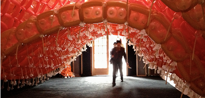
THE(un)SCENE, the only art fair with no entrance fee, was also the only one to break completely from the genre’s design norms. This was clearly part of the fair’s mission; its website begins by claiming that THE(un)SCENE "contrasts the maze of cookie-cutter, white-walled art fairs. . . in an easily navigable space that is itself a work of art." Located in two large rooms behind a theater complex near the Armory piers, the fair welcomed visitors with totems of brightly colored plastics, installed like friendly sentries in a graveled entrance yard. Just inside the building, visitors had to duck under a long, arched tunnel made from hundreds of magician’s balloons. Their inner-flesh color made it feel like a birth canal or intestinal passage.
This gateway led to another world, where the dark-carpeted space had no booths. Artwork was hung on external and installed walls and in a few installation pieces. A large, simple frame suspended over the central area of the main room delineated a performance/workshop area. This skillfully defined the "stage" zone without interfering with movement through the space during un-programmed times. Other items were also hanging from the ceiling; the curators included all angles in their use of the space. While many fairs had artworks attached to the ceiling, this was the only place where it felt like visitors were consistently being encouraged to look in all directions. But I also found that I was looking in all directions for the people in charge; who was selling the work? I could only figure out who was guarding it, and who was selling the refreshments, behind a solidly built-in bar. That’s the risk of a truly open floor plan.
At last, we come to the Independent, an invitation-only fair created in 2010 by dealers who wanted to reinvent
the genre. All participants seemed happy and the fair was busy on all floors of the former Dia building on 22nd Street, in the thick of the Chelsea galleries. Galleries’ names were painted on walls’ borders, rather than posted on placards that jutted out from walls, so visitors couldn’t glance at a card and decide to skip a booth. The spaces weren’t even booths, since the floor plan was designed "to reflect the spatial and curatorial concerns of the galleries and institutions," according to the Independent’s website.
In practice, this meant that instead of defined booths, there were corners and nooks and sometimes corridors dedicated to specific galleries, publications, etc. Sightlines were everywhere, and often artworks from different institutions got juxtaposed as one space led into another. I got slightly disoriented on every floor, but not in a bad way. I could become immersed in wandering and looking, while trusting that I’d find my way back to the exit stairway. While the irregular pathways kept visitors in motion, there was no sense of urgency, nor was there the zippy pace of Scope. Gallerists and visitors alike praised the Independent’s layout for affording people time to stop, look around, and talk about the work. Some of the artworks here, as at SPRING/BREAK, responded to the site’s decaying architecture.
Three Boston galleries spent the week in New York: Barbara Krakow Gallery at the ADAA fair, and Steven Zevitas Gallery and Samsøn Projects at VOLTA. Why so few? Barbara Krakow noted that participation was expensive, and Boston galleries tended to be small. Her presence was part of many years of involvement in the ADAA, including time as a board member. Zevitas considered his presence as a worthwhile gamble. Given that immediate sales are always unpredictable—this year’s returns, for instance, were likely reduced by the insanely cold weather during his fair’s VIP preview—the investment is still likely to pay off in long-term contacts, and in the general ripple effect of the gallery’s visibility.
For Alvarez, participation is part of a role he wants to play in the globalization and diversification of the art market. As a Boston gallerist at an international fair in New York, he could challenge various provincialisms that persist at a time when artwork can travel so easily across borders. For instance, as he put it, "the location [of the gallery]isn’t important, to make a contribution to culture." Samsøn Projects, like many galleries in smaller cities, shows artists from many cultures and countries. So when viewers would point to the artwork in his booth and ask Alvarez, "Is that by a Boston artist?" he could respond with another question: "What is that?"
Most Boston galleries aren’t angling to position themselves in the global art scene, and I figure they’re devoting energy to other goals, which can only add to the overall variety in the art scene. In fact, my survey of the art fairs’ design features leads me to appreciate equally the opportunities afforded by the fairs and the viewing conditions in real galleries and museums. While the Armory Arts week is an amazing chance to see artwork and meet people from around the world, I ended my tour with renewed resolve to spend more time locally, going to visit more real exhibitions. When institutions spend days or weeks (instead of hours) creating their exhibition spaces, it’s exciting to find out what art can look like in there.


