
Until September 7th, The Golden Age of Dutch Seascapes at the Peabody Essex Museum in Salem offers a rare opportunity to see a spectacular collection of Dutch and Flemish paintings from the National Maritime Museum in Greenwich, England. These are magnificent but not sentimental depictions of the sea from the period between 1550 and 1700. Not the soft impressionist sea shores and sail boats that decorate everything from office to hotel: here are sails that are angular and sharp as knives cutting into black skies, oceans torn open by harsh stripes of meticulous foam, ships that look like fat beetles, outfitted with a million detailed appendages, about to be swallowed or squashed. Beautifully described in hair- raising detail, with every wave and oar shimmering they present a nocturnal and metallic death by storm or by war. As a counterpoint, or reminder of the purpose of such dangerous sea adventures, there are many gorgeous and quiet depictions of harbor scenes, embarkations, or ships at sail. The exhibition comprises six galleries that have been modified by rich wall colors and by the addition of bull’s-eye glass and black and white floor tiles to evoke De Hooch style interiors. The first gallery is a deep warm blue and the final gallery dedicated to battle scenes is a bright fierce red. An additional feature of the show is the inclusion of an actual painting conservator at work on a maritime picture in the gallery, and in the same room a video about the conservation of pictures in the show.
The curators don’t waste any time in dazzling you: upon entering the first gallery you are instantly confronted by Heemskerk’s Defeat of the Spaniards at Gibralter 1619 by Cornelis Claez van Wierungen c. 1619. This is a large painting and initially the impression is of a beautiful, deep greenish-blue sea upon which a handful of glittering toy ships are sailing. The sky is a bright cloudless foil to the dark sea, punctured by numerous spiky masts and cheerful flags. Look closer and you will find the dozens of finely painted clues to the battle: floating corpses and bits of wreckage dot the swaths of ocean blue. Everything is sharp, sparkling and orderly, yet merciless. The barrel floating in the foreground is so alive it seems to spin in the water before your eyes.
In the second gallery, Dutch Yachts Racing from the 1630s by Andries van Eertvelt, records a sporting event but appears more violent than the previous battle scene. In their effort to outrace each other, all boats lean into the wind creating a series of sharp diagonals. The craft in the foreground is spotlighted through a hole in the black sky so that its sail is a bright diamond against the dark ocean it has plunged into. The angular sails and waving flags capture the strain of speed, but the black clouds and dark ocean are a reminder of the mortal price for mixing two elements on this scale.
In this same gallery is a vitrine of very small panel paintings that are tours de force on a mini scale. Whereas the big paintings amaze with their lavish skill, the tiny ones seem magically effortless. Although they are all wonderful, I particularly enjoyed two small pictures by Abraham de Verwer, Dutch Ships on a Rough Sea, and even more, A Dutch and an English Ship off a Harbour, both on copper and from about 1625. Each has a sunny palette and delicate yet soft paint handling.
Wrecks are a strong suit in the exhibition and a nice pairing in the third gallery of The Wreck of the Amsterdam by an unknown artist from about 1630, and William van de Velde the Younger’s Two English Ships Wrecked in a Storm on a Rocky Coast of 1700, illustrates their potential. The Amsterdam is in a blue palette, while an orange sky sets the tone in Two English Ships. Both feature an enormous hole through a layer of black clouds that provides the necessary spotlight for drama, but also suggests a heavenly judgment. I prefer the Amsterdam because of how super animated each element is: the waves swirl madly, the cliffs are grey and jagged, the black sky is raked with light, and the ship, which lies on its side, is being sucked relentlessly towards the rocks. In comparison Two English Ships is restrained, but it too shows a terrifying scene. The ship in the foreground is caught in the act of snapping two masts as it ploughs into a wave. The bottom of the picture is dominated by a series of rolling waves whose luminous troughs and spiny crests are depicted with alarming fidelity. In the right hand corner some tiny figures cling to a large rock.
Among the trove of glowing, picture- book harbor scenes two stood out to me: Ships at Anchor off a Mediterranean Harbour by Pieter Van den Velde around 1680 and A Spanish Three Decker at Anchor off Naples by Abraham Willaerts from 1699. The Van den Velde is a tiny painting displayed in a vitrine in the fourth gallery. It depicts ships of various sizes basking in strong sun light that has rendered the sea a pale transparent green. A dark shadow in the immediate foreground frames the dreamy scene and the city lies barely visible behind the ships indicated by the lightest strokes of ochre and lavender. The Willaerts view is more typical in scale but unusual in its vertical format; it is probably the tallest and skinniest picture in the exhibition. You are brought right into the scene by the elegant yet forceful device of a sharply protruding wall corner that is carried into the middle ground by the line of a metal railing, which in turn forms another corner with the stone wall in the background The angular design locks in three sides and underscores the security of land versus the openness and unknown quality of the ocean. The paint handling is precise yet soft and the pale blues of the sky and water are balanced by the warm gold of the quay. Three figures stand in the morning light observing the re-loading of the docked ship: a Dutchman with his back to us, and another Dutchman who looks away from his conversation with a Turkish man to watch the activity.
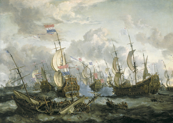
The battle scenes are inevitably an opportunity to display maximum artistic ambition and they do not disappoint. The final gallery presents a grouping of war scenes including Abraham Storck’s The Royal Prince and other Vessels at the Four Day’s Battle 1-4 June 1666 of circa 1670, a sumptuous and cruel masterpiece: and just as fascinating, but in black and white, Willem van de Velde the Elder’s c. 1660 monumental pen-painting of The Battle of the Sound, 8 November 1658. In contrast to the typical ominous black skies, sunlight prevails on Storck’s Four Day’s Battle allowing him to depict the sinking ship with well-lit precision and to silhouette the mastheads against the light like a relentless procession of black needles. The light and shadow in the waves of the foreground describe an oily, gelatinous liquid so different in quality from the chalky sky with its powdery clouds, that it dazzles the eye. The ships buzz with tiny details from their fine rigging to their ornamental carved prows.
The Battle of the Sound, as a pen-painting is just as stunning within the limitations of its medium: ink with pen and brush on a white oil ground. There are several superb examples of this same technique throughout the show, but Battle of the Sound is especially ambitious and leaps off the red gallery wall. Though pen-painting was not a forgiving medium, van de Velde was a master as you can see in the softness of his smoke and clouds, and the incredible fineness of his renderings of ships and water. Individual pen strokes are visible in the planks of the ships, whereas in the clouds, one shade seamlessly transitions into the other. The overall effect is of a light, airy, delicacy at odds with the subject of a ferocious battle. It seems to have painted itself, as if the dust settled perfectly into the shapes of ships and clouds. I especially admired the skeleton of a boat in the lower right and the ragged tears in the sails of the ship in the foreground on the left.
Van den Velde,Verbeeck, de Verwer,de Vlieger, de Vries,Vroom: such a lot of Vs and such crazy names- who can ever remember them and tell them apart? In fact the exhibition is stunning and memorable and I have not done justice to each of these magical painters including some of the more recognizable names such as Backhuysen or Porcellis. Fortunately, the accompanying catalogue prepared for the English version of the exhibition called Turmoil and Tranquility, The Sea through the Eyes of Dutch and Flemish Masters 1550 -1700, is an excellent reference with informative chapters about each artist. Despite the beautiful illustrations and fine scholarship, flat little images can only hint at the electrifying presence of some of the best maritime pictures in the world. One of the refreshing discoveries of the exhibition is just how great maritime painting can be as painting. The unique blend of document and drama resulted in a vast variety of painterly interpretation: each artist found a different way of balancing a focal point within a cosmic context, of describing water and sky, and of capturing detail. Although the level of skill across the board is miraculous, it is the distinct stylistic personalities that make the pictures so riveting.
What enlivens and deepens an already marvelous exhibition is the historic and artistic atmosphere contributed by the Peabody Essex Museum of Salem Massachusetts, the perfect American sponsor. The P.E.M.has an extensive permanent maritime painting gallery featuring such well known names as Fitz Hugh Lane and James Edward Buttersworth, but also just as many lesser known and fascinating folk artists. But perhaps even more unique is its famous collection of artifacts related to sea trade, many of which are displayed in the East India Marine Society Hall, one of the loveliest granite buildings in New England. With its haunting portraits of sea captains and glass cases of rare and odd things, this gallery adds another layer of tangibility to the lives symbolized by the ships in the Dutch seascapes.
-
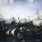
- Heemskerk’s Defeat of the Spaniards at Gibraltar, 25 April 1607, about 1619, Cornelis Claesz van Wieringen (about 1575-1633), Oil on canvas, National Maritime Museum, Greenwich, London, UK, Courtesy Peabody Essex Museum.
-
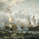
- The Royal Prince and other vessels at the Four Days Battle, 1–4 June 1666, about 1670, Abraham Storck (1644-1708), Oil on canvas, National Maritime Museum, Greenwich, London, UK, Palmer Collection. Courtesy Peabody Essex Museum.
-
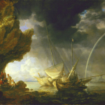
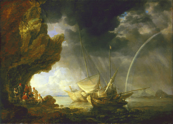
- Seascape with Sailors Sheltering from a Rainstorm, c. 1640, Oil on oak panel, 332 x 457 mm, Bonaventura Peeters the Elder, © National Maritime Museum, Greenwich, UK.
"The Golden Age of Dutch Seascapes" is on view until September 7 at the Peabody Essex Museum, located at East India Square 161 Essex Street, in Salem, MA.
All images are courtesy of the Peabody Essex Museum, and the loaning institutions.
Originally posted in the August 13th edition of Old Masters, New Perspectives.


