
With the end of Big Red & Shiny’s first academic year quickly approaching, we’ve been taking stock of the past 8 months to identify our successes and re-evaluate where we’d like to have a larger impact. One part of our mission has always been to highlight new voices within our cities—emerging artists who are bringing exciting ideas and techniques to their mediums or those who may just be graduating into our arts scene. Around this time every year we are provided with some of these best new voices and, given the number of academic institutions in our area, we have quite a bit to choose from. It only seems fitting then that we take the time to recognize the important work coming out of our schools. We will, of course, only be able to represent a small sampling of those institutions, but over the next few weeks we hope to provide a snapshot of promising, soon-to-be matriculated Boston artists.
........................................................................................
Massachusetts College of Art and Design Master of Fine Arts Exhibition II
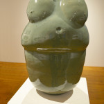
 Ji In Lee Big Mama, 2013
Part 2 of the MassArt thesis show is smaller, installed on the first floor gallery only. This round gravitates heavily towards media and conceptual practice, with only one artist each from the 2D and 3D departments, both of whom seem focused on an understated attention to craft. Ji In Lee’s stacked totems of ceramic vessels are beautiful and well-installed, but don’t stray far from their designation as functional objects. The exception is Big Mama, an oversized fertility icon that manages to be both shabby and ornate in the best possible ways. Victoria Piron’s small paintings on board are delicately rendered, oscillating between straight realism and a more illustrative technique.
There’s a sympathetic relationship to Piron’s work in Chelsea Welsh’s photographs. Her observations of the everyday in the warm, aged yellow light of late afternoon are similarly easy to overlook but rewarding. The tone and palette are consistent, and capture well the overgrown, worn-out beauty of urban domesticity. There’s a refreshing love of things as they are, unromanticized. Canbra Hodson’s High and Low, a photo and video odyssey into a missing person search in her native Maine town is, in contrast, genuinely creepy and disorienting. Her subjects tend to be obscured or slightly out of frame,
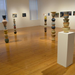
 Ji In Lee, Victoria Piron, and Chelsea Welsh's thesis installations.
wandering through the grey forested landscape and bleak small town settings. Borrowing from the format of a travelogue, her car becomes an anchoring point, acting as a rain-drenched vantage point. Otherwise, perspective is more or less untethered, and the sense of removal speaks to the surreal emotional unraveling that comes from periods of sleeplessness and anxiety. This is punctuated by the video element of the project—very much a photographer’s video, employing little to no movement across a series of static vignettes—that leaves the viewer feeling like a disembodied witness. A weak point is the audio: intermittent news broadcast clips cut over an ambient soundtrack that feels a little incidental for such a deeply personal and intense body of work.
 Amber Vistein and Amanda Justice's collaborative thesis installation. Photo courtesy of Mark E. Anastasio.
I might be more forgiving of the sound if it weren’t for Amber Vistein and Amanda Justice’s inclusion in the show, which employs sound as form with real acuity. The duo created an immersive audio-visual experience, employing a glass projection helmet in a darkened room. With such a novel format, the content could easily get lost, but it stands up. Visuals that wouldn’t appear to be much projected on a wall are perfectly fitted for viewing within the helmet, wherein formal considerations have more to do with pacing, color dynamics, and placement in the field of vision (the entirety of which is engaged by the concavity of the "screen") than, say, image quality or recognizable content. The sound is matched well to the visuals, pairing growled and slurred lines from Samuel Beckett with rumbling, yawning abstract sound. I was surprised by how the sound plays off the unique acoustic qualities of the helmet, which adds a roaring that is familiar to anyone that has put their ear to a conch, only magnified. Strange things happen in both the visual and audio components, with intensity and in unison, but the fullness of the experience is as pleasurable as its particulars are disturbing. It makes it hard to leave the installation, which becomes, after five or ten minutes, not unlike how purgatory might feel. It’s great to see an artists working successfully in an unusual set of formal parameters and pulling off an experience that transcends the format.
I was also impressed with work from the Dynamic Media Institute, MassArt’s somewhat set-apart graduate program in design. While the work in this show stands closer to the dialogue of contemporary art than contemporary design, Gabriel Schaffzin’s installation mimics the language of advertising in the digital age perfectly. Probing networked culture for potential dystopias, the artist presents familiar near-futures in which long-form reading and deep engagement with ideas are becoming extinct, an ideological rallying point for a select few. A series of documents orbiting a fictional society called the Longformers are clever, if a little heavy handed. However the cultural critique shines in a video advertising a multifaceted digital shape that adjusts to reflect one’s social views, politics, and taste to the world at a glance. The video is a pitch-perfect send up of advertisements for electronics and digital products that promise not only a service, but an ideological framework for living. The imagery and language are spot on, right down to the toddlers playing with a tablet and the couple holding each other on a rocky coast. This kind of deep, critical reading of the role of design in contemporary society, paired with a strong sense of both narrative and display, is where DMI could really shine as a design program within an institution still dominated by visual art.
 Nadia Afghani, installation shot.
Nadia Afghani’s practice seems focused in language and intention. Half of her work on view is in Braille—one piece is a long strip of oversized plastic bubble wrap on a giant roller, the other installed in several lines running up the banister to the second floor of the gallery. I, and presumably the majority of viewers, can’t read Braille, and I didn’t see a translation anywhere, so I imagine the point is to obfuscate meaning as a way to talk about the failure of translation. Braille often gets used in art as a kind of tactile, inaccessible stand-in for written or spoken language. It’s like using Cyrillic or Kanji characters as a texture in design —it invites multiple unintended connotations and it’s potentially reductive of the audience who might be able to access the information if it isn’t the intent to provide an experience particular to that audience for some real purpose. On the other hand, it’s possible that by privileging an audience who is typically at a disadvantage in the context of visual art, the artist is flipping and revealing the underlying structures that benefit certain groups over others in things typically perceived to be innocuous, like language. This position is more clearly outlined in her vinyl text installation of the phrases NOTHING IS LEFT and NOTHING IS RIGHT. Producing a conceptual feedback loop in its subversion of common associations, it’s a far simpler and ultimately more successful interrogation of the assumptions that exist and are perpetuated through language.
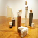
 Installation shot of Unum Babar's Thin Cities
Unum Babar presented Thin Cities, an installation of pale casts of architectural elements in miniature. Standing alone or in clusters, they echoed the disarray of unplanned urban sprawl, seemingly turned inside out. The best of them reveal exposed building materials like insulation, or stained imprints of the cast surfaces. More easily read photo-collaged elements don’t work as well, as they show a little too much and demystify the process. The more understated traces left on the plaster surfaces create a sense of displacement, that these ghostly casts could be drawn as easily from Mission Hill or Babar’s hometown in Pakistan.
-

- Nadia Afghani Photo courtesy of Evan Smith
-
- Ji In Lee, Victoria Piron, and Chelsea Welsh’s thesis installations.
-
- Ji In Lee Big Mama, 2013
-

- Amber Vistein and Amanda Justice’s collaborative thesis installation. Photo courtesy of Mark E. Anastasio.
-
- Nadia Afghani, installation shot.
-
- Installation shot of Unum Babar’s Thin Cities
All photos, unless otherwise noted, courtesy of Evan Smith.


