
That sex sells will hardly be news to anyone conscious of the history of advertising. We like looking at the bodies of the people we find sexually attractive—why not? And so ad designers work their magic to make a connection in our minds between the promise of sex and the purchase of the product. Okay—we know it’s more subtle and complex than that: that marketing strategy in a nutshell is to sell a lifestyle in which the product takes on a symbolic, keystone role, standing for and necessary to that lifestyle. That’s why the product is so often minimized in or missing from the ad—it’s the attractions of the lifestyle that they need the consumer to focus on.
Sex is often part of the lifestyle for sale, and honestly—who’d buy a life without it? So what’s the harm done exhibiting beauty, showing some skin, hinting at an interrupted carnal rendezvous? No one, not the most bovine consumer, really believes that buying product X will translate directly into sex with someone who looks just like the model in the ad. And those of us who are a little more ad-savvy get to sit on the subway and chuckle at the clever puerility of the AXE product ads on the subway (shock absorbers on a ratty couch? Service numbers on a dorm room door? Can these boys imagine sex after graduation?), or tsk! at the misogyny and coded violence of the recent Bud Light posters (look at her pose and tell me that’s not a simulated rape, and while shoved up against an enormous Bud Light bottle! How lucky for her!).
Here’s the thing, though: everyone on that train, in some important ways, is just as ad-savvy as you are. Inundated with advertising images all day long, no one over the age of 12 could possibly fail to “see through” those AXE ads. The whole point of that ad series was to be “seen through.” It is the recognition of their hyperbolic absurdity that drives the message system coded into those ads: AXE gets you laid; you are smart enough to understand the sexual activity implied by this ad; AXE gets you laid; you are smart enough to recognize this depiction of an AXE user’s sex life as exaggeration; AXE gets you laid; you are sophisticated enough to be amused by our blatant attempts to manipulate you; AXE gets you laid; you are smart and sophisticated enough to buy this product as a result of your own decisions, and not because of this edgy, subtly sycophantic ad campaign; AXE gets you laid.
This is not, naturally, a conscious process, and if you men reading this didn’t go out and purchase AXE products after riding the T, be willing to consider that your lack of interest might have as much to do with demographic targeting as anything else. If they’d been aiming at you, some of you might have been hit.
The point is that more and more, ad designers are counting on their target demographic to be not only familiar with the images they use, but fluent in the grammar of the language created when image and message are blended together in the service of marketing. The more sophisticated we are at reading visual marketing messages, the easier it is for ad designers to sell us stuff.
And lest you think this is a marketing technique most useful with guys who watch Spike TV, consider its presence in media aimed at other demographics. For instance, a typical clothing ad—Burberry, for instance—in Wallpaper* magazine reads like a frozen moment in some narrative that begs decoding, offering beautiful people, sexual tension, overtly bizarre or expensive settings, vacant stares and mannequin-shiny flesh, arranged in what looks like a Burberry-designed robot performance of a Tennessee Williams play. Wallpaper* itself is a masterpiece of sustained irony, and in the context of its pages these ads are simply not meant to be taken seriously, and would in fact be utterly bewildering to a reader not well versed in the modes and conventions of contemporary fashion photography. Lucky for Burberry, and thanks to recent trends in fashion advertising, we are well versed. And so the coded message goes: Burberry clothes are sophisticated and a sign of wealth; you are smart enough to build a narrative into which this scene fits; Burberry clothes are sophisticated and a sign of wealth; you are smart enough to recognize this scene as a playful construct that is not congruent with reality; Burberry clothes are sophisticated and a sign of wealth; you are sophisticated enough to be amused at our attempts to manipulate you with this ad; Burberry clothes are sophisticated and a sign of wealth; you are smart and sophisticated enough to buy our clothes as a result of your own tastes, and certainly not because you now associate our brand with a feeling of self-satisfied cleverness and sophistication.
If you didn’t buy any Burberry last year, again consider giving some thanks to the tactical precision of demographic targeting. For some of us it was merely an economic reality, for others a matter of broader style incompatibilities (Roca Wear and Burberry don’t share closets well), but for thousands of women in Boston last winter it made sense to buy that really rather ordinary plaid scarf from Burberry, and so demonstrate not only their smartness and sophistication, but also their fluency in ad-speak.
To move beyond discussion of the hinted-at sex of ads like these and tackle the heavy stuff—the Diesel and American Apparel ad campaigns, for example—is to court accusations of prudishness. Everyone has their own comfort levels when it comes to nudity and sexuality in the media, and I daresay the average reader of Big RED & Shiny has a higher tolerance than most, and good for us. So we shall leave moral judgment by the wayside here and simply look at the way patterns in advertising have evolved lately, particularly in the realm of photography-based campaigns. I mentioned above that ad campaign designers are relying more and more on the audience’s familiarity with the language of marketing images, the grammar of it, so to speak. Consider the grammar then of the latest Diesel clothing line ad campaign. In men’s and women’s magazines, on their website (it’s interactive, even!), and on billboards, the language of the images used is the language of porn.
Diesel is, as Calvin Klein was in the 90s, at the forefront of a shift in marketing from using the classic codes of erotica to those of porn—a boundary line not easily marked between two genres not easily defined. One practical way to think about the difference that some feminist theorists have used might be boiled down to an equation: porn = erotica + exploitation/violence/humiliation. If erotica relies on the sexualizing of the naked body, then porn relies on the eroticizing of sexual violence, humiliation, and exploitation. Regardless of one’s moral stance on the issue of porn in society, I think it can be agreed that porn has a certain grammar—a certain set of codes and conventions used in the images and scenes collectively recognized as “pornography.” If you’re not sure what these are, look to the recent Diesel campaign, with it’s coded tableaux of sexual exploitation and violence—presented with hot smiling models and the tagline A Guide to the Individual Pursuit of Hedonistic Pleasure (visit diesel.com if you’ve missed the ads in this campaign). From bestiality to whipping, soup to nuts, it’s all there, beautifully designed, photoshopped within an inch of its life, amusing and clever. The reclining cowboy with the matryoshka/blowjob dolls is the clearest example in the campaign. In line with the codes and conventions of straight male-oriented porn, he lies back, fly unzipped, ready to be serviced by the diminutive (childlike?) inflated dolls behind him, each smaller than the next. The dolls’ only purpose in the world of the tableau is to provide the reclining cowboy with oral sex—they are cute orifices. In the world of advertising, they replace women so that the focus of sexual interest can remain on the body of the cowboy, an icon of gay porn and ladies’ night out strip clubs. There’s a little something here for everyone but lesbians, who must not be a target demographic. The dolls also allow the image to exist in the non-porn world (imagine if they were real young girls, mouths open, lined up behind him?), while providing a wink and a nod—we get it, in other words. If we weren’t conversant with the grammar of porn, we wouldn’t. The image would have no resonance, none of the depth of association the campaign relies upon for its humor and cachet. It would simply be a hot dude with some blow-up dolls, selling jeans.
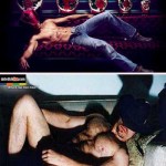
American Apparel has taken a different esthetic tack, but still trades upon the public’s familiarity with porn imagery. The campaign most familiar to Bostonians is probably the one appearing weekly on the back cover of The Weekly Dig. The images of pretty young things in American Apparel togs are reproducing precisely the look of amateur porn, with its often awkward posing, poor composition, and badly-lit, shadow-casting boy/girl next door models. The classic web-porn experience of this genre uses frames showing a steadily decreasing amount of clothing and increasing amount of sexualized posing, usually with props by the end, though not often with partners. The usual subjects are the barely-legal set. The A.A. ads simulate an early frame from one of these series, and on the back of The Weekly Dig, at least, have been indeed moving closer every week to reproducing the dénouement of those final frames. A link on the American Apparel site leads to stories the campaign has generated in the press, and among other things we learn that the models are primarily corporate employees of the design company, and that the usual professional boundaries between sex and business are deliberately somewhat blurred by the founder of the company. Melissa, the site tells us, has just won the impromptu office wet tee-shirt contest (see image), while fortuitously wearing a shirt from the new line. Here there isn’t any of the coded violence or humiliation or even domination present in the Diesel ads—just good clean American Apparel fun with kids like the ones you went to college with. But inherent in the porn version of these images is extreme objectification of young girls or boys by older men. The visual and sometime textual message is one of sexual availability, normalizing the idea that adolescents are willing sexual prey. Regardless of one’s comfort with that message, it is a message that can’t help but be carried into the marketing use of those same images.
That, finally, leads to the question these ads raise: regardless of how comfortable we are with porn itself, how comfortable are we with the fact that as a society we are so conversant with its grammar, its modes and conventions, that it can be used as a foundation for a kind of marketing that assumes it as an unchallenged part of our collective consciousness? When these modes and conventions have reached a level of cultural currency so basic and pervasive, when the audience’s reaction to their use in ads is only to recognize how they are used, and questions of whether they should be used are dismissed as prudish, the fundamental questions concerning the role of porn in our society go unexamined and unchallenged. Whether porn is art, obscenity, or merely another form of media, this lack of critical awareness cannot be a good thing.
-

- An ad from Diesel’s new Hedonism campaign.
-

- Top: an ad from American Apparel Bottom: an image found at an amateur pornography site
-
- Top: an ad from Diesel Bottom: an ad for DateDickLive.com Where real men meet.
Links:
American Apparel
Diesel
All images found online.


