
Brands distinguish things from one another. In marketing, essentially anything can be considered a brand, from a pack of gum or a tube of toothpaste to a magazine, a school, an airline, a hospital, or a country. NBC is a brand. So is Newsweek. Harvard, as one of the world’s most prestigious universities, has done well marketing its brand image and licensing its name for use in a variety of merchandise. When Florida, Mexico, New York, or Paris advertise for tourism, they are positioning these locations as brands, packaged as any other product might be. They are more than names in that as brands, they must convey an image and seek an emotional response. From a marketing perspective, it is useful to note which brands appeal to which generation, or to more than one generation, and ask why this is the case.[1]
Being an artist is very much about creating a brand. An artist uses their name, their style, and their body of work to create a unique identity, tied to their name and brand. It is not uncommon for women artists to keep their last name after marriage out of a desire to maintain the public identity they have created. Museums and galleries bank on the name recognition of their artists, and exploit it to bring in larger audiences. Witness the blockbuster Monet and Gauguin shows at the MFA, or the ICA's "Getting Emtional" exhibition jam-packed with A-list names.
What does it mean, then, when an artist makes their work by combining existing and recognizable brands? What can be said of the work, or of the artist's intentions, when the work itself is little more than a recombination of marketing brands meticulously nurtured by Madison Avenue?
In her seminal "Pop Art" from 1966, Lucy Lippard quotes painter James Rosenquist: "Current methods in advertising, sublimation and the hard sell, invade our privacy," he has said. "It's like getting hit with a hammer; you become numb. But the effect can be to move you into another reality. These techniques are annoying in the form in which they exist, but when they're used as tools by the painter, they can be more fantastic."[2]
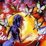
I don't know if painter Robert Amesbury is a fan of Rosenquist, or allies himself with Pop Art, but his paintings certainly take Rosenquists statement to an extreme. They are overloaded with pop imagery, layered in an aesthetically appealing jumble that pits powerful icons against each other. The paintings are loaded with color, saturated beyond even the standards of advertising, with a gleam that is equal parts enticing and terrifying.
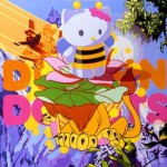
In one image, Hello Kitty and a Disney-ish lion float above a mountain-scape labeled with the Dunkin Donuts logo. That last sentence was as hard to write as the painting is to absorb; and this image is one of the simpler compositions in the room. On the other extreme (and I brace myself for the sentence I must now write) a painting features a can of Comet Cleaner, a can of Raid, a gangsta, a sports logo, floating with flowers and fired upon by machine guns, while in the corner hovers the logo of Rock Star Games (makers of Grand Theft Auto).
If Rosenquist felt that advertising in the '60's was hitting him with a hammer, Amesbury is hitting us with a Mack truck, layering the consumerist meanings of a diverse variety of products all at once, burying us in their meaning, until we are numb. Or, perhaps, we are already numb, and it takes nothing short of all-out war on our senses, a total carpet-bombing of iconography, to make us notice what these products have done to our psyche. It is almost as if he wants to challenge us, to taunt us, daring us to become numb in the face of so much meaning.
Returning to my earlier question, then, what does it mean when an artist makes work in this way? What do we take away from a room overflowing with popular icons?
The answer I come back to, over and over again, is that these pieces require us to accept these icons, to fold them into our artistic canon, and see them as part of our artistic dialogue. This, of course, was part of the argument of Pop Art, but Amesbury is asking more of us. He is asking us to buy these paintings, put them in our homes, and live with them. We may have cans of Comet under the sink, a copy of Grand Theft Auto in our (or our children's) Playstation 2, or a can of Pringles in the pantry. These items are our world, and a still-life made from our common household items would be false without these things, much like a still-life of pumpkins and apples was relatively accurate in the 1870s.
Personally, I'm hoping that this Pop Will Eat Itself form of cultural recycling comes to an end soon. I nearly vomited recently after seeing a student work remaking Warhol's "Marilyn Monroe" with Paris Hilton. Yet, as long as the trend continues, Amesbury is certainly at the top of the field and his paintings come the closest I've seen to escaping the trappings of art-trends that bog down many similar works.
Robert Amesbury at Bernard Toale Gallery is a loud show, screaming with color and assaulting with icons. I left with very little idea of Amesbury or his intentions, but many questions about my own relationship to pop icons and advertising. In the end, this is what I expect art to do, and for that I enjoyed this show.
1 - Joe Marconi, Future Marketing, NTC Business Books / American Marketing Association, 2001.
2 - Lucy R. Lippard, Pop Art, Thames and Hudson, 1966.
-
- Robert Amesbury.
-
- Robert Amesbury.
-

- Robert Amesbury.
Links:
Bernard Toale Gallery
"Robert Amesbury" is on view June 15 thru July 30, 2005 at Bernard Toale Gallery.
All images are courtesy of the artist and Bernard Toale Gallery.

