
By LINDA K. PILGRIM
Beatrice Dauge Kaufmann sees the most optimistic interpretations of American landscapes of New England and New York landscapes that I’ve ever seen. Yet, her glasses are not naively rose-colored. She simply has a way of perceiving the best—and most colorful—pieces of the atmosphere of the Northeast possible. Her optimism is conveyed through daring colors: lemony yellows, cotton candy pinks, watermelon reds, blueberry and bright baby blues plus more—colors that are exceptionally difficult to describe. These artificial nametags don’t do them justice, because hers are paintings that must be seen in person to be fully appreciated. It’s almost as though she has a built-in—and apparently unconscious—filter that extracts the grays that I’ve always perceived, having grown up in the Northeast. But, Dauge Kaufmann is Swiss, and I can’t help but noticing that she’s not the first person from Switzerland that I’ve met who uses colors of this genre. For example, her paintings of the often-overcast skies and the beaches of Cape Cod, seem to be come to life as colors devoid of darkness on her canvases, yet miraculously they are still genuine.
Dauge Kaufmann’s abstract compositions of oil, usually on canvas, make an unintentional nod to Abstract Expressionism and Color Field painting in their formal approach, but she carries them out with her unique vision—only concerned with the present. She doesn’t seem concerned about referring to historical movements or not. So, you won’t find any of the ole’ “AE” dark or brooding colors or intellectual interpretations; however, plenty of intensity and emotion materializes on her surfaces. Unlike the American painters of the 1950s and ‘60s, Dauge Kaufmann naturally and automatically “pushes” her palette toward a more optimistic field of vision and colors that are vivid versions of light hues.
Dauge Kaufmann’s spirit is bold and this gives depth to potentially pale pinks, yellows and sky blues without adding any tones made with black. Her saturated hues inexplicably feel as though they possess an underlying structure—and a solid one at that. Paradoxically, the artist has been able to create strong abstract compositions with these colors, which are not just self-reflective formal explorations but come directly from her perception of the world she sees outside. She is like a plein air painter, except she captures the shades, tones, and hues of the environment in her mind—not a photograph—and brings them home to release them on the canvas along with her related emotions. The compositions that result are due to “the colors’ lead,” she explains.
The titles of Dauge Kaufmann’s compositions reveal her sources, such as Atlantic seascapes, rural Maine landscapes, and cityscapes ranging from New York to Sicily to those of her temporary Cambridge, Massachusetts home. Dauge Kaufmann paints these locations from memory, which is profoundly influenced by her emotional response to the place. Yet, she doesn’t paint the land and sea of Cape Cod with the traditional grays used by American artists throughout history. Instead, she unconsciously selects and extricates the optimistic essence—no matter how minute—of any color there, incorporates her emotive response to it, and reveals the most visually pleasing slice of seascape with her signature palette. When asked about her perception of colors, she seems unaware that her vision might be unusual. She seems to be able to see another dimension of color and light that is almost invisible by other artists whose eyes have been infiltrated by the darker hues of the Atlantic coastline. In fact, when I asked her about this and compared what I saw in the New England sky on an average winter day, Dauge Kaufmann was unaware that her color perception might be unique.
Perhaps she can perceive colors in her unique manner because she looks at places like New England and New York through the eyes of a foreigner. From her European-bred perspective, she sees the American environment as fresh, like a newborn intrigued and amazed by the appearance of everything she encounters.
Dauge Kaufmann assertively portrays her pleasure and hope with colors that “lead” her, not only when constructing a composition in the present, but she also explains that her “colors ‘push’ her future paintings” too. In a contemporary art world flooded with colors created with Adobe Photoshop and printed with the limitations of the equipment on which they are viewed, this artist’s palette has been discovered and developed with pigments mixed and by hand—and best seen in person.
-
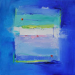
- Beatrice Dauge, Inside You I, oil on canvas.
-
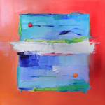
- Beatrice Dauge, Inside You VI, oil on canvas.
-

- Beatrice Dauge, Inside You VII, oil on canvas.
"Beatrice Dauge: Bleu" is on view April 12 - May 3, 2007 at The Copley Society.
All images are courtesy of the artist and The Copley Society.


