
By ARTHUR WHITMAN
Currently up at the DeCordova, Big Bang! Abstract Painting For The 21st Century, surveys the current state of the venerable genre. The best work in the show feels classic but not pedantically backward-looking, mindful of history while displaying a range of fresh and individualistic approaches. Some of the work tries too hard for a new millennium feel, often faltering despite its strengths.
The work of Reese Inman is arguably the most non-traditional here. Both her compositions—grids of variously arranged dots on flat backgrounds—and color choices are generated with assistance from a self-designed computer program. After printing these patterns out onto panels, Inman overpaints each dot with multiple layers, using plastic squeeze bottles. This process gives some of the dots a wobbly, fluid quality seemingly at odds with the overall high-tech aesthetic. Still, these are slick productions. The Noise series (V, VI and VII) resemble futuristic skylines, with dot stack towers casting reflections below. Using a more restrained palate, the Infodramaseries alludes to Dante with its titles: Paradiso, Purgatorio and Inferno. Red and orange dots are scattered, seemingly randomly, across a dark red background. The nature of the "drama" is elusive. Do the dots—varying in density from panel to panel—represent souls? Inman's paintings are not the most compelling here, but they are likely the most innovative technique-wise. Big Bang! is full of art quoting (however vaguely) the "look" of science and technology, while using more or less traditional painterly procedures. There's nothing wrong with that, of course; still, Its interesting to see at least one painter embracing electronics at another level.
Barbara Takenaga and Julie Miller also create fields and clusters of mulit-colored dots. Unlike Inman, they work in a more traditional manner, rejecting both the grid and the algorithm. Takenaga's dots—variously sized and cramming her surfaces—form dizzying waves and vortexes. Seeing her work in reproduction can be deceptive, as the dots appear to be a slickly rendered 3D. Looking at them more closely, you can recognize their soft, painterly qualities (reminiscent at times of Ross Bleckner). This improved my assessment of her work quite a bit. Most of Miller's work is on paper, dotted obsessively with pen and paint-marker. Her dots are flat, and the majority tiny. They cover the sheets, resembling static. Looking at them, elements pop in and out of attention. The presence of a similar animated video—made from little circles drawn on a graphics tablet—is almost redundant. Both artists are skillful visual technicians, although their work can feel a bit gimmicky.
Working in a somewhat similar vein, but less successfully, Jon Petro's three large canvases are covered entirely with overlapping loosely-brushed elliptical loops. His work actually looks better in reproduction. Between their thick paint application, too straightforward color choices and no room to breathe denseness, they lack the optical buzz of most of Miller and Takenaga's work. Meg Brown Payson's layered dots and loops have plenty of breathing space, as well an engrossing complexity. Her squarish panels call to mind single-celled organisms floating swimming in liquid. The subtle palate consists of blues, warm greens, yellows and oranges. Vertical stripes on some pieces call to mind some of her abstractionist forebearers, echo the shape of the support, and con/tain the softer forms.
Steven Bogart's relatively small paintings are a highlight of the show. Oil and/or enamel on canvas, they feature dense, Pollock-esque tangles of paint, some of it marbleized. These are laid down over relatively flat, thinly painted areas. Typical of the work shown, three adjacently hung pieces share a palate: most prominently black, white, blue, cyan, pale pink and yellow. 2:49, the largest, stands in the middle. The lines are both fluid and strangely stiff.
Also owing something to Pollock—albeit less blatantly—Thaddeus Beal and Sarah Walker both cover their surfaces all-over with intricate linear patterns. The similarities don't go much further. Beal's acrylic board pieces are highly restrained in color, with often Islamic-looking geometric linework painted on and carved into tan or greenish fields. Walker's work on paper is wilder and less disciplined. The pieces feature a dizzying array of swirls, splotches and crystalline latices. As titles like Dust Atlas and Diffusion Formation might suggest, they have a science fiction feel. Many younger abstractionists take a similarly maximalist, bombastic approach; Walker's work is not among the more successful examples I've seen.
Using markedly different techniques, Terry Rose and Laurel Sparks both create intricate, biological-looking forms. Working on aluminum panels, Rose mixes oil and pigments with varnish in a spontaneous process he compares to alchemy.
In A Different Somewhere, three vaguely marine-looking creatures appear to be swimming in a amorphous silvery field. Towards the lower right is a waterfall of pigments—lavender, gold, blue, greys and silvers. Beginning Again is sparer and more microscopic looking with a light sandy-shiny background and clusters of green-gold cells leaving smoky trails. Laurel Sparks' elaborately mixed-media paintings flirt with the kitschy, the decorative and the effeminate, which can be part of their charm, or not. Here, they mostly work. Joy and Its Opposite features a fan-like central branching shape emerging from the middle of the bottom edge. It resembles a bunch of flowers or coral, with little bulbous endings. The "stems" of this form are thinly stained with the canvas visible beneath. The branch tips are more thickly painted; off white with multi-colored circles. The background is baby blue at the bottom and dark gray towards the top.
Along with Miller and her video, a few other artists have strayed from the expected format. Sean Foley and Christi Rinklin both leave their main supports—canvas and aluminum panels respectively—to paint on the wall. In both cases, this move seems symptomatic of broader attempts to give abstraction a more contemporary relevance. Neither entirely pulls it off.
Foley's extravagant centerpiece, Menace, takes up a whole wall. The two canvas paintings are the strongest section, featuring a panoply of jazzy swirls, blobs and bubbles. The left hand panel sprouts a small grove of stylish three dimensional cutouts, reminiscent of Jean Arp's Dadaist reliefs, as well as the mid-century modernist designs of Ray and Charles Eames. The work would still have something of a pastiche quality, but what pushes it way over the top is the ungainly red and white stripes and mock-Rosenquist explosion painted on the wall. Rinklin surrounds her two aluminum panel paintings with curving silhouettes, which resemble smoke or vines. These framing forms are perhaps the most appealing part of her work, an elegant counterpoint to the too-slick cartoon grotesque inside. Her Ecstatic Beatification is also notable for its use of the DeCordova's indoor brick archway (part of the old building) as a further frame.
-
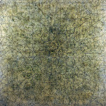
- Thaddeus Beal, Spring Convergence, mixed media on acrylic, 2005.
-
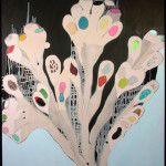
- Laurel Sparks, Joy and Its Opposite, acrylic, marble dust, collage on canvas, 2005.
-
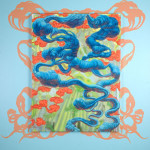
- Cristi Rinklin, Ecstatic Beatification, oil and acrylic on Dibond aluminum, 2006.
DeCordova Museum and Sculpture Park
"Big Bang! Abstract Painting for the 21st Century" is on view January 20 – April 22, 2007 at The DeCordova.
All images are courtesy of the artist and The DeCordova.


